
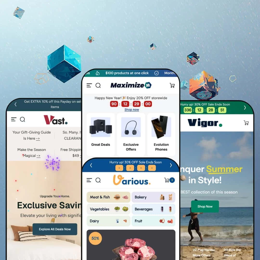
This is a theme built for merchants drowning in SKUs. The developer's case is simple: 500+ products, shoppers who need to find things fast, and a checkout path that doesn't punish them for browsing. After testing all four preset demos across every major page type -- homepages, product pages, collection pages, carts, search, and menus -- it holds up. But each preset makes that case for a completely different kind of store.
Pros.
〰️
Pros. 〰️
✚ A navigation engine that earns its complexity
The mega menu is not a nice visual flourish. It is the structural reason this theme works across electronics, sports, home decor, and grocery without any of them feeling like a misfit. Every preset uses the same underlying flyout system, but Vigor stages it as a brand-tab navigator for multi-manufacturer sporting goods, Vast embeds a live contact form inside a flyout for high-consideration furniture purchases, and Various extends it four levels deep with department thumbnails for grocery browsing. The same navigation capability serves all four contexts without modification to the system itself -- only to its configuration. For a merchant who needs navigation that educates shoppers rather than just listing links, this is the first capability to evaluate seriously.
✚ Conversion tools that don't require extra apps
A lot of what merchants typically solve with third-party apps is already in the box here. Countdown timers on sale sections, bundle discount sections with tiered structures, flash sale product grids, and pre-order buttons distinct from standard add-to-cart all appeared across multiple presets during testing. That matters in two ways: it reduces the number of apps you need to install and maintain, and it eliminates the category of problem where an app conflicts with the theme and breaks something at checkout. The tools are native, they coexist cleanly, and they were all live in the demos.
✚ Product cards that read the room
A product card with a single variant shows "Add to cart." A product card with multiple variants shows "Choose option." A pre-order product shows "Pre-order." All three states were present and consistent across all four presets. This sounds basic but it isn't -- simpler themes collapse everything to a single button label regardless of context, which creates friction for the shopper and ambiguity about what clicking will actually do. Here the card tells the shopper exactly what the next step is before they take it.
✚ Banners built for the real world
Each homepage banner section supports a separate image file for desktop and a separate one for mobile. That means the art direction stays intentional across screen sizes instead of relying on CSS to crop a desktop image into something presentable on a phone. The Vigor preset also demonstrated video in the hero section loading a thumbnail preview before the clip streams, which prevents the layout from jumping as the video loads. These are not glamorous details. They are the difference between a store that looks built and a store that looks assembled.
✚ nternational reach built in
Six languages in the Vast and Various presets, three in Maximize and Vigor, all switchable from a clean utility bar toggle that saves the preference per session. For a merchant targeting markets outside English-speaking regions -- a European home decor brand, a specialty food importer serving urban immigrant communities -- this removes a meaningful barrier without requiring a separate localization app. The multi-currency switcher sits in the same bar. Both features were verified live in the demos.
✚ Flexible presets, consistent core
The four presets make genuinely different editorial and structural choices while drawing on the same underlying feature set. Vigor uses the mega menu as a brand-tab navigator; Vast turns it into a seasonal commerce platform with embedded contact forms; Various configures it for four-level grocery navigation with per-department thumbnails. The result is flexible preset options that maintain core functionality while offering distinct aesthetic approaches. A merchant can choose the preset closest to their own vertical and reconfigure from a relevant starting point, rather than building everything from a blank canvas.
Cons.
〰️
Cons. 〰️
🚫 These demos are configured for a large store
Every preset is staged at full density for a large, fully realized inventory. Stacked hero sections, countdown banners, bundle grids, editorial flyouts, seasonal shops -- they're all on by default. If your catalog has 40 products, you will spend a meaningful portion of your setup time removing sections rather than adding them. Knowing which sections to cut without undermining the page's conversion logic requires judgment, not just clicking. Buyers with leaner catalogs should add that editing work to their setup estimate.
🚫 The demos are not production-ready out of the box
The Various preset makes this clear: collection slugs with "-copy" in the URL, three pickup locations with identical placeholder addresses. These are demo shortcuts, not theme defects, but they illustrate a broader point. Any of these presets will need deliberate cleanup before a real store goes live -- URL structures, location data, navigation depth trimmed to match actual catalog size. The demos are excellent references. They are not finished stores.
-
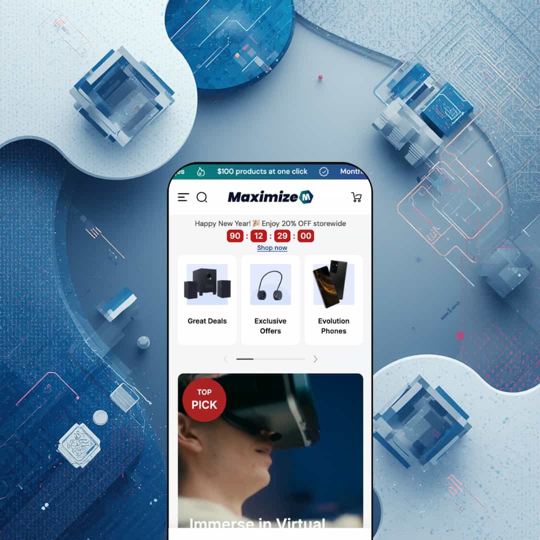
Dark. Dense. Built for a shopper who knows what they want and wants to find it in two clicks. This preset is configured for consumer electronics retail, and the visual choices leave no ambiguity: high-contrast type, a cool-toned palette, and a homepage packed with category shortcuts that assume the person browsing already has a product in mind.
What makes this preset work
Right below the hero, there's a scrollable horizontal strip of category icons: budget phones, tablets, gaming laptops, smartwatches. It sounds like a small thing. It isn't. In a catalog with hundreds of products, that strip is the fastest path from landing to browsing a specific subcategory -- no menu-opening, no hunting. For a shopper who already knows they want a gaming laptop, that strip is the first navigation element they'll interact with, and it gets them where they're going before they've had time to feel lost.
The branding detail worth noticing is the dual-mode logo. This preset loads two logo files -- one for dark backgrounds, one for light -- and switches between them automatically as the page style changes. It sounds like polish for polish's sake, but in electronics retail it matters. A merchant's brand mark is competing with manufacturer logos and product photography all the way down the page. Staying legible in both contexts without manual workarounds is a genuine time-saver.
The mega menu in this demo is dressed for a tech store. Opening "Trending Collections" or "All Electronics" reveals wide flyouts with subcategory links on one side and editorial image panels on the other -- a photo of smartphones with a headline, a CTA, a clear visual anchor. The result is a menu that teaches shoppers what's in a category before they click into it, which matters in electronics where the difference between a flagship phone and a budget phone is not always obvious from a product name alone.
Further down the homepage, a three-tier bundle section (Buy 2 save 10%, Buy 4 save 20%, Buy 6 save 30%) sits above a product grid. Putting that offer on the homepage rather than at checkout means shoppers encounter the incentive while they're still in discovery mode, not after they've already decided what to buy. A VR headsets section near the bottom embeds a product video -- not just images -- showing that the theme handles video at the product-category level, not only in the hero.
Where it stumbles
The demo is configured for a large electronics catalog, and the navigation reflects that. Five levels of hierarchy -- top-level nav item, category, sub-type, product tier, editorial panel -- is appropriate when you have hundreds of products to organize. For a smaller catalog, it's a teardown job before launch. A merchant with 60 SKUs and two product categories will spend real time stripping this nav back before it feels honest rather than aspirational. That's a demo density problem, not a theme flaw, but it should factor into setup estimates.
The discount badges on some products go to extremes: -88% and -96% markdowns. Those are staging numbers, not live prices, but they expose a real merchant decision. The badge system will display whatever percentage you give it. In electronics, where buyers are accustomed to checking prices elsewhere, a badge that overstates the deal can backfire. Worth setting a house policy before those badges go live.
-
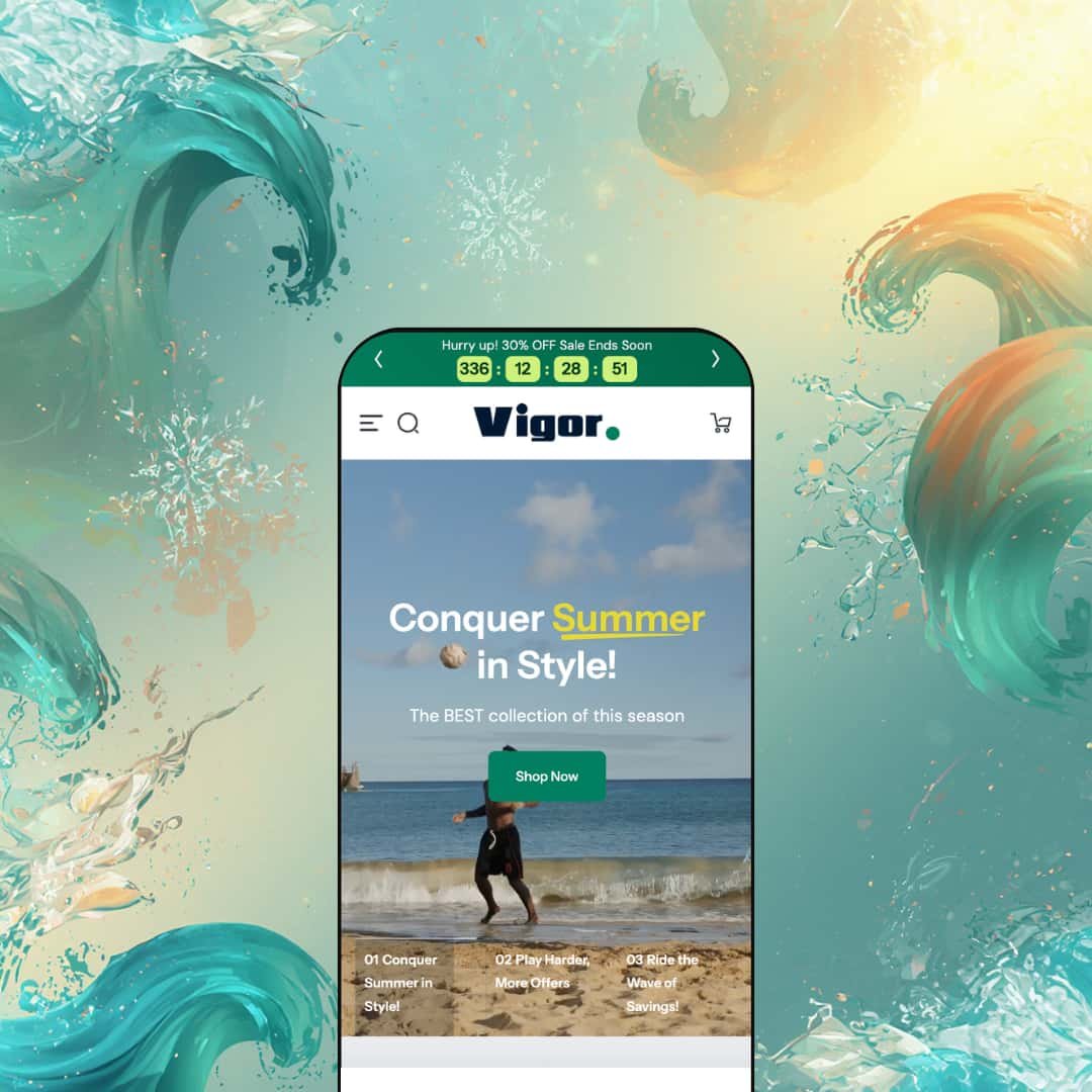
This preset doesn't walk you in -- it sprints you through the door. Three full-width video clips cycle across the hero: summer collection shots, tennis, surfing. Each has its own headline and CTA. By the time the third clip runs, you already know this is a multi-sport store, and you've seen three separate campaign messages without reading a word.
What makes this preset work
The video hero is the loudest staging choice, and it earns the space it takes. For a sports and outdoor brand running different campaigns across different activity verticals -- summer watersports one month, winter gear the next -- this format lets multiple messages share the prime position on the page without fighting each other. Each clip is its own campaign. Swapping clips for a new season requires no structural changes to the page, only new video files.
The "Brands" nav item reveals the most commercially interesting navigation decision in this preset. Opening it shows a flyout organized by brand -- Maximize, SlidePro, Pro-Guard, Awesome Sport, Sportism -- as horizontal tabs across the top. Each tab opens its own product links and imagery. That structure treats brand partnerships as primary navigation rather than an afterthought buried in a sidebar. For a retailer with formal agreements and dedicated inventory per manufacturer, it's the right call. A shopper who came specifically for SlidePro finds SlidePro immediately.
The "Popular" flyout does something worth pausing on. Open it, and three product grids appear directly inside the menu -- Kids' Sports, Women's Sports, Men's Sports -- each with product images, prices, and add-to-cart buttons. You can put a single-variant item in the cart without ever leaving the navigation dropdown. The theme's product card logic (direct add-to-cart for single-variant products, choose-option for multi-variant) plays out right there inside the menu. That's a notable shortcut for a shopper who already knows what they want.
The flash sale section on the homepage runs a countdown clock alongside a full product grid. Both the single-variant and multi-variant button states appear correctly here, consistent with the rest of the site. The effect is a time-limited promotion with native urgency mechanics that doesn't require a third-party app to run.
Where it stumbles
The Vigor demo runs two parallel navigation structures simultaneously: a sport-category flyout system and a brand-tab mega menu. For a multi-sport, multi-brand catalog, that's the right structure. For a merchant adapting this preset to a vertical where brand organization doesn't apply, or where one sport category is the entire business, the dual-structure nav needs significant rethinking before it serves customers well. That reconfiguration is doable, but it's not a quick edit.
-
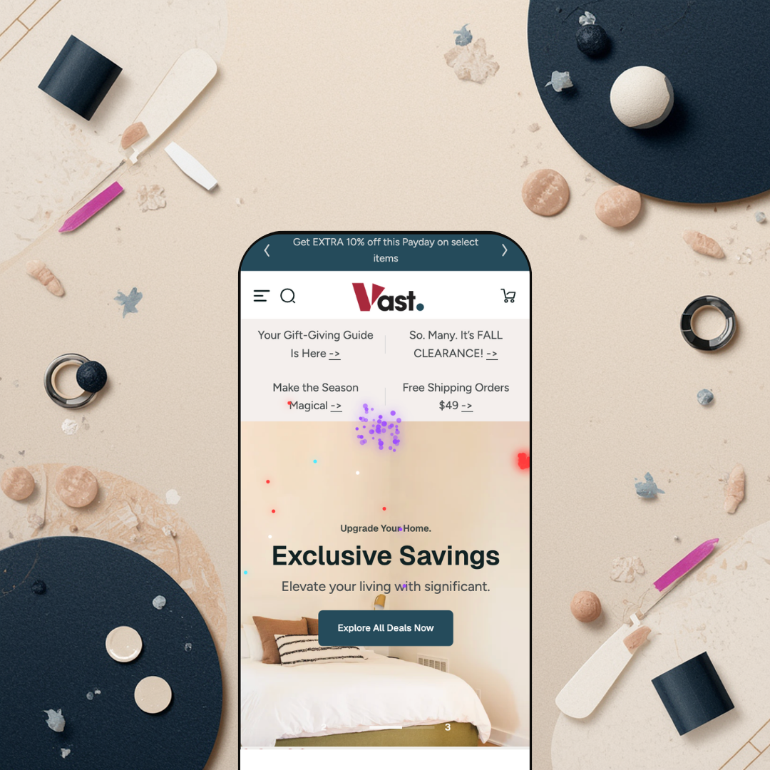
Where the Maximize preset signals speed and precision, this one signals calm. The hero opens on warm tones, large editorial headline type, and a message about sanctuary rather than savings. The pace is slower, the margins are wider, and the implicit promise is that you'll find what you're looking for without feeling rushed. That's a deliberate fit for a home furnishing store, where purchases are considered and returns are costly.
What makes this preset work
The most distinctive structural choice in this preset is how it handles seasonal commerce. The "Christmas Shop" is a top-level nav item -- not a promotional banner, not a footer link, not a collection buried under "Sale." Opening it reveals a full mega menu with dedicated subcategories: Christmas Nutcrackers, Ornament Sets, Christmas Wreaths and Garland, Stocking Stuffers. A separate "Holidays" item groups New Year, Christmas, Gift Shop, and Christmas Decor. For a home decor retailer whose Q4 revenue depends on shoppers finding seasonal gifts quickly, building the holiday shop into the permanent navigation structure means the campaign lives at the highest level of the site rather than being bolted on each November.
There's a contact form inside the mega menu. Not on a contact page -- inside the navigation flyout itself. Opening "Contact Us" in the nav reveals Name, Email, Phone, and Message fields alongside the store's address and hours. A shopper considering a $900 sofa can ask a question without leaving the page they're on. For furniture and home goods, where the purchase decision can span days and involve questions about dimensions, materials, and delivery, that friction reduction is real. It's a smart match between feature and product type.
The homepage includes a dropdown-based category explorer -- choose a furniture type, drill into a subcategory -- that functions as a browsing tool without requiring a full page load. Below it, category tiles display live item counts: "Sofas 57 items," "Storage 66 items." Shoppers can see how deep a category goes before they click into it. That detail matters in a wide catalog; knowing there are 57 sofas available before you enter the collection sets expectations and makes the subsequent browsing feel appropriate rather than overwhelming.
Where it stumbles
The Vast demo homepage is stacked. Sliders, dual-image banners, countdown sections, product grids, category explorers, and editorial panels all appear in close succession. For a large home furnishing catalog, the density earns its space. For a merchant launching with 40 or 50 products, that same homepage will feel padded and require cutting -- not toggling off sections at random, but making considered decisions about which conversion sections to keep and which to remove without breaking the page's logic. That's editorial work, not just theme configuration.
The Sofas mega menu has four sub-panels: by Size, by Material, by Type, and Sofa Sets. Each panel holds six to eight links. A merchant with a full furniture catalog will use all of it. A merchant launching with a narrower range will be removing sub-panels rather than building them, which means starting the setup process in reverse.
-
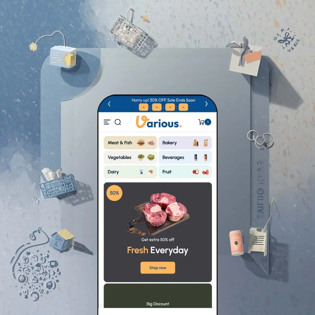
The first thing you see on this preset's homepage is a discount. Then another. Then a third. The hero cycles through deal callouts -- "50% Get extra 50% off -- Fresh Everyday" -- at a pace that makes it clear this is a store competing on price and freshness, not aspiration. Everything about this preset is configured for grocery: the color warmth, the food photography, the navigation depth, and one standout product card detail that the other three presets don't have.
What makes this preset work
The price per unit is right there on the product card. Not buried on the product page, not requiring any calculation from the shopper -- $6.50/oz, $1.38/oz, $4.65/3oz, visible at a glance. For a grocery or specialty food shopper comparing a 12-oz jar against a 32-oz version, that number is the decision. Surfacing it at the card level is the single most operationally thoughtful thing this preset does, and it does it natively, without a third-party app.
The navigation is staged four levels deep with thumbnail images at each level. The path to "Fresh Fish" runs: Shop by Category, then Meat and Fish, then Fish and Seafood, then Fresh Fish. Every flyout along the way shows a thumbnail so you know you're in the right department before you click further. For a grocery retailer whose shopper base knows what they want to cook for dinner, that specificity is table stakes. A generic two-level navigation for an online grocery store is a shortcut that costs you conversions.
The "Today's Deals" section is a horizontal tab strip at the top of a product grid -- Fresh Fruit, Fresh Fish, Natural Spices, Butter and Cheese, Cookies. Clicking a tab swaps the grid below without reloading the page. Multiple food departments get homepage promotion simultaneously, each with its own deals, without requiring separate landing pages. For a grocery retailer running weekly promotions across five different categories, the structure is a meaningful operational simplification.
The recipe blog integration in the top utility bar -- linking to /blogs/recipes and a News and Articles section -- turns the store into something with reasons to return beyond shopping. A pasta recipe links naturally to semolina, imported tomatoes, and good olive oil. That content-to-product pathway supports search visibility and builds the kind of regular visit habit that grocery retail depends on.
Where it stumbles
All three store pickup locations in the demo show the same address and phone number. That's a demo shortcut, and it won't appear in any live store -- but it is a reminder that the store locator requires real data to be useful. For a food retailer where local availability matters (think fresh fish, refrigerated dairy), launching with placeholder location information is a functional gap that will confuse shoppers who rely on pickup. Populating the locator carefully is not optional.
Several collection URLs in this demo carry "-copy" suffixes: /collections/butter-cheese-copy, /collections/pork-copy. Those are artifacts from how the demo was assembled. In a production store, those URLs matter for SEO and for any links built into emails or marketing campaigns. Cleaning them up means recreating the affected collections from scratch, since Shopify doesn't allow direct slug edits on existing collections without redirect work. It's manageable, but it's a launch task that should be planned for, not discovered at go-live.
Niche Suitability
-
![Maximize Main Preset from the Maximize Shopify Theme]()
Maximize Preset
Consumer electronics retailers and multi-category tech merchants. The subcategory icon rail, dual-mode branding, and editorial mega menu are well-matched to catalogs where product education happens before the product page, and where category depth is a feature rather than a problem.
-
![Vigor Preset from the Maximize Shopify Theme]()
Vigor Preset
Multi-sport retailers, outdoor equipment stores, and any catalog organized meaningfully by brand or activity. The video hero and brand-tab navigation are strong enough that a merchant in this vertical could launch with relatively light customization.
-
![Vast Preset from the Maximize Shopify Theme]()
Vast Preset
Home furnishing retailers, lifestyle decor brands, and seasonal gift shops -- specifically merchants with a meaningful Q4 business who benefit from having holiday commerce built into the permanent nav structure.
-
![Various Preset from the Maximize Shopify Theme]()
Various Preset
Online grocery retailers, specialty food importers, farm-to-table shops, and beverage brands -- any food business where per-unit pricing and deep category navigation are genuine shopper expectations rather than nice-to-haves.
Not Ideal For
Final Recommendation
-
Retailers with 100 or more SKUs who run regular promotions, need deep navigation for shoppers to self-serve through a large catalog, and may be serving customers in more than one language. The four presets cover electronics, sports, home decor, and grocery -- if your business resembles any of those verticals in catalog size and purchase behavior, this theme was built with you in mind.
-
A boutique with 25 products, a service business with no physical goods, or a brand whose entire store is a hero image and a single product collection. For those merchants, Maximize is structurally oversized and the setup cost of removing what you don't need outweighs the benefit of the features you'd keep. A simpler theme will get you live faster and cost you less configuration time.
-
Medium-High. The feature set is genuinely strong, but every one of these demos needs cleanup before it becomes a real store -- staging content removed, URLs planned, navigation depth matched to actual inventory. Merchants comfortable in the Shopify theme editor will handle it. Merchants who have never configured a theme before should budget for some help.
★ 8.2/10
Rating
-
Native countdowns, bundles, pre-order, store locator, per-unit pricing, and variant-aware product cards cover most conversion tool needs without requiring additional apps.
9
7
-
The same feature depth that makes this theme powerful makes initial setup non-trivial. Merchants comfortable in the theme editor will manage well; those new to Shopify may need onboarding time.
8
-
Separate desktop and mobile image assets in banner sections and a collapsible drawer menu for mobile navigation are genuine strengths.
8
-
Interactive elements responded quickly during testing. Video-heavy sections load media progressively rather than blocking content.
9
-
Four presets spanning electronics, sports, home decor, and grocery demonstrate real configurability. The mega menu alone can serve almost any category structure a merchant needs to build.
FAQ
〰️
FAQ 〰️
-
👑 Maximize was built with high-SKU retail in mind -- electronics, sports equipment, home furnishing, and grocery are all demonstrated by the four presets. The Vigor preset, for example, segments product cards by men's, women's, and kids' within the navigation flyout itself, so sport-specific retailers can organize their catalog clearly right out of the box.
-
📱Yes. The banner sections load separate image assets optimized for mobile viewports, and the mega menu collapses into a drawer-style navigation on smaller screens. The Vast preset's holiday shop section, which has particularly deep nesting, still presented cleanly in the mobile drawer during testing.
-
🎨 The theme supports logo swaps for both light and dark modes, as seen across all four presets where two logo files are loaded and switched depending on the header style. Typography is fully self-serve via the theme editor. Color schemes, section layouts, and mega menu content are all configurable, making it practical to diverge from any of the four demo aesthetics significantly.
-
⚡ Perceived performance was solid throughout testing. The search dropdown populated product suggestions without a noticeable delay, cart drawers opened immediately after clicking, and the video hero on Vigor's slideshow loaded its thumbnail preview before streaming, which prevented layout shifts. No section content appeared to block page interaction during scrolling.
-
👕 It does. Single-variant products show a direct add-to-cart button on the product grid card. Multi-variant products show a choose-option button leading to a variant selection flow. Pre-order products display a dedicated pre-order button distinct from both. The behavior is consistent across all four presets.
-
🔎 The theme supports clean page titles, heading hierarchies, and the standard Shopify SEO fields for products and collections. The Various preset's integration with a Recipes blog and a News and Articles section is a practical example of how content marketing can be layered into the store structure for organic search, without requiring a separate CMS.
-
💱 Yes, and this support is configured via Shopify Markets and the theme's built-in language and currency switchers. The Vast and Various presets each load six languages (English, Spanish, Japanese, Italian, German, and French) in the top utility bar; Maximize and Vigor each load three. The switcher saves session preferences and is accessible from every page of the store. Currency switching is handled through the same utility bar control.
-
⚙️ Yes. Maximize is a standard Shopify theme and integrates with apps through the usual app blocks and theme extension system. The native feature set -- timers, bundles, store locator, pre-order -- means merchants may need fewer third-party apps than with simpler themes, but nothing in the theme's construction limits app compatibility.
-
🛒 All four preset demos are publicly accessible. Shopify also allows merchants to add the theme to a development store and customize it fully before purchasing, so it is possible to adapt the preset to your actual catalog and confirm fit before committing the $200.
This review is based on hands-on testing of the publicly available preset demos of the Maximize Shopify theme as of February 27, 2026. Theme features, preset availability, and performance can change with subsequent updates from the theme developer.