
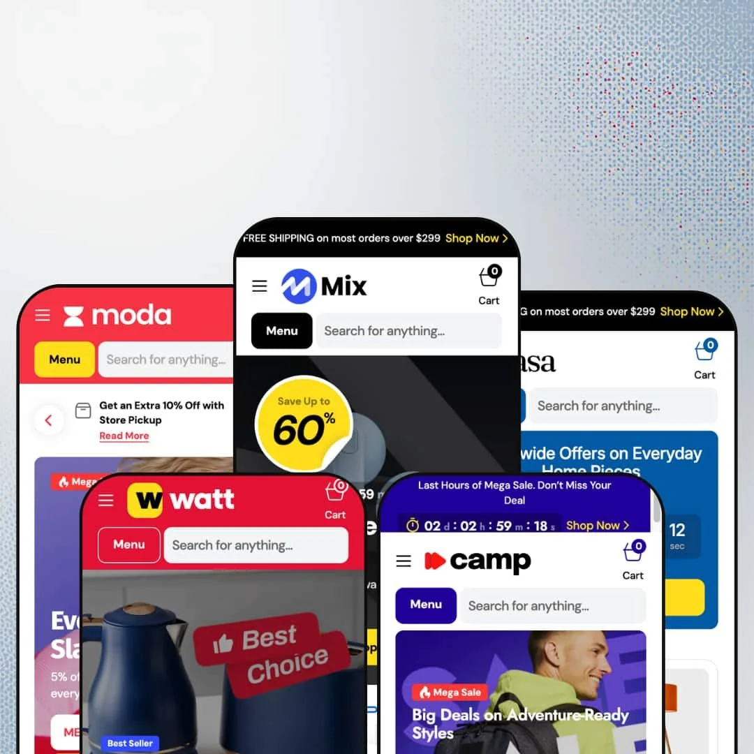
At $380, Mix isn't cheap. But it's trying to earn that price tag by packing in just about every conversion tool a Shopify merchant could ask for: countdown timers, promo popups, image hotspots, before/after sliders, and a mega menu system that turns your navigation bar into ad space. Built by Creative Commerce and pitched at large-scale sellers, the theme ships with five presets covering electronics, fashion, outdoor gear, homeware, and appliances.
Pros.
〰️
Pros. 〰️
✚ Mega menu with in-menu promotional banners
Most Shopify mega menus give you a wider dropdown with more links. Mix's mega menu gives you advertising space inside the navigation. Each dropdown supports nested sub-categories, specific product deal links, and two image-driven promo cards with lifestyle photography and custom logos. Across the five presets, those promo cards adapt to the niche: electronics deals in Mix, knitwear promotions in Moda, adventure gear in Camp, room styling in Casa, appliance offers in Watt. It's the same capability everywhere, but it looks native to each vertical.
✚ Built-in dark/light mode toggle
Every preset ships with a dark/light mode switch in the header, and it works exactly as you'd hope: one click, and the entire store flips. Product cards, navigation, footer, search overlay, cart drawer. Most themes need custom code or a third-party app for this. Mix builds it in, which gives merchants two visual identities from a single theme installation without any extra work.
✚ Rich product page system with three gallery layouts
The product page isn't just an image and a buy button. You get three gallery layouts (slider, stacked, grid), a structured specs table, delivery timeline indicators showing Pickup, Express, and Standard shipping with estimated dates, and inline trust badges ('Free 90-Day Returns,' 'Shipping Information') right next to the Add to Cart button. That's a lot of conversion infrastructure without a single app installed. For multi-variant products like the StreamBook Air Ultra, which uses Display Resolution and Operating System as two separate variant axes, the page handles complexity without breaking a sweat.
✚ Extensive section library with conversion-focused modules
Twenty-plus section types. Countdown timers, image hotspots, promo tile grids, scrolling marquee strips, collapsible FAQ lists, testimonial blocks, logo carousels, information bars, collection tabs, banner sliders, and more. For merchants who want to build rich, editorial-style homepages without installing a page builder app, Mix provides the raw materials natively. The library is identical across all presets; what changes is how each one populates and arranges those sections for its target niche.
✚ Enhanced search with predictive results and icon-driven categories
The search overlay goes beyond autocomplete. It shows a 'Most Popular' row of full product cards (complete with variant swatches and hover images) alongside a category sidebar with custom SVG icons tailored to each preset's product context. Quick View buttons work inside the search results too, so a shopper can preview a product without leaving the overlay. It's the kind of search experience that usually requires Algolia or a dedicated search app.
Cons.
〰️
Cons. 〰️
🚫 Homepage section density demands editorial judgment
Mix gives you every building block. That's its strength and its liability. The default staging in Mix and Watt packs over a dozen content sections onto the homepage, and the result scrolls for what feels like forever. Merchants who don't aggressively edit their homepage risk overwhelming visitors with too many entry points. This theme rewards curation. If you're not willing to spend time deciding which sections stay and which go, the homepage will work against you.
🚫 Demo staging rough edges
The live demos have a few visible staging issues that don't affect theme functionality but do affect first impressions. Countdown timers in the Mix hero slides and the Camp/Watt announcement bars display all zeroes because no end date is set. Casa's newsletter page has a URL typo (/nesletter), and Watt's multicolumn demo page has a similar one (/multicoulmn). These are demo problems, not theme bugs. But for a $380 theme, the demos are the storefront, and these details chip away at the polish.
🚫 Dual variant selector overlap on product pages
On products with multiple variant axes, the product page shows both button-style pickers and a dropdown selector at the same time. They stay in sync and both work correctly, but the redundancy can confuse shoppers who aren't sure which to use. A toggle in the theme editor to pick one style per variant group would clean this up.
-
The default preset is a general marketplace. Electronics, books, vinyl, art prints, smartwatches, projectors. It throws the full catalog at you across a homepage that runs over a dozen sections deep.
What works in this preset
The hero doesn't hold back. Three full-bleed slides rotate through electronics, vinyl deals, and smartwatch offers, each one carrying a percentage-off badge and a countdown timer overlay. Dark backgrounds, white type, punchy CTAs. It immediately tells visitors: this is a marketplace, there are deals, and they're time-limited.
Scroll down and you'll find a 'Shop by Category' grid that uses transparent PNG product cutouts against colored tile backgrounds. Laptops, watches, projectors, headphones, speakers, books, art, vinyl, and sale items each get their own tile. It looks like a product catalog spread, not a generic Shopify collection grid, and that editorial quality gives the preset a marketplace authority that flat rectangles can't match.
The 'New Products and Current Offers' section is genuinely clever. It's a promo tile grid where every card is a different size, carrying a different badge: percentage discounts here, 'Best Seller' labels there, 'Mega Sale' fire icons on another. The varied sizing keeps your eye moving. Most themes would give you a uniform 4-column grid and call it a day. Mix makes it feel like a magazine page.
Two separate homepage sections feature a coupon code ('MEGA30') with click-to-copy functionality. Tap it, it's on your clipboard. Simple, effective, and the kind of thing most merchants install a third-party app to get. Having it built in means fewer apps, less clutter in the theme editor, and one fewer monthly subscription.
Between sections, a scrolling marquee strip repeats 'Sale up to 50%' across the page. It's a small touch, but it breaks up the visual density of back-to-back image grids and keeps that urgency simmering in the background.
The mega menu earns its name here. The 'Best Deals' dropdown organizes promotions by Electronics and Books, listing specific deal links ('Smart Watches: up to 50% OFF,' 'Fiction books: up to 50% OFF') alongside two image-rich promo cards with lifestyle photography and custom logos. It's navigation that doubles as advertising.
Where it stumbles
There's a lot. Maybe too much. Multiple featured collection grids, promo tiles, coupon banners, a marquee strip, and then another full product slider. The homepage runs long. If you're selling nine categories like the demo does, the density makes sense. If you're selling two or three, you'll need to strip sections out, because otherwise the page scrolls forever and the shopper's attention gets split a dozen different ways.
-
Moda takes the same engine and dials everything back for fashion. Women's, Men's, and Accessories. Cleaner lines, bigger product photography, less promotional noise.
What works in this preset
Navigation gets simpler immediately: Sale, Accessories, Women, Men, Best Deals. That's it. The mega menu still works here, but the promo banners swap to model photography with fashion-focused copy ('Up to 70% Off Knitwear, Layers & More'). It reads like a fashion editorial, not an electronics clearance sale. That tonal shift starts right at the navigation level, which is exactly where it should start.
The header is notably cleaner. Currency, language, and dark mode controls live in a slim utility bar up top, but there's no announcement banner shouting about free shipping. Product imagery leads. For fashion brands that spend money on lookbooks and lifestyle shoots, this staging decision lets that investment carry the page instead of competing with text overlays.
Open the search and you see fashion-specific category icons for Accessories, Men, and Women, with popular product cards showing model photography: Angular Frame Sunglasses, a Basic Fleece Sweatshirt, a Button-Front Knit Cardigan. Even the search overlay has been recontextualized for apparel. It's a small thing, but it reinforces the brand feel at every touchpoint.
Moda includes a dedicated Sections navigation under Features, linking to individual demo pages for each available section type, all styled with fashion imagery. If you're evaluating the theme before buying, this saves you from having to install it just to see what's available.
Where it stumbles
The homepage is noticeably shorter than Mix. That's by design for fashion, but it also means prospective buyers see fewer section types on the landing page. You have to click through the Features navigation to discover the full library. Mix and Watt lay everything out on the homepage; Moda makes you go looking. Whether that's a problem depends on how thoroughly you evaluate before purchasing.
-
Outdoor gear. Ski jackets, snow pants, thermal gloves, adventure packs. Camp takes Mix's promotional engine and points it at the slopes.
What works in this preset
Before you even scroll, the announcement bar is already working on you. A countdown timer ticks next to 'Last Hours of Mega Sale. Don't Miss Your Deal,' with a 'Shop Now' link right there. For outdoor retailers running end-of-season clearance (and when aren't they?), this above-the-fold urgency matches how the industry actually sells: seasonal windows, limited inventory, time pressure.
Camp's Features menu does something genuinely useful for buyers evaluating the theme. It links each of the three product page gallery layouts to a different outdoor product: Slider on the Adjustable Bib Snow Pants, Stacked Gallery on the All-Mountain Ski Jacket, Grid Gallery on the All-Terrain Safety Helmet. You can see exactly how each layout handles gear photography. The Stacked Gallery, where all images appear in a vertical scroll, works particularly well for technical apparel where shoppers want front, back, and detail shots without clicking through a carousel.
The blog ships with 'Why Base Layers Matter in Cold Weather,' which is exactly the kind of article that ranks in search and funnels readers toward product pages. It's a good demonstration of how the blog section can serve double duty: content marketing and SEO, both pointing back to the catalog.
The mega menu's promo banners lean into the outdoor identity: 'Adventure-Ready Packs on Sale,' 'All-Weather Protection Starts Here,' each with rugged photography. The 'Best Deals' dropdown separates deals by Accessories, Men, Sale, and Women, with specific product links under each column. It's the same mega menu engine as Mix, but the staging makes it feel like a completely different store.
Where it stumbles
The catalog is thinner. Just Women, Men, and Accessories at the top level. The mega menu's columns have fewer product links to fill them, and the search sidebar shows only four category icons. That's fine for a demo, but merchants with a broader outdoor catalog (camping, climbing, cycling, water sports) will need to build out sub-categories themselves to make the navigation feel full.
-
Furniture, lighting, storage, candles, wall art. Casa turns Mix into a homeware store with warm tones, lifestyle room shots, and a category structure that mirrors how people actually shop for interiors.
What works in this preset
The top navigation splits into Furniture, Lighting, Storage, and Decor. That's how interior shoppers think, and the mega menu respects it: the 'Best Deals' dropdown lists specific products under each category (Mesh Task Chair, Rattan Lounge Chair, Metal Pendant Light, Tripod Table Lamp). These feel like curated picks, not a database dump. When a shopper is browsing homeware, that editorial touch matters because they're buying aesthetics, not specs.
The image hotspot page is the standout here. Casa's Features menu links to a Product Markers section where clickable pins overlay a styled room photograph. Each pin connects to a product page. For a home decor merchant, this is the dream: one beautiful lifestyle shot can sell four products at once. You'd typically need an app for this. Mix builds it in.
The search overlay uses homeware-specific SVG icons (Decor, Furniture, Lighting, Storage) and surfaces popular products that match the context: an Abstract Flow Canvas, an Adjustable Spot Wall Light, an Arch Block Candle. It's a small touch that keeps the browsing experience consistent, even in a utility element like search that many themes treat as an afterthought.
The demo blog runs 'Balance and Contrast: Using Color to Anchor White Spaces.' Decorating queries pull serious search traffic, and this kind of editorial content creates organic entry points that paid advertising can't replicate as efficiently. It shows the blog capability being used the way a real homeware brand would use it.
Where it stumbles
A small staging misstep: the Features menu links to the newsletter page at /pages/nesletter instead of /pages/newsletter. It won't affect a real merchant's store since they'd set up their own URLs, but it's visible during evaluation and adds a slightly unfinished feeling to an otherwise polished preset.
-
Toasters, washing machines, coffee grinders, TVs, irons, blenders. Watt is Mix's answer to the big-box appliance store: dense, deal-driven, and organized for shoppers who know what they need.
What works in this preset
Thirteen categories in the search sidebar. Audio, Bestsellers, Coffee Machines, Home Appliances, Irons, Kitchen Appliances, Mixers, New In, Photo & Video, Sale, TVs, Washing Machines, and All Products. Each one gets a custom SVG icon (a coffee cup, a washing drum, a TV silhouette). For a large-catalog appliance store where shoppers search by product type, this level of categorization provides immediate orientation. It's the kind of depth that makes the theme feel purpose-built rather than adapted.
The announcement bar runs the same countdown treatment as Camp ('Last Hours of Mega Sale. Don't Miss Your Deal'), which makes sense for appliance retail. Black Friday, summer kitchen refreshes, back-to-school: appliance purchases cluster around promotional windows. Having that urgency above the fold before the shopper even scrolls is the right call for this vertical.
Top-level nav includes Kitchen, Home, New In, and Bestsellers alongside the standard Sale and Best Deals tabs. New In and Bestsellers are editorial collections, not just product categories. They let merchants highlight seasonal arrivals and top performers without burying them inside a larger collection page. It's a simple curation layer, but it matches how appliance shoppers browse: 'What's new?' and 'What's popular?' are the two questions they ask most.
Watt's Features menu exposes 19 individual section demo pages. Slideshow, Banner grid, Banner slider, Card grid, Collapsible list, Collection tabs, Collections grid, Countdown, FAQ, Featured blog, Featured collection, Featured slider, Information bar, Logo list, Multicolumn, Newsletter, Popular products, Simple slider, Testimonials. It's the most complete section showcase across all five presets and lets prospective buyers evaluate the full library without installing anything.
Where it stumbles
Same issue as Mix: homepage density. Product grids, promo banners, featured sliders stacked end to end. If you're selling kitchen appliances and home electronics across a dozen sub-categories, that density works. If you only sell coffee machines, you'll be deleting sections for a while.
The Features menu links to the multicolumn page at /pages/multicoulmn. A URL typo, same category of issue as Casa's newsletter link. Visible during evaluation, irrelevant to actual merchants, but it chips away at the demo's polish.
Niche Suitability
Not Ideal For
Final Recommendation
-
Multi-category retailers who run active promotional campaigns and want their theme to do the heavy lifting. Electronics marketplaces, home goods stores, fashion brands with broad catalogs, appliance retailers. If you're comfortable curating a large section library and you'd rather have features built in than bolted on through apps, Mix is a strong pick. The five presets give you a head start for electronics, fashion, outdoor, homeware, or appliance retail, and every capability is available regardless of which preset you start from.
-
Single-product stores and minimalist brands. If your ideal homepage has a hero image, a product grid, and a footer, Mix will feel like overkill. The theme rewards merchants who use its features; if most of them go unused, you're paying $380 for complexity you don't need.
-
Medium to High. The section library is powerful, but 'powerful' means 'lots of decisions.' Each preset gives you a strong starting point for its niche, but you'll still need to configure countdown dates, set up promo codes, populate mega menu links, and prune sections that don't serve your catalog. This isn't a set-it-and-forget-it theme. It's a build-it-your-way theme.
★ 8.0/10
Rating
-
One of the deepest feature sets in the Shopify theme market. 20+ section types, three product page gallery layouts, image hotspots, countdown timers, and a mega menu with in-menu promos. Very few gaps that would require third-party apps.
9
-
Powerful but potentially overwhelming for first-time Shopify merchants. Each preset provides a strong starting point, but curating the homepage demands editorial judgment. The Features navigation menu helps with orientation.
6
-
Responsive across tested page types. The cart drawer, search overlay, and mega menu collapse into mobile-friendly panels. Product card swatches and Quick View remain functional on smaller viewports.
8
-
Smooth transitions, no visible lag on slideshows or product grids. Image-heavy sections load progressively. Interactive elements like the dark mode toggle and currency selector respond instantly.
8
-
Five presets spanning electronics, fashion, outdoor, home, and appliance retail. Dark/light mode, extensive section library, three product page layouts. Substantial range without touching code.
9
FAQ
〰️
FAQ 〰️
-
👑 It covers a lot of ground. The five presets target electronics (Mix), fashion (Moda), outdoor gear (Camp), home decor (Casa), and home appliances (Watt). The mega menu, section library, and product page system adapt to each. In the Mix preset alone, the promo tile grid demonstrates how a multi-department store can spotlight deals across books, vinyl, art, and tech in a single homepage section.
-
📱Responsively. On the Camp preset, the mega menu collapsed into a mobile drawer with expandable sub-categories, product grids maintained swatch visibility, and the slide-out cart and search overlay both worked as full-screen mobile panels. Nothing felt like a desktop feature shoehorned onto a smaller screen.
-
🎨 Very. The dark/light mode toggle gives you two visual identities out of the box. Font and color settings are fully configurable in Shopify's editor. The 20+ section types let you build anything from a dense 13-category marketplace (Watt's search sidebar) to a streamlined fashion storefront with minimal navigation (Moda). The range is wide enough that two stores using Mix could look nothing alike.
-
⚡ Interactive elements load quickly. The StreamBook Air Ultra product page in the Mix preset renders its image gallery, variant selectors, and specs table without any perceptible delay. Scrolling through the dense Mix homepage with its promo tiles, marquee strip, and multiple product grids stayed smooth during desktop testing. The same held across all five presets.
-
👕 Yes. Products with color variants display swatch buttons directly on the card, whether it's the Compact View Mini projector in Mix or the All-Terrain Safety Helmet in Camp. On the product page, multi-attribute items like the StreamBook Air Ultra use both button-style and dropdown selectors for its Display Resolution and Operating System axes. Both interfaces stay in sync when you pick a combination.
-
🔎 Breadcrumbs appear on product pages (Home > Shop > Electronics on the StreamBook Air Ultra), structured product data is included, and every preset has blog functionality. The Camp blog ('Why Base Layers Matter in Cold Weather') and Casa blog ('Balance and Contrast: Using Color to Anchor White Spaces') show how the blog section supports niche-relevant content marketing that can drive organic search traffic.
-
💱 Every preset ships with multi-currency support covering 28 countries and territories. Language packs vary by preset configuration: Mix offers English, German, and French; Moda provides English, French, and Italian; Camp includes English, French, and Spanish; Casa offers English, German, and Spanish; and Watt supports English, German, and Spanish. Language and currency selectors appear in both the header and footer, and merchants can add more through Shopify's localization settings.
-
⚙️ Mix uses standard Shopify theme architecture, so app blocks and app embeds work through the theme editor. That said, the built-in feature set (countdown timers, promo popups, product badges, image hotspots, FAQ sections, trust badges) covers much of what merchants typically install third-party apps to get. Fewer apps means a simpler tech stack and lower monthly costs.
-
🛒 Yes. Shopify's 'Try theme' feature lets you install Mix and customize it in the editor before purchasing. All five preset demos are publicly accessible for hands-on browsing at the demo URLs linked throughout this review.
This review is based on hands-on testing of the publicly available preset demos of the Mix Shopify theme as of March 2026. Theme features, preset availability, and performance can change with subsequent updates from the theme developer.