
Most Shopify themes sell you a grid. Pebble sells you a magazine. At $400, this theme from FoxEcom is built for brands that treat every scroll as a storytelling opportunity, particularly kids' apparel, lifestyle boutiques, and anyone who'd rather show an outfit than list a product. It ships with a single preset called Pebble, which sounds limiting until you realize how much is packed into that one configuration.
Pros.
〰️
Pros. 〰️
Merchandising that actually merchandises
This is the headline. Pebble doesn't just display products; it builds context around them. The built-in lookbook ("Shop The Look") layers product cards directly over editorial images. The step-by-step outfit builder walks customers through coordinated purchases. Occasion-based collection highlights with accordion navigation let brands organize by activity, and tabbed product grids keep the homepage scannable. These sections aren't decorative. They're designed to push average order values up through cross-selling and outfit-based shopping, and they do it without needing a single third-party app.
A mega menu that pulls its weight
Most mega menus are just wider dropdowns. Pebble's version turns navigation into a merchandising surface. Every collection link can carry a thumbnail image, categories group under clear headings, and a promotional banner card with a CTA sits right alongside the links. For fashion brands where browsing is half the purchase decision, this means customers see what's inside a collection before they click into it. That's a meaningful step beyond plain text lists.
Search that shows products, not just keywords
Open the search overlay and you'll immediately see popular search terms alongside a grid of featured product cards, complete with images, badges, prices, and action buttons. Shoppers interact with products before they've finished typing a query, which cuts friction for return visitors. In most themes at this tier, you'd need a third-party search app to get this level of enrichment. Having it native is a genuine advantage.
Animation that knows its place
It's easy to overdo scroll animations. Pebble doesn't. Transitions feel intentional throughout the theme, guiding the eye rather than competing for it. The overall page flow has an editorial rhythm that keeps shoppers engaged through long, content-rich homepages without ever feeling like a tech demo. Brands with strong photography will appreciate that the scaffolding stays invisible and lets the imagery do the heavy lifting.
Flash sales and page templates, no apps required
A native countdown timer for product flash sales comes built in, which means no app conflicts, no extra subscriptions, no performance drag. Pair that with three product gallery layouts (Vertical Thumbnails, Inside Thumbnails, 2 Columns) and four collection page templates (Minimal, With Collection Cards, With Banner, Full Wide Banner), and merchants get real configuration depth out of the box. Less app dependency, leaner storefront.
Cons.
〰️
Cons. 〰️
You need the photography to match
This isn't a theme you can populate with product-on-white shots and call it a day. The lookbook, outfit builder, collection highlights, and mega menu all expect high-quality lifestyle photography and carefully curated product groupings. Without them, sections feel hollow, and the editorial tone the theme is designed to deliver falls flat. That's not a bug; it's a design philosophy. But it sets a high entry bar for merchants who are still building their visual library.
One preset, zero track record
Pebble launched at version 1.0.0 in February 2026. Zero reviews on the Shopify Theme Store at the time of testing. One preset. At $400, competing themes typically ship with three or more presets so merchants can preview different color schemes, font pairings, and industry contexts before buying. FoxEcom has ecosystem presence, but this specific theme has no merchant feedback, no update history, and no way to gauge how it holds up over time. Early adopters are betting on potential.
Swatch circles could be clearer
Product cards show color variants as small filled circles below the product name. They're functional, but there's no tooltip or color name on hover, which makes it surprisingly hard to tell two similar shades apart in the grid. If you sell three variations of beige (and plenty of kids' brands do), shoppers will have to click through to the product page to figure out which one they're looking at. Small friction, but it adds up across a catalog.
-
Think children's fashion boutique: warm colors, playful staging, editorial-weight photography, and enough homepage sections to fill a small catalog on their own. Pebble is the only preset Pebble ships with, and it leans hard into lifestyle storytelling and occasion-driven navigation.
What works in this preset
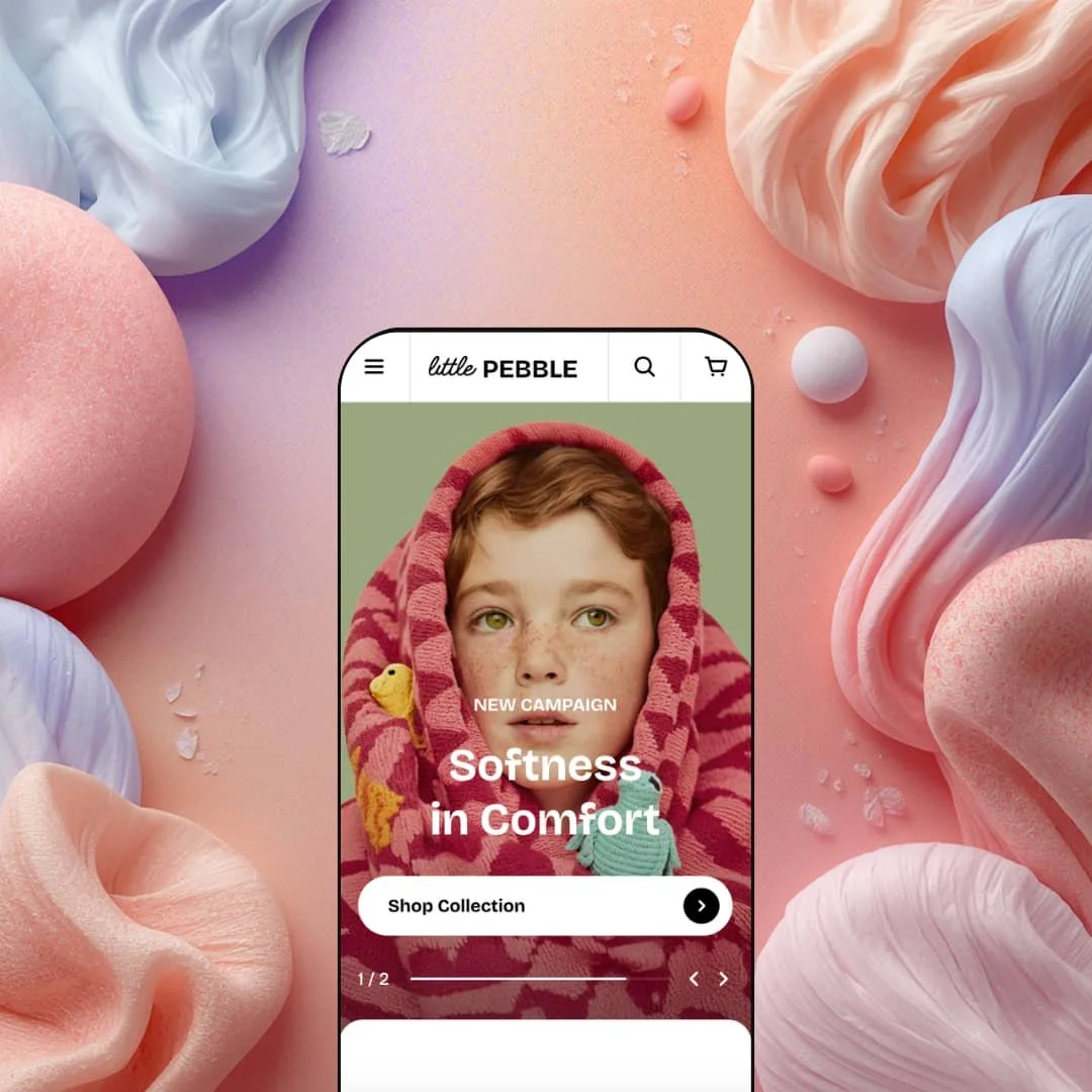
You land on the homepage and the first thing that hits is the color. Soft beige. Cream. A large serif typeface spelling out "Softness in Comfort" over a full-bleed lifestyle slideshow. The rounded UI elements, the gentle spacing, the pastel tones throughout every single section. It all says "premium children's brand" before you've read a word of copy. That cohesive warmth isn't just a color setting you could swap out; it's baked into how Pebble stages every image, every heading, every card. The whole thing feels like a single creative director touched every pixel.
Scroll past the hero and you'll hit a Boy's/Girl's collection tab toggle. Simple idea, well executed. Each tab shows a grid of collection cards with product counts next to them ("Sweaters 25," "Outerwear 18"), so parents get a quick sense of catalog depth before committing to a click. No page reload, no clutter. Just tap, browse, decide.
The real personality shows up in the "Outfit For" section. Four occasion-based collections, Move, Glow, Study, and Roam, are staged as a vertical accordion. Click a heading and it expands into a short description, a lifestyle image, and a "Shop Now" CTA. Below the accordion, full-width banner cards with overlay text double down on each collection's identity. It's the kind of organization that makes sense for brands selling by occasion rather than category, and it gives the homepage a narrative arc that most product grids never achieve.
Then there's the "New In" editorial section, which is where Pebble staging gets genuinely interesting. Large lifestyle images sit alongside product cards in a scrolling layout, and the copy is short and poetic. "Soft & playful, this sweet lilac." "Bright & airy, this light blue." It reads like a lookbook caption, not a product description. The rhythm alternates between full-width imagery and compact product tiles, and the effect is more fashion-magazine than online-store. That particular pacing and brand voice is very much a Pebble choice.
Product cards throughout this demo run dense with information. Variant swatches as colored circles, badges stacked on the thumbnail (New, Popular, Hot, On Sale), "Choose Options" for multi-variant items, straight "Add to Cart" for singles. In the outfit builder section, the demo goes a step further and stages material callouts like "4-Way Stretch" and "100% Cotton" right alongside the carousels. It's a lot of information per card, but for an audience that cares about fabric and fit, it works.
Where it stumbles
Here's the thing about Pebble: it doesn't know when to stop. The homepage stacks roughly twelve distinct sections between the hero and the footer. Collection tabs, a "New In" editorial scroller, the occasion-based accordion, tabbed product grids for Best Sellers and New Arrivals, a scrolling marquee, the full lookbook, a video section, a flash sale feature area, and the outfit builder. That's a lot of scrolling. If merchants populate every section, shoppers on slower connections or smaller screens may tap out long before they reach the lookbook or outfit builder, which happen to be two of the most compelling sections on the page. It's a real risk that the best content sits below the patience threshold.
The marquee strips don't help. Two of them cycle across the homepage: "Playful Kids Wow mix your style" on one, "Comfort Products / Organic Cotton / Safety for Skin" on the other. On a page that's already packed with badges, banners, and product callouts, these scrolling text bands add noise, not clarity. They're the one element that feels more like a template demo filler than a deliberate design choice.
Niche Suitability
-
Children's fashion brands, lifestyle boutiques, and curated apparel shops with strong editorial photography who want to sell outfits rather than individual products. The occasion-based collection staging (Move, Glow, Study, Roam) is particularly effective for brands that organize products by activity and want that structure front and center.
Not Ideal For
-
Merchants running large catalogs with minimal lifestyle imagery, stores where speed-to-checkout matters more than browsing depth, or anyone after a stripped-back, minimal aesthetic. If you don't have the photography to feed every section, Peblle’s editorial density will work against you.
-
Fashion-forward children's brands, lifestyle boutiques, and merchants with strong editorial content who want to sell through storytelling and outfit curation.
-
High-volume catalog sellers, merchants with limited photography, or anyone who wants a lean, fast-loading homepage with minimal content sections.
-
High. Pebble rewards content investment generously, but it requires curated photography, coordinated product groupings, and thoughtful section management to deliver on its editorial promise.
Final Recommendation
★ 7.0/10
Rating
-
Pebble goes well beyond baseline with built-in lookbooks, outfit builders, flash sale countdowns, and multiple gallery/collection layouts. The mega menu with promotional images and predictive search with product cards are both above average.
8
-
Deep control through the theme editor, but the sheer number of content-hungry sections means setup isn't quick. The lookbook and outfit builder require more planning than a standard product grid.
6
-
Navigation collapses into a clean slide-out drawer with nested dropdowns. Product cards, lookbook panels, and the outfit builder adapt well to single-column layouts. Scroll length is long on mobile, but sections load progressively without visible jank.
7
-
Animations are smooth and image-heavy sections use lazy loading. The homepage's lifestyle imagery adds weight to initial load, though. Perceived speed was good but not instant, particularly in image-dense areas.
7
-
Multiple collection templates, three product gallery layouts, and configurable homepage sections provide solid range. The single-preset limitation and strong editorial lean may feel constraining outside fashion or lifestyle niches.
7
-
👑 It's purpose-built for it. The Pebble demo stages a full children's boutique with Boy's/Girl's collection tabs, occasion-based browsing (Move, Glow, Study, Roam), and an outfit builder that turns product discovery into a guided, step-by-step experience. Any apparel or lifestyle brand with strong photography will feel right at home.
-
📱Navigation folds into a slide-out drawer with collapsible sub-menus, and product grids shift to a single-column layout. The lookbook and outfit builder sections scroll horizontally, keeping the interactive merchandising intact. During testing, tap targets were well sized and transitions stayed fluid throughout.
-
🎨 Typography, colors, button styles, and section layouts are all editable through the theme editor. The mega menu supports custom promotional banners, collection pages come in four layout variations (Minimal, With Collection Cards, With Banner, Full Wide Banner), and product pages offer three gallery configurations. The overall aesthetic leans editorial and warm, though, so brands after an ultra-minimal or industrial look will probably need custom CSS.
-
⚡Scroll animations are smooth, images lazy-load, and interactive elements like the search overlay, mega menu, and collection tab switcher respond without noticeable delay. The Pebble homepage is image-heavy by design, which adds to initial load weight, but nothing felt sluggish during hands-on testing.
-
👕 Product cards show color swatches as small circles and display "Choose Options" for multi-variant items, while single-variant products get a direct "Add to Cart" button. On the product page, variant selectors are clearly labeled with size and color options. The flash sale page (Light Jacket Grey) handled variant selection alongside the countdown timer without any conflict.
-
🔎 Breadcrumb navigation appears on product pages, URLs are clean, and standard meta fields are accessible through Shopify's editor. Pebble doesn't add proprietary SEO modules, but it doesn't block Shopify's built-in tools either. Blog support is included and functional through the Our Journal page in the Pebble demo.
-
💱 Country/region selection, currency switching, and language selection are Shopify Markets features configured in the Shopify admin, not built into the theme itself. Pebble's contribution is pre-translated theme UI strings (button labels, form text) for English, French, Italian, German, and Spanish. The Gentech demo displays a styled selector in the header, but the underlying functionality is platform-level.
-
⚙️ Pebble is built on Shopify's standard section architecture with theme blocks, so app blocks can be inserted into compatible sections. The built-in flash sale countdown, lookbook, and FAQ page also reduce the need for common third-party apps in those categories.
-
🛒 Shopify's "Try before you buy" policy applies. You can install and customize Pebble without paying until you publish. The live Pebble demo at pebble-little.myshopify.com is publicly accessible for browsing and hands-on testing.
This review is based on hands-on testing of the publicly available preset demos of the Pebble Shopify theme as of March 25, 2026. Theme features, preset availability, and performance can change with subsequent updates from the theme developer.