
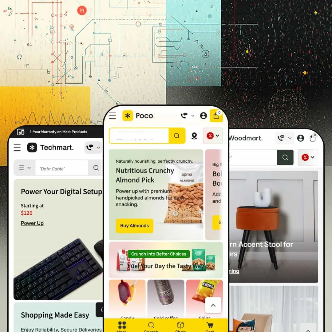
Poco doesn't ease you in. The moment any of its three demos load, you're hit with a wall of product cards, category icons, promotional banners, and urgency labels that make it clear this theme was built for one thing: getting items into carts fast. It ships with three presets covering grocery delivery, consumer electronics, and home furnishings, but underneath all three sits the same commerce-heavy engine designed for stores with big catalogs and impatient shoppers.
Pros.
〰️
Pros. 〰️
✚ Mega menu as a merchandising surface
Poco's mega menu goes well beyond a standard dropdown. Across all three presets, it supports embedded sub-collection links, editorial copy blocks, collection image grids, promotional banners, and even live product cards with pricing and sale badges. The navigation bar becomes an active merchandising layer where shoppers can browse, discover, and filter without loading a single new page. Most competing themes treat their menus as simple link lists; Poco treats its menu as a storefront within the storefront.
✚ Inline quantity controls and quick-add flows
Products without variants get a minus/plus quantity stepper right on the card, so shoppers can add multiple units from the collection grid without ever opening the product page. For items with variants, the cards display color swatches and option selectors (like the 128 GB / 256 GB / 512 GB storage choices visible in Techmart) that update the card image inline. Whether you're bulk-buying groceries or comparing phone colors, the theme meets you at the card level instead of forcing extra clicks.
✚ Cart drawer with free-shipping progress bar
Adding any item across any preset opens a slide-in cart drawer with a visual progress bar showing how much more you need to spend for free shipping. It's a simple upsell mechanic, but it runs site-wide and keeps shoppers on the page rather than routing them to a separate cart screen. For stores where average order value matters, that gentle nudge is always visible.
✚ Built-in store-pickup selector
Instead of reaching for a third-party app, merchants get a native pickup section listing multiple physical locations with addresses, operating hours, and direct Google Maps links. It keeps the checkout flow consistent and eliminates the styling mismatches that often come with bolting on external pickup solutions.
✚ Enhanced predictive search
The search overlay returns products, collections, articles, and quick links at the same time, with thumbnail previews and pricing visible before you even submit the query. In the Techmart preset, the search bar also includes a category-scoping dropdown so shoppers can narrow results by product type before hitting enter. The speed and depth of this search feel closer to a standalone site-search app than a built-in theme feature.
✚ Countdown timers and promotional popups
Select product cards support a live countdown timer (Days/Hour/Min/Sec) right beneath the price, creating deal urgency in the collection grid itself. The theme also ships with a built-in promotional popup carrying structured discount information, including percentage off, minimum order value, and terms. Both are native sections, not app add-ons, which means fewer plugins to maintain and fewer potential conflicts to troubleshoot.
Cons.
〰️
Cons. 〰️
🚫 Sold-out variant button behavior
When all variants of a product are unavailable, the add-to-cart button briefly flashes "Add" before flipping to "Sold." This was visible in both the Poco and Techmart presets. That momentary flash of an active-looking button is enough to trip up shoppers who click before the state fully resolves, and a clearer disabled state from the start would prevent the confusion entirely.
🚫 Demo-content bleed between presets
The Techmart electronics preset still runs the Poco preset's grocery-themed announcement bar and shares an identical promotional popup with the same $135 minimum order value. It's a staging issue, not a functional limitation, but it means merchants need a thorough content audit after picking their preset. The demo content doesn't fully differentiate across all three options, so expect a manual cleanup pass before you can go live.
🚫 Homepage density requires careful pruning
Both the Poco and Techmart presets stack a heavy load of homepage sections by default: hero slideshows, category icon strips, featured product grids, long-format promotional banners, additional collection grids, blog carousels, and multiple promo areas. If your catalog is big enough to fill all that, you're in great shape. If it isn't, you'll be spending real time in the theme editor removing sections so your store doesn't look oversized for its inventory.
-
Think digital supermarket circular. The Poco preset stages a full-service online grocery store with department-style navigation, delivery urgency cues, and a color palette of greens, oranges, and whites that immediately says "fresh market."
What works in this preset
The first thing that grabs you is a scrolling row of circular category icons just below the hero: Candy, Cold Coffee, Chips, Cheese, Chocolate, Vegetables, Fruits, and more. Each one links to a collection. It's the kind of visual shorthand you'd expect from a grocery delivery app, and it works. Shoppers with dozens of departments to browse get a one-glance map of the entire store instead of hunting through a text menu.
Beneath the prices on product cards, you'll spot short urgency labels tuned specifically for perishable goods. "Delivers in hours." "Grab it before gone." "Delivers in 1-2 days." These aren't generic sale badges. They're designed for a mindset where delivery timing matters more than specs or lifestyle photography, and they hit differently than a standard "Sale" tag when you're shopping for strawberries or ice cream.
This homepage doesn't believe in whitespace. A hero slideshow rolls into the category strip, then a featured products grid, a long-format promo banner, another collection grid, a blog carousel, and several more promotional sections. It's dense. For a grocery store with a deep catalog, that density works. The page reads like a printed weekly circular, packed with offers and categories, which is exactly what repeat grocery shoppers are trained to scan.
The store-pickup panel is surfaced prominently here, listing four physical locations (Main Store - US Store, Paris Store, Sandy Spring Outlet, Dunwoody) with hours and Google Maps links. While this is a theme-wide capability, the Poco preset makes it central to the shopping flow rather than tucking it away in the footer. For a grocery brand with physical locations, that visibility matters.
Hover over "Dairy" or "Snacks" in the navigation and you won't get a simple dropdown. You'll get what amounts to a mini landing page: sub-collection links organized by department, a short editorial blurb ("Dairy Highlights"), a scrollable row of collection images, and a promotional banner. For a grocery store where shoppers need to drill into Cheese Slices, Butter Blocks, or Frozen Desserts without loading a new page, this mega menu staging earns its screen real estate.
Where it stumbles
If you don't have dozens of collections to fill it, this homepage is going to look like a half-empty warehouse. The sheer number of stacked sections works for a store with 50+ products across many categories, but a merchant with a smaller range would need to spend serious time in the editor pruning sections just to avoid looking sparse in the wrong places.
The announcement marquee loops "Buy 2 Get 1 FREE on all Indian Sweets - Limited Time!" about ten times in a row. If you've only got one message to share, the marquee just repeats it endlessly with no visual separator between passes. It looks sloppy.
Every product card shows a "Choose a store to see availability" label, even if the shopper hasn't touched the pickup selector. For merchants who don't use the pickup feature at all, that label becomes visual noise on every single card in the grid and would need to be switched off manually.
-
Same engine, different skin. Techmart takes Poco's quick-commerce bones and dresses them for consumer electronics, swapping the fresh-market greens for darker backgrounds, blue accents, and a showroom aesthetic that feels closer to a Best Buy landing page than a farmers' market.
What works in this preset
Above the fold, you get three entry points instead of one. The hero pairs a large rotating banner on the left (smartphones, earbuds, appliances) with two smaller static cards on the right, each pinned to a "Starting at" price and a collection link. Those side cards function as permanent promotional anchors, and the price-point framing signals affordability instantly. For an electronics store where shoppers usually filter by budget before brand, that's a smart layout choice.
The mega menu here does something genuinely unusual. Under the "Hot Devices" tab, you'll find actual product cards sitting right inside the navigation dropdown, complete with images, prices, and sale badges. You can browse featured products without the page changing. It turns the nav bar into a shopping surface, and while the mega menu capability is shared across the theme, Techmart's decision to load it with full product cards rather than just collection links creates a noticeably more aggressive merchandising feel.
Inside the "Appliances" dropdown, a vertical sidebar lists curated links with benefit-driven labels: "Smart Phones That Power Life," "Fast Chargers & Power Boosts," "Wireless Earbuds & Sound Bites." It reads like an editorial recommendation list rather than a generic category tree, and it steers shoppers toward product groups using language that sells rather than just organizes.
There's a built-in "Super Discount For Your First Purchase" section that promotes account creation with a clear deal: "Min spend $60. Max reward $20," linked directly to the login page. It's a native conversion tool for first-time visitors, and it doesn't require a popup app or loyalty plugin to work.
The newsletter signup is staged as a full-width section with a lifestyle image and the headline "Stay Ahead Of The Aisle!" rather than a floating popup. For electronics shoppers who tend to find popups annoying, this embedded approach feels less intrusive while still capturing emails.
Where it stumbles
The announcement bar is still running grocery copy. "Buy 2 Get 1 FREE on all Indian Sweets - Limited Time!" shows up on an electronics store, which is obviously a demo oversight. But it reveals that the marquee text doesn't automatically adapt when you switch presets. Merchants will need to clean that up manually on day one.
Same story with the promotional popup. It's identical to the Poco preset, down to the "Extra 20% Off" overlay and the $135 minimum order value. Both the popup and the announcement bar need a content pass before launch, which is a small but avoidable onboarding chore.
In the "Best-Selling Tech Deals" grid, hovering between tall smartphone images and squarer accessory shots occasionally produces a brief visual jump. It's a layout shift caused by mismatched aspect ratios between primary and secondary product images, and it's noticeable enough to feel unpolished when browsing a mixed-category grid.
-
After the relentless density of Poco and Techmart, loading Woodmart feels like walking into a well-lit showroom. The same theme engine is running underneath, but this preset dials everything back: warm neutrals, cream tones, muted earth colors, and product cards that actually breathe.
What works in this preset
The product cards here are noticeably cleaner than the other two presets. Images are larger, badges are fewer, and each card clearly displays the vendor name (Furnexa, Decoza, Woodora, Modrest) near the title. For a furniture store carrying multiple brands, that vendor visibility matters. Shoppers can spot maker provenance at a glance without clicking through, and the generous spacing lets the product photography do the heavy lifting.
Collections are organized the way furniture shoppers actually think: by room and product type. Nightstands, Accent Chairs, Beds, Bookcases, Cabinets, Coffee Tables, Dining Tables, Bar & Counter Stools. Nobody shopping for furniture thinks "I need SKU-4521." They think "I need something for the bedroom." This room-based structure matches that mental model and encourages cross-category browsing that a flat alphabetical list wouldn't.
Navigation in this preset demo is presented as a simplified structure: Shop, Rooms, New Arrivals, Collections, and Features. The deep mega-menu tiers from Poco and Techmart are available but not emphasized here, and the result is less cognitive load. For a furniture store where visitors browse and compare rather than speed-shop, that restraint is the right call.
The blog integration positions editorial content like "How to Design a Living Room That Feels Effortlessly Elegant" within both search results and the homepage layout. For a furniture brand, this is valuable. Purchase decisions involve research and inspiration, not impulse, and surfacing design advice alongside products frames the store as an authority rather than just a catalog.
Where it stumbles
The homepage feels noticeably lighter than the other two presets. That spaciousness suits the aesthetic, but merchants with larger furniture catalogs may find the out-of-box page a bit thin. You'll likely need to add custom sections in the theme editor to fill the page, especially if you're carrying hundreds of products across multiple rooms.
Product card hover interactions here are more subdued. The inline quantity steppers and countdown timers visible in Poco and Techmart aren't emphasized in this demo's staging. The cards favor clean imagery over conversion triggers. That's a deliberate design choice, and those features are available through theme settings. But merchants who want aggressive add-to-cart cues at the card level should know they'll need to turn them on themselves.
Niche Suitability
Not Ideal For
Final Recommendation
-
Poco is built for grocery delivery stores, food and beverage brands, convenience retailers, electronics shops, and home goods stores that need deep navigation, fast cart flows, and multi-location support. If you've got a medium-to-large catalog and you care more about speed-to-checkout than editorial storytelling, this is your theme.
-
Brands selling a single hero product, luxury fashion, or artisanal goods that depend on whitespace, storytelling, and a slow-reveal shopping experience will find Poco's density and commerce-first layout working against them. It's not trying to be beautiful. It's trying to be fast.
-
Medium. The three presets give you a strong starting point for grocery, electronics, or furniture, but the homepage density, mega menu content, and demo copy all need hands-on configuration to match your actual catalog size. Plan on a dedicated setup session rather than a quick install-and-publish.
★ 7.4/10
Rating
-
Rich built-in feature set including store-pickup selector, mega menu with product cards, predictive search, countdown timers, inline quantity controls, and four distinct product page layouts (Two Column Gallery, Thumbnail Bottom Carousel, Thumbnail Top/Bottom Carousel, Right Media Position). You get a lot of capability without reaching for apps.
8
-
The sheer number of configurable sections, from mega menu content to promo banners to pickup locations, means a steeper learning curve than simpler themes. Once you've got the system mapped out, the editor is logical and consistent.
7
-
Navigation collapses into a functional drawer, product cards stack cleanly, and the cart drawer stays accessible. The mega menu compresses reasonably, though the Poco preset's density can mean a lot of scrolling on smaller screens.
7
-
Pages load at an acceptable pace given the volume of images and sections. Hero slideshows and mega menu panels render without noticeable lag, and the predictive search feels snappy. Merchants with image-heavy homepages should optimize their media for best results.
7
-
Three distinct presets covering grocery, electronics, and furniture demonstrate genuine range. Four product page layouts, configurable mega menu content, and section-based homepage building offer solid customization. Typography and color choices are fully in the merchant's hands.
8
FAQ
〰️
FAQ 〰️
-
👑 It's one of the strongest options out there for that niche. The Poco preset demos department-style category icons, inline quantity controls on product cards, and a store-pickup location panel with Google Maps links. The whole experience mirrors what shoppers expect from a modern grocery delivery app.
-
📱Yes. Navigation collapses into a slide-out drawer, product grids reflow to single or double columns, and the cart drawer stays fully functional. In the Techmart preset, variant swatches for color and storage remained tappable and responsive on narrower viewports during testing.
-
🎨 You've got full control over colors, typography, and logo placement through the Shopify theme editor. The Woodmart preset proves how far you can take it: the same engine that runs a vibrant grocery store can produce a restrained, editorial furniture showroom, all from the same settings panel.
-
⚡ Interactive elements like the predictive search, cart drawer, and mega menu dropdowns respond without perceivable delay. The Poco preset's image-heavy homepage loads smoothly, though merchants with very large hero slideshows should optimize their images to keep things fluid.
-
👕 Yes, and it goes further than most themes at this price point. The Techmart preset displays color swatches and storage options directly on product cards in the collection grid. Selecting a swatch updates the card image inline. Products with no variants get a direct quantity stepper instead.
-
🔎 The theme supports standard Shopify SEO fields including meta titles, descriptions, and alt text. Breadcrumbs appear on product and collection pages across all presets, and the blog section supports content marketing. There are no proprietary SEO tools beyond what Shopify provides natively.
-
💱 The actual language and currency switching is handled by Shopify Markets, not the theme itself. What Poco controls is where and how those selectors appear in the layout. Across all three presets, the theme positions clean, styled locale and currency dropdowns in the header and footer regions, keeping them accessible without cluttering the navigation. The official feature list also confirms EU translations for English, French, Italian, German, and Spanish. On the theme side, RTL CSS layout support is built in for right-to-left languages, which is a genuine theme-level feature rather than a platform default.
-
⚙️ Poco runs on Shopify's Online Store 2.0 architecture, so it supports app blocks and standard app embeds. The theme's own feature set, including countdown timers, product badges, stock counters, and quick view, covers a lot of ground that would otherwise require third-party apps.
-
🛒 Yes. Shopify's "Try theme" option lets you install Poco and customize it in your store editor without paying. You only pay the $220 USD one-time fee when you're ready to publish. All three preset demos (Poco, Techmart, Woodmart) are also publicly accessible if you want to browse them live before committing.
This review is based on hands-on testing of the publicly available preset demos of the Poco Shopify theme as of March 21, 2026. Theme features, preset availability, and performance can change with subsequent updates from the theme developer.