
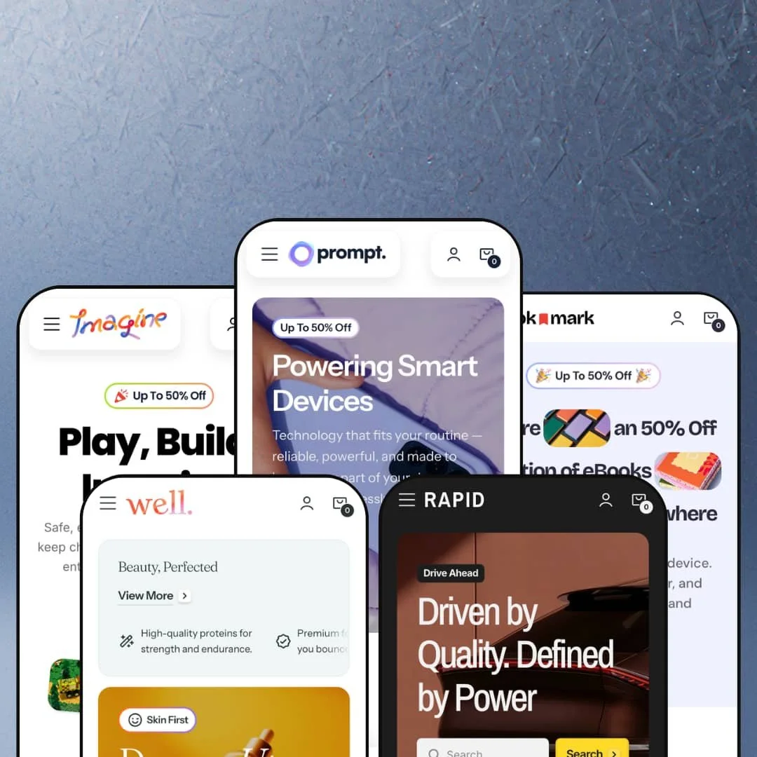
Prompt costs $320 and ships with more built-in sales tools than most merchants will ever configure. That's both the pitch and the problem. This theme from Noord packs hotspot sections, a cart drawer with cross-sell recommendations, in-menu promo banners, Quick View, dark mode switching, and a featured product module with full variant selection right on the homepage. No apps needed. Five presets cover everything from skincare to motor oil, and they don't just reskin the colors — they genuinely rethink how the homepage is staged. But with that depth comes setup time, and some of the advertised features don't show up in the demos at all. We tested what we could access to find out whether the substance matches the ambition
Pros.
〰️
Pros. 〰️
Adaptable mega menu system
The Prompt theme's greatest asset is its mega menu system, which adapts from text-link grids with promotional banners (Prompt, Bookmark, Well, Rapid) to a full visual product catalog (Imagine), all within the same underlying architecture. Each configuration supports dual promotional image banners that can drive traffic to featured collections or products, and the menu accommodates category-grouped product links with sub-collection headings. This level of navigation flexibility is uncommon at the $320 price point and gives merchants a genuine range of storefront structures without switching themes.
Conversion-focused cart drawer
The slide-out cart drawer across all presets includes cross-sell product recommendations ("You May Also Like"), a free-shipping progress bar with a celebratory icon, order note functionality, and a "Start Shopping" CTA for empty carts. These elements work together to reduce cart abandonment by keeping shoppers engaged even when the cart is empty and by surfacing complementary products at the moment buying intent is highest. This implementation rivals dedicated upsell apps that merchants would otherwise need to install separately.
Rich product page template
Across all presets, the product page supports slider and grid gallery layouts with thumbnail navigation, expandable accordion tabs for description, features, reviews, store testimonials, and support information, a linked blog article embed, variant selectors with colour swatches and live image swaps, a specialist contact link with a staff photo, quantity steppers, and inline newsletter forms. The accordion structure keeps the buying area uncluttered while providing substantial depth for merchants who need to communicate complex product details. Product badges (Bestseller, New, Sale) surface as small labels on product cards in both collection grids and homepage sections, providing at-a-glance merchandising cues across the entire storefront.
Interactive homepage sections
The theme engine supports a deep library of homepage sections including interactive hotspots with clickable product pins, a featured product module with full variant selection and add-to-cart, a testimonial carousel with linked products, an FAQ accordion, a scrolling icon marquee banner, and second-image-on-hover in product grids. These sections were most extensively staged in the Well preset, but they represent theme-level capabilities available to any preset. The hotspot section alone tested successfully with six product pins, each correctly opening a product overlay with price and Quick View access.
Dark/light mode and Site Settings panel
The dark/light mode toggle, confirmed in four of five presets, lets shoppers choose their preferred visual environment without any merchant configuration. The toggle lives inside a Site Settings panel that provides a clean, unified drawer for store preferences. This dual-mode capability effectively gives merchants two visual identities per preset and accommodates shoppers who browse in low-light environments or simply prefer dark interfaces.
Cons.
〰️
Cons. 〰️
Demo content typos across multiple presets
Typos like "Retfunds," "Fhipping," and "Vew More" appear in footer policy links across multiple presets. While these are placeholder text issues and not theme bugs, they're among the first things a prospective buyer notices when evaluating a $320 theme. Multiple typos in the same preset (notably Imagine, which has both "Retfunds" and "Fhipping") compound the unprofessional impression and may cause merchants to question the developer's attention to detail. This is a polish issue, not a functional flaw, but it's worth noting for theme evaluation purposes.
Homepage section density in content-heavy presets
The Well preset's homepage stages roughly 14 distinct sections, and merchants who install it as their starting point will need to invest meaningful time disabling sections to match their brand's content strategy. The demo communicates "everything the theme can do" rather than "here's a focused storefront," which may overwhelm merchants who prefer a curated, above-the-fold conversion layout. The theme editor presumably makes disabling sections straightforward, but the demo itself doesn't model restraint.
-
The Prompt preset stages a fictional "Nova" smartphone and gadget brand through a clean, minimal-dark aesthetic tuned for consumer electronics. Its mega menu organizes products under Smartphones, Smartwatches, and Headphones with two promotional image banners alongside the navigation links. The product page for the Nova R20 showcases a slider gallery with thumbnail navigation, colour swatches that swap product imagery, storage variant selectors, and an expandable "Trade-in" information drawer complete with a step-by-step breakdown and a link to an "Ask Specialist" contact page.
What works in this preset
In this preset demo, the electronics niche is staged with a restrained dark colour palette that makes product imagery pop against muted backgrounds. The typography stays clean and technical, avoiding decorative flourishes in favour of sharp sans-serif headings. This gives the entire storefront a premium consumer-tech feel that suits smartphones, smartwatches, and headphones without any customization.
The product page stages a "Trade-in" expandable drawer that walks shoppers through a four-step trade-in program, complete with credit estimates ($40-$630), a specialist photo, and an "Ask Specialist" link. It's a compelling demonstration of how the theme's accordion content blocks can be configured beyond simple product descriptions, turning the product page into a mini-consultation experience tailored to high-value electronics purchasing.
The collection page for Smartphones presents the product grid with an icon-accented heading and a category banner image alongside the collection title and description. Each product card surfaces badges (Bestseller, New, Sale) and a Quick View trigger on hover, and the grid flows into a promotional banner and trust badges below. This staging presents the collection template as a self-contained shopping destination rather than a simple product list.
Where it stumbles
In this preset demo, the collection page positions its promotional banner below the entire product grid. Shoppers who find what they need in the first few rows may never scroll far enough to see the banner, which limits its effectiveness as a cross-selling or brand-building tool. Placing it mid-grid or above the fold would make it a stronger conversion driver.
The Prompt preset's homepage was inaccessible during testing due to rate-limiting on the demo store, so homepage-specific sections could not be evaluated. Product and collection pages loaded correctly, but merchants evaluating the demo may need to visit at different times to see the full homepage experience.
-
Bookmark reimagines the Prompt framework for a publishing and stationery retailer, staging books, notebooks, and writing accessories with a warm, literary tone. The mega menu splits into Books, Notebooks, and Stationery with two promotional banners. Product pages include a size variant selector (A5, A4, Pocket) and a quantity stepper, giving the purchasing flow a distinctly stationery-friendly feel.
What works in this preset
In this preset demo, the product page for the Night Garden Lined Notebook prominently stages a quantity stepper alongside the size variant selector, which makes the add-to-cart flow feel purpose-built for stationery shoppers who routinely buy multiples. The quantity input sits directly beside the Add to Cart button, making bulk purchasing intuitive rather than requiring shoppers to edit quantities after adding to cart. This small layout decision reflects how a stationery retailer thinks about their customer's typical buying behaviour.
The product page's "Features" section in this preset is staged with illustrated category-specific icons (Interactive Reading Experience, Smart Bookmarking & Highlights, Device Format Options) that give the layout an editorial, magazine-style quality. Each benefit is paired with a small custom illustration and a short descriptive paragraph, creating a visual rhythm that feels at home in a bookshop context rather than a generic product listing. The icons themselves differ from the product page feature blocks in other presets, which tend to use lifestyle photography.
The "Better Prices in Bulk" expandable drawer on the product page walks shoppers through a four-step volume pricing process and includes a circular staff photo with an "Ask Specialist" link. For a stationery brand targeting schools, offices, or gift buyers, this bulk-pricing callout is a compelling demonstration of how the theme's accordion sections can be tailored to the merchant's sales model.
The literary styling extends to the mega menu banners, which showcase book covers and notebook designs in the promotional slots. The overall colour palette leans warm and neutral, with soft shadows and rounded elements that make the storefront feel inviting rather than sterile. This tonal choice differentiates Bookmark from the sharper, darker Prompt and Rapid presets.
Where it stumbles
In this preset demo, the product page gallery for the Night Garden Lined Notebook shows only two images. For a notebook product, showing lined interior pages, binding detail, or a scale reference alongside a hand or pen would add buying confidence. The theme's gallery supports multiple images, but this demo staging undersells the capability and may leave prospective merchants wondering how rich the gallery can actually get.
-
Imagine stages the Prompt theme for a toy and board game retailer, pushing the mega menu to its most ambitious configuration. Instead of category text links with side banners, the Shop dropdown displays a full visual product grid showing every single product with its thumbnail image, plus collection shortcut tiles and a promotional banner. It's the closest any preset comes to replicating a "shop-all" browsing experience inside the navigation itself.
What works in this preset
In this preset demo, the mega menu is staged as a full-width visual product catalog rather than a traditional text-link dropdown. Every product appears as a clickable card with its thumbnail image and name, alongside collection shortcut tiles (New In, Sale, Accessories) that each carry their own thumbnail images and a promotional banner. This transforms the navigation into a mini-storefront and makes browsing the entire catalog possible without ever visiting a collection page. For a toy shop with 15 to 50 products, this approach replaces the need for a dedicated "shop all" page entirely, and it demonstrates a level of mega menu flexibility that most competing themes don't offer in their demo staging.
The newsletter section in this preset uses a three-image mosaic layout, stacking three product shots alongside the subscription form. This adds visual weight and merchandising context that the simpler single-image newsletter sections in other presets don't match, making the email capture area feel like a curated editorial moment rather than a generic signup block.
The product page for the Centipede Arcade Builder stages colour variant swatches (Yellow vs. Orange) that instantly update the product imagery, alongside "Features" content blocks using a mix of full-width and half-width lifestyle images. Three distinct benefit cards (Smart Play Starts Here, Build and Experiment, Games for Learning) create a magazine-style layout below the main product details, reinforcing the playful, educational tone of the entire preset.
Where it stumbles
In this preset demo, the visual mega menu's information density may overwhelm on smaller laptop screens. With 18 product cards, 3 collection tiles, a promotional banner, and a sale callout all inside a single dropdown, the navigation requires significant vertical scrolling and could feel cluttered for first-time visitors who expect a simpler category structure. This is a direct consequence of the ambitious staging choice, and merchants with larger catalogs would need to reconfigure the menu to a more traditional layout.
In this preset demo, blog content is not prominently surfaced in the primary navigation flow. The blog exists and is accessible through the Features submenu, but it doesn't appear directly on product pages or as a homepage section the way other presets stage it. Merchants who rely on content marketing to drive organic traffic would want to enable blog sections during setup.
-
Well is the most content-rich preset of the five, staging a beauty and skincare brand with a soft, editorial wellness aesthetic. Its homepage packs in a hero section, popular products grid, collection image tiles, an interactive hotspots section, a full-width image slider with category tabs, an about-us teaser, benefit cards, a featured product module with variant selection, a testimonial carousel, blog posts, a scrolling icon banner, an FAQ accordion, a newsletter with three images, and trust badges. It's a masterclass in demonstrating how many homepage sections the Prompt theme engine supports.
What works in this preset
In this preset demo, the homepage stages roughly 14 distinct sections that collectively tell a complete brand story from first hero to final trust badge. The section sequence flows from product discovery (hero, popular products grid, collection tiles) through education (benefit cards, hotspots, full-width slider with category tabs) to social proof (testimonials, blog posts) and conversion capture (newsletter, FAQ). This editorial density gives beauty and wellness merchants a ready-made content marketing homepage that would take significant effort to build from scratch with a less section-rich theme.
The full-width image slider in this preset maps category tabs (Protect / Glow / Restore) to lifestyle images with overlay text and collection-linked CTAs. The tab indicators (Daily Defense / Bright Skin / Night Repair) provide quick access without waiting for auto-rotation, creating a branded content experience that doubles as a collection navigator. This staging is particularly effective for skincare brands that organize products by concern or routine step.
The scrolling icon banner displays a continuous horizontal marquee of illustrated badges (No excuses, Stronger every day, Push your limits, and six more), each with a small custom icon. This adds kinetic energy to the page and serves as a brand-storytelling element that breaks up the static content sections above and below it. The marquee runs in two rows scrolling in opposite directions, which gives it a distinctive visual identity compared to standard trust-badge strips.
The product grid in this preset stages second-image-on-hover across multiple cards. Hovering over a product card in the "Your Daily Essentials" section swaps the primary image for a secondary angle showing texture, packaging, or usage context. This gives shoppers a quick preview without clicking through and encourages browsing across the grid.
Where it stumbles
In this preset demo, the homepage section density may slow scanning for shoppers who prefer a focused, above-the-fold conversion layout. With roughly 14 distinct sections, the page requires sustained scrolling. Merchants who install Well as their starting point will need to invest time in the theme editor disabling sections to match their brand's content strategy, and the demo doesn't communicate a "less is more" option.
The hotspot product card styling differs slightly from the main product grid cards in this preset demo. The hotspot popover shows the product image, title, and price but uses a slightly different card layout than the standard grid, which creates a mild visual inconsistency when shoppers encounter both elements on the same page. This is a small styling friction that's noticeable when the grid cards and hotspot cards appear in close proximity.
-
Rapid stages the Prompt theme for an automotive aftermarket brand, wrapping motor oils, cleaners, and lubricants in a bold, industrial dark-mode aesthetic. The homepage opens with a hero section containing an embedded search bar directly inside the banner, which is a staging choice not seen in other presets. Below it, collection cards display with full descriptions and "View Collection" CTAs, and promotional banner blocks alternate between full-width and two-column layouts.
What works in this preset
In this preset demo, the hero section places a search input directly inside the main banner alongside the headline. This staging choice encourages product discovery from the first moment a visitor lands on the page, which is particularly effective for automotive care stores where shoppers often arrive with a specific product in mind (a particular oil grade, a wheel cleaner, a chain lubricant). None of the other presets surface search this prominently, making it a defining usability decision for Rapid's storefront flow.
The collection cards in this preset go beyond simple image-and-title tiles. Each collection (Motor Oils, Protective Coats, Cleaning, Lubricants, Sale) includes a multi-sentence description and a dedicated CTA button, which helps shoppers understand what each category contains before clicking through. For an automotive care store where product categories may be unfamiliar to casual buyers, this descriptive approach reduces guesswork and supports informed browsing.
The promotional banner grid in this preset alternates between full-width and half-width blocks with distinct CTAs (View Collection, See Details, Find Yours, View More), creating a dynamic visual rhythm on the homepage that prevents the monotony of identically sized sections. This layout cadence keeps the homepage feeling editorial rather than template-driven, even with a limited number of product categories.
The bold, industrial dark-mode aesthetic is committed throughout the entire preset, from the dark header and hero through the collection cards and footer. The colour palette leans heavily into charcoal, black, and high-contrast white text, creating a masculine, garage-workshop atmosphere that suits automotive products. This is one of the more tonally cohesive presets in the collection.
Where it stumbles
In this preset demo, the homepage hero text ("Driven by Quality. Defined by Power") overlaps the search bar area at certain viewport widths, creating a visual clash between the heading and the input field. The search bar itself remains functional, but the overlapping typography reduces readability and makes the hero section feel crowded rather than commanding at those specific sizes.
Niche Suitability
Not Ideal For
Final Recommendation
-
Merchants running electronics, beauty, toy, book, or automotive stores who want a single theme flexible enough to serve multiple brand aesthetics will find Prompt's five presets demonstrate real range. The theme's broad section library supports content-heavy storefronts, and the five distinct demo niches prove it can adapt to very different brand identities without feeling forced.
-
Stores with extremely large catalogs (500+ products) that need advanced faceted filtering beyond what Shopify's native filters provide may outgrow the theme's discovery tools. Merchants who need subscription or membership flows won't find those demonstrated here, though Shopify app integrations would fill that gap.
-
Medium. The theme ships with rich defaults and five well-staged presets, but merchants will need to replace demo content carefully (especially given the typos) and may want to trim homepage sections to match their brand's content strategy.
★ 7.8/10
Rating
-
The theme covers an impressive feature set including Quick View, hotspots, mega menu with promotional banners, slide-out cart with cross-sells, colour swatches, FAQ accordion, dark/light mode, and blog integration. The product page template is among the most section-rich available at this price point.
8
-
Five distinct presets give merchants strong starting points, but the sheer number of homepage sections (especially in Well) means new users will spend time learning which blocks to keep and which to disable. The navigation menu structure is intuitive once configured.
7
-
All pages rendered responsively during testing. The mega menu collapses into a mobile drawer, and the cart drawer functions consistently. No mobile-specific breakage was observed, though the dense Well homepage would require significant scrolling on smaller screens.
7
-
Pages loaded with perceived fluidity. Interactive elements (Quick View overlays, accordion expansions, cart drawer animations, image hover swaps) responded without noticeable delay. No jank or layout shifting was observed during testing.
8
-
Five presets spanning electronics, books, toys, beauty, and automotive demonstrate exceptional range. The dark/light mode toggle, multiple gallery layouts (slider vs. grid), configurable mega menu styles, and section-rich homepage architecture give merchants deep customization latitude.
9
-
👑 Prompt works well across a wide range of industries. The five presets stage electronics, books, skincare, toys, and automotive care, and each feels purpose-built. The Imagine preset's visual mega menu is particularly effective for toy and hobby shops with catalogs under 50 products.
-
📱Every page tested collapsed responsively into mobile-appropriate layouts. The mega menu converts to a slide-in drawer, Quick View overlays remain functional, and the cart drawer works consistently. The Well preset's long homepage does require sustained scrolling on phones, but nothing broke.
-
🎨 Highly customizable. The dark/light mode toggle alone opens two visual identities per preset. Colour swatches, typography hierarchy (with italic accent styling visible in headings across Well), promotional mega menu banners, and configurable homepage sections provide substantial creative control.
-
⚡Interactive elements responded with no perceptible lag during testing. Image hover swaps on the Well preset's product grid, Quick View modal opens across Rapid, and accordion tab expansions on the Prompt preset's product page all felt immediate. No layout shifting or stalled animations were observed.
-
👕 Yes. Colour swatches with live image swaps were tested on Prompt (Blue/Purple) and Imagine (Yellow/Orange). Size and fragrance selectors worked correctly on Well's featured product module (100ml/150ml/200ml, Citrus/Floral/Rose). The Bookmark preset demonstrated a size variant (A5/A4/Pocket) with no issues.
-
🔎 The theme supports standard Shopify SEO infrastructure: clean URL structures, proper heading hierarchy (H1 on product titles, H2 on section headings), breadcrumb navigation on product and collection pages, and alt text on images. Blog integration across all presets adds content marketing capability for organic search.
-
💱 The theme's official feature list includes EU translations for English, French, Italian, German, and Spanish, but the demo presets display all content in English regardless of which language is selected. The language and currency selectors visible in the demos are UI components that showcase how the switcher looks; the actual language switching, currency conversion, and country/region options are standard Shopify Markets functionality configured at the platform level. Merchants planning to sell internationally should test the locale files after installing the theme in their own store.
-
⚙️ The theme follows Shopify's standard app integration architecture. No compatibility issues were observed in the demo, and the product page's accordion tab structure provides natural insertion points for review apps, size chart apps, and other product-level widgets.
-
🛒 Yes. The Shopify Theme Store offers a "Try theme" option that lets merchants install and customize Prompt in their own store without paying until they publish. All five preset demos (Prompt, Bookmark, Imagine, Well, Rapid) are publicly accessible for live evaluation.
This review is based on hands-on testing of the publicly available preset demos of the Prompt Shopify theme as of March 25, 2026. Theme features, preset availability, and performance can change with subsequent updates from the theme developer.