
Seventh costs $420 and it doesn't apologize for it. This is a Shopify theme built for brands that already know what they look like, where the photography is strong, the margins are healthy, and the homepage needs to feel more like a fashion editorial than a product catalog. Built by Krown Themes, it ships with a modular layout system, a mega menu that doubles as a merchandising surface, and enough section types to rebuild your storefront every season without switching themes. That flexibility cuts both ways. If you don't have the visuals to fill these layouts, Seventh will expose that fast.
Pros.
〰️
Pros. 〰️
A modular layout system with real depth
Here's what separates Seventh from most premium themes: it doesn't give you one homepage and call it a day. You get three homepage configurations, three collection page formats, three product page gallery styles, and a deep library of content sections covering scrolling text, animated headings, media galleries, image comparisons, multicolumn layouts, testimonials, and lookbooks. That means you can redesign your storefront for a seasonal campaign, a product launch, or a full rebrand without ever switching themes. The underlying system is built on cards, theme blocks, and sections that scale from classic grids to asymmetric, editorial-forward compositions.
A mega menu that actually sells
Most theme mega menus are functional. Seventh's is a merchandising channel. It supports multi-column category links alongside image-backed promotional tiles with badges and dedicated CTAs. Seasonal campaigns, flash sales, new collection announcements: they all get prime real estate inside the navigation dropdown. For brands that run frequent promotions, this reduces the pressure on homepage banners and gives shoppers one more reason to engage with the menu rather than skipping past it.
A slide-out cart that keeps shoppers in the flow
The cart drawer isn't just a line-item list with a checkout button. It includes a collapsible discount code field with an apply button and a dedicated order instructions text area. That's a small structural choice, but it matters. Shoppers applying a coupon don't need to navigate to a separate page or hunt for an input field at checkout. Everything consolidates into one panel, and that kind of friction reduction adds up over thousands of transactions.
Search that works as a discovery tool
Seventh's search doesn't just help people find what they already know they want. It opens a full-panel sidebar with curated bestseller suggestions and popular search tags linked to collections, complete with product thumbnails, vendor names, prices, and sale badges. Before a shopper types anything, they're already browsing. For stores with deep catalogs where browsing fatigue is a real problem, this turns a utility interaction into a merchandising moment.
Storytelling tools you'd normally pay extra for
The Shop the Look hotspot system lets you pin clickable product links to editorial lifestyle images, so one photograph can drive traffic to multiple product pages. The before/after image comparison slider gives merchants a visual way to demonstrate material quality, color accuracy, or styling differences. Both features typically require third-party app subscriptions on other themes. Having them built in keeps the store lean and saves on recurring costs.
Product cards that do the heavy lifting
Color swatch thumbnails that swap the card image on click. Calculated sale percentage badges. Image rollover on hover. Star ratings with review counts. All of this shows up at the grid level, which means shoppers can browse variants, see social proof, and spot deals before they ever commit to visiting a product page. It's the kind of card-level merchandising that reduces bounce and lifts click-through rates.
Cons.
〰️
Cons. 〰️
The price tag demands serious content to match
$420 puts Seventh at the higher end of the Shopify theme market. For established brands with budgets for professional photography and a clear visual identity, that's easy to justify. For merchants launching their first store or testing a concept, it's a steep starting point, especially before you factor in app subscriptions and customisation time. And here's the catch: the editorial layout paradigm, with its oversized hero blocks, full-bleed galleries, and lookbook hotspots, is built to showcase strong imagery. Feed it mediocre photos and the layouts won't compensate. They'll amplify the problem. The theme's impact is only as strong as what you put into it.
The setup curve is steeper than average
Flexibility has a cost, and it's measured in decision fatigue. Three homepage styles, three collection formats, three product gallery layouts, over a dozen content section types. If you're comfortable in the Shopify editor and you already know what your brand looks like, you'll move fast. But if you're a beginner without a clear direction, the sheer number of options can stall you before you've published a single page. More opinionated themes get you live faster.
The mega menu can crowd smaller screens
That rich, image-heavy mega menu is a strength on a 27-inch monitor. On a 13-inch laptop, the panel fills a large chunk of the viewport, and the density can feel cramped. Merchants whose audiences skew toward compact laptops should test the menu's usability at those dimensions before committing.
Content pages blend together
The About Us, Blog, and Lookbook pages all share the same generous-spacing, large-image editorial formula. Cohesion is nice, but if you want each page to feel distinct, you'll need to invest time in the theme editor adjusting section ordering, spacing, and content density. Out of the box, they're more uniform than some brands might prefer.
-
Seventh's single preset stages a refined editorial fashion concept for a fictional brand called MKDT Studio, selling premium clothing and accessories for men and women. The colour palette runs through muted earth tones, off-whites, and dark navy, and it holds that luxury tone consistently from the hero sections all the way down to the product grids and footer.
What works in this preset
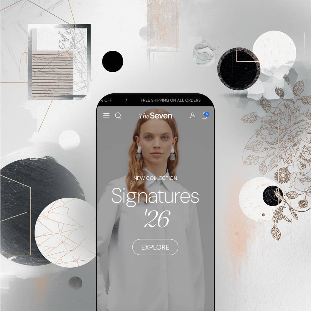
The homepage doesn't ease you in. It opens with two back-to-back full-viewport hero panels: the first announces "NEW COLLECTION / Signatures '26" in a mix of uppercase sans-serif and italicized serif, and the second introduces the men's line with "Dress to impress." No product grid, no collection carousel. Just two massive editorial images setting the mood before you've seen a single price tag. It's a bold call, and it works. You immediately understand this isn't a store that competes on volume. The one-CTA-per-hero restraint keeps everything focused.
Open the SHOP dropdown and you'll notice it's doing double duty. Alongside the expected multi-column category links (Collections, Women, Men), the mega menu stages two image-backed promo cards. One carries a "20% OFF / Special Winter Sale" badge, the other promotes "Signatures" with a "NEW" tag. It makes the navigation feel like a merchandising surface rather than a utility menu, which suits the fashion-forward staging well. You're already being sold before you leave the header.
The product cards in the "Most popular" grid pull their weight too. Each card shows small color swatch thumbnails below the main image. Click one and the hero image swaps to match. Hover and a secondary photo kicks in. Sale items get a calculated percentage badge ("-23%"), and there's a five-star rating with a review count sitting right below the price. You haven't visited a single product page and you've already browsed colorways, seen social proof, and spotted a deal. That's a grid doing serious work.
Search doesn't open an inline text field. Instead, you get a full-height slide-out sidebar with a search bar at the top, clickable "Popular searches" tags linked to collections, and a curated "Our bestsellers" row showing thumbnails, vendor names, prices, and sale badges. You haven't typed a character and the panel is already showing you products. It's a smart move for a fashion store where shoppers don't always know what they're looking for by name.
The cart drawer goes further than most. Below the line items, there's a collapsible "Discount codes" section with an apply button and a visible prompt ("Use SS25 for 25% off entire order"), plus a separate "Order instructions" text area. Everything a shopper needs to finalize a purchase lives inside this one panel. No page hopping, no hunting for where to enter a coupon.
One thing I appreciated was how the LAYOUTS navigation tab exposes three distinct product page configurations: Creative Huge Gallery stacks full-width images that dominate the screen, Creative Inline Gallery flows images alongside product details in a scrolling column, and Classic gives you the traditional side-by-side layout. Seeing all three in the same demo makes it clear how much mileage merchants can get out of a single theme depending on their photography style.
Where it stumbles
That same LAYOUTS tab is also the preset's weak spot from an evaluation standpoint. It crams over 20 internal page links across categories like Homepages, Collection Pages, Product Pages, Product Discovery, and Brand & Content. As a demo showcase it makes sense, but when you're a merchant seeing Seventh for the first time, it reads more like a developer's feature index than a curated storefront. It takes real exploration to figure out which layout options actually matter for your store, and that density can feel intimidating before you've even opened the theme editor.
Niche Suitability
-
This preset is tailor-made for luxury fashion labels, premium accessory lines, designer homeware stores, and any brand with a strong photography library that wants their Shopify store to feel like an online editorial. The dual-hero homepage and Shop the Look hotspot pages reward merchants who invest in lifestyle imagery.
Not Ideal For
-
It's not the right fit for budget-conscious founders still testing a product concept, stores with large commodity catalogs, or anyone who doesn't have professional photography to feed the layouts. Seventh's full-bleed, image-heavy sections amplify weak photos rather than hiding them.
Final Recommendation
-
Established fashion brands, premium DTC labels, editorial-driven lifestyle stores, and design-forward merchants who want their Shopify storefront to rival a standalone fashion e-commerce site. If you've got strong photography and a clear brand vision, Seventh gives you the tools to build something that feels genuinely custom, no code required.
-
First-time sellers on a tight budget, high-SKU commodity stores, and merchants who don't have the visual content to power editorial layouts. If you need a theme that compensates for weaker imagery or walks you through setup with fewer choices, a more opinionated, lower-priced option will serve you better.
-
Medium-High. The modular system is powerful, but configuring three homepage styles, three product page layouts, and a deep section library takes time and intentional curation. If you know what you want, you'll build fast. If you're still figuring it out, expect a longer runway.
★ 8.2/10
Rating
-
Seventh packs an unusually dense feature set for a single theme. Quick buy, slide-out cart with discount codes, mega menu promos, image hotspots, before/after sliders, animated headings, lookbooks, and color swatches are all built in. Filters and sorting present Shopify's standard system in a clean, well-styled interface. The countdown timer and stock counter are listed but weren't actively staged in the demo.
9
-
Three homepage styles, three collection formats, three product page galleries, plus a dozen content section types. That's enormous control, but it creates a steeper learning curve than simpler themes. Experienced Shopify users will appreciate the flexibility. Complete beginners may feel lost.
7
-
Editorial layouts translate well to mobile with full-width image stacks and a hamburger menu that opens a well-structured sidebar with category links, promo tiles, and social links. Product cards stay legible and interactive. The search sidebar works cleanly on narrow viewports too.
8
-
Pages load with low-res placeholders that swap to full quality quickly, keeping perceived speed high. Scroll-triggered animations run without jank. The theme is image-heavy by design, so merchants should optimise their media, but the code itself doesn't introduce unnecessary weight.
8
-
This is Seventh's strongest category. Three homepage layouts, three collection formats, three product gallery styles, and over a dozen section types give merchants compositional control that rivals page-builder tools. Swatches, badges, typography, and spacing are all configurable.
9
-
👑 Fashion, lifestyle, and premium product brands that lean on editorial-quality imagery. The Shop the Look hotspot page lets you pin product links to a single lifestyle photograph, which is purpose-built for fashion lookbooks and curated home decor collections.
-
📱Yes. Full-bleed hero images stack cleanly, the sidebar menu surfaces category links, promo tiles, and social icons in one scrollable panel, and product cards keep their swatch thumbnails and sale badges at narrow widths.
-
🎨 Very. You get separate light and dark logo files, three homepage layouts, three product gallery formats, and dedicated content sections for animated headings, scrolling marquee text, testimonials, and media galleries. Shaping the store's personality doesn't require touching code.
-
⚡ Pages loaded with a low-res placeholder that resolved quickly to full quality during testing. Scroll-triggered animations (heading reveals, marquee strips) rendered without stutter. The theme is image-heavy by design, so compressing and optimising media files matters, but the underlying code doesn't introduce noticeable bloat.
-
👕 Yes. Product cards display image-based swatch thumbnails that swap the main photo on click. Multi-variant products surface a "Choose options" quick buy button, while simpler items can be added directly. Product pages support standard size and colour selectors with clear visual feedback.
-
🔎 Seventh follows Shopify's standard SEO architecture: editable title tags, meta descriptions, URL handles, and structured heading hierarchies. The theme uses semantic headings across its editorial sections and includes breadcrumb navigation on product and collection pages, supporting clean crawlability.
-
💱 Language selection and currency switching are Shopify Markets features handled at the platform level, not by the theme. What Seventh contributes is pre-translated UI strings ("Add to cart," "Search," form labels) in five EU languages: English, French, Italian, German, and Spanish. It also includes RTL CSS layout support for right-to-left languages like Arabic and Hebrew, a genuine theme-level feature many competitors lack.
-
⚙️ Seventh is built on Shopify's standard section and block architecture, so it's compatible with the broader app ecosystem. The slide-out cart already supports discount code input and order instructions natively, which cuts the need for certain cart-enhancement apps.
-
🛒 Yes. You can preview the full demo at seventh-theme-main.myshopify.com, which showcases all homepage, collection, product, and content page layouts. Shopify lets you install and customise the theme in your admin before publishing, so you only pay the $420 when you go live.
This review is based on hands-on testing of the publicly available preset demos of the Seventh Shopify theme as of March 23, 2026. Theme features, preset availability, and performance can change with subsequent updates from the theme developer.