
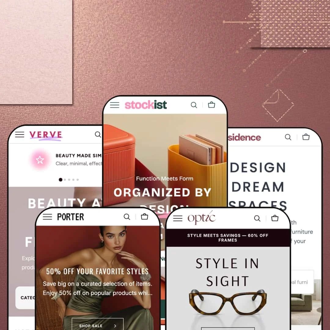
Most Shopify themes say they support large catalogs. Stockist, a $320 theme by Noord, actually means it. The theme ships with five presets covering books and stationery, home decor, clothing, beauty, and eyewear, and each one uses the same underlying toolkit to tackle a genuinely different retail vertical. That alone sets it apart from themes that slap a new color scheme on the same homepage and call it a "preset."
Pros.
〰️
Pros. 〰️
✚ Mega menu navigation with embedded collection imagery
Across all five presets, the mega menu system is the feature that defines Stockist. Each top-level nav item opens a dropdown loaded with collection thumbnails, descriptive text, and promotional banners. Compared to Dawn, where navigation is a list of plain text links, this is a different experience entirely. First-time visitors can preview a category visually before committing to a click, which speeds up orientation and keeps bounce rates lower for stores with large, diverse catalogs. It's the single biggest reason to choose this theme over lighter alternatives.
✚ Predictive search with dual content zones
The search overlay splits into "Popular Searches" (linking to collections) and "Popular Products" (showing product cards with prices, sale badges, and hover images). This dual-zone approach serves two very different shoppers simultaneously: browsers who need direction and focused buyers who know what they want. The instant product previews within results reduce friction between searching and buying, which is a real conversion advantage for stores with hundreds of SKUs.
✚ Variant-aware Quick Add and Quick View system
Simple products get a "Quick Add" button that drops items straight into the cart. Multi-variant products show "Quick View" to surface selectors for color, size, or other options. The theme handles this automatically based on variant structure, and the behavior appeared consistently across all five presets. It's a smart shortcut: single-SKU items skip the selection modal entirely, while multi-variant items surface choices without loading a full product page. That kind of intelligence in the add-to-cart flow is something many themes still get wrong.
✚ Extensive built-in section library
Over 20 configurable sections ship with the theme: Product Markers, Before/After Image Slider, Countdown Timer, Compare Page, Brand List, Ticker, Collection Carousel, Testimonials, Collapsible Content, Banner Grid, Search Banner, Video Banner, Gallery With Text, Media Banner, Image Collage, Image Multicolumn, and more. For merchants who would typically install three or four apps to cover promotional countdowns, social proof, and product comparisons, this is a genuine cost saver. Every section is available across all presets regardless of how the demo stages them.
✚ Dual product page gallery layouts with scroll effects
Two product page gallery formats are available in every preset: Stacked Gallery for detail-rich photography displayed vertically, and Slider With Previews for sequential viewing with clickable thumbnails. Both support image zoom and high-resolution imagery. The theme also layers scroll-triggered animations, parallax effects, and fade-in transitions across homepage sections. During testing, none of these effects produced noticeable lag, which is worth noting because animation-heavy themes often trade polish for speed.
Cons.
〰️
Cons. 〰️
🚫 Homepage content density requires careful curation
The homepages across several presets stack a lot of sections: featured collections, product carousels, promotional banners, image collages, text blocks. For merchants with large catalogs, that's a feature. For everyone else, it's a project. If you don't curate aggressively, the homepage becomes a long scroll that competes with itself for attention, and first-time visitors may bail before they figure out what you actually sell. The theme gives you the tools to build a rich page, but it doesn't protect you from overdoing it.
🚫 Preset demo staging may create misleading capability impressions
Every preset shares the same feature set, but each demo surfaces a different selection of sections. Testimonials appear in Stockist and Verve but not Porter or Optic. Video Banner is staged in Residence but not others. Search Banner shows up in Verve and Residence but not Stockist. None of this means functionality is missing; every section is available in the theme editor regardless of which preset you install. But merchants evaluating a single demo could easily assume certain features aren't included, which creates unnecessary hesitation during purchase decisions.
🚫 Setup complexity for merchants with small catalogs
Everything that makes Stockist powerful for large catalogs, the mega menu, the 20+ sections, the deep navigation, also creates a steeper setup curve for smaller merchants. Configuring collection images and descriptions for the mega menu, choosing which sections to enable, populating promotional blocks: it all takes deliberate planning. If you carry under 30 products, you'll spend more time disabling sections than building your storefront, and the resulting store might feel underpopulated if the navigation depth doesn't match your inventory.
-
The Stockist preset plays the part of a bookstore and stationery shop. It's cheerful, well-organized, and stacked with content, like walking into an independent gift store that somehow also has a great website.
What works in this preset
Open the mega menu here and you'll find Books, Stationery, Soft Goods, Home Items, Accessories Kit, and New Collections, each with thumbnail images and a one-line category description inside the dropdown. It's a small touch, but those descriptions do real work for a mixed-goods retailer. When you sell everything from plush toys to fountain pens, visitors need to orient themselves fast, and the visual shortcuts inside the navigation handle that without requiring a click. Shoppers can scan a dropdown and know exactly where they're headed before committing to a category page.
The color palette leans warm and approachable. Soft neutrals, rounded buttons, gently curved card borders. The whole storefront has a lifestyle-retail personality that feels intentional rather than templated. It's the kind of aesthetic that suits stationery, books, and gift products well because it says "curated" without trying too hard. Badges, UI elements, and card treatments all reinforce this playful-yet-organized mood, and it carries consistently from the homepage down to the product pages.
This demo goes heavy on homepage content. Multiple featured collections, product carousels, promotional banners, and image-and-text blocks stack vertically to create a long editorial landing page. For a store with a wide inventory, that's exactly right: it showcases breadth from the first scroll. The rhythm of alternating product grids with banners keeps the eye moving and creates natural section breaks, so even with a lot of content, the page doesn't feel like a wall.
The search overlay deserves its own mention. It splits into "Popular Searches" linking to collections (Books, Bottles, Candles, Pens) and "Popular Products" showing actual product cards with prices, sale badges, and hover image previews. That dual-zone approach means browsing visitors get collection-level shortcuts while focused shoppers see the specific product they're after. It's a small architectural decision that pays off across the entire shopping experience.
Where it stumbles
The same content density that works for a large catalog becomes a liability if you don't have the inventory to back it up. The homepage stacks so many sections that first-time visitors could scroll for a while before reaching the footer. If you're selling three product categories instead of ten, several of these sections will feel like filler. Merchants with smaller ranges will need to disable sections aggressively, and that takes some of the "out of the box" appeal away.
-
Residence is staged as a home decor and furniture store, and it does something clever: it organizes navigation around rooms, not just product types. The whole preset has a refined, warm quality that makes you want to redecorate.
What works in this preset
The standout choice here is room-based navigation. The "Rooms" dropdown organizes collections by Living Room, Bedroom, Dining Room, Hall, and Workspace, each with a thumbnail. This is how furniture customers actually think. Nobody wakes up and says "I need seating." They say "I need something for the living room." By meeting shoppers at their mental starting point, the navigation sidesteps the awkward translation from "room idea" to "furniture category" that most stores force.
Category depth runs impressively deep without feeling bloated. Seating breaks into Classic Sofas, Poufs, Armchairs, and Sofa Beds. Chairs covers Dining Chairs, Desk Chairs, and Bar Stools. Tables splits into Dining and Coffee. Storage includes Dresseres, Cabinets, and Wall Shelves. Each dropdown presents a focused set of options rather than a sprawling list, which keeps the experience manageable even when the catalog is large.
Product cards feature furniture on white and neutral backgrounds, and the effect is immediately noticeable. The grid looks cohesive even when products vary wildly in size and shape, because the consistent background treatment ties everything together visually. Hover over a card and the second image shows the item from a different angle, which is particularly useful for furniture where form and proportion matter. Shoppers can evaluate shape and scale before clicking through.
Where it stumbles
The homepage in this demo leans toward product grids and category content rather than promotional blocks. If you're expecting big countdown banners, testimonial carousels, or marketing-forward hero sections right out of the box, you'll need to configure those yourself. The staging makes sense for furniture, where product discovery matters more than promotional urgency, but merchants wanting a promo-heavy landing page will feel like the starting point is too sparse.
-
Porter is dressed as a women's clothing store, and it pulls off a neat trick: blending editorial collection curation directly into the navigation. It's fashion-forward without being fussy.
What works in this preset
The best thing in Porter is the "New Collections" mega menu dropdown. Open it and you'll find named seasonal collections like Eternal Grace, Chic Revolution, Modern Femme, Classic Allure, and Vintage Vibes, each with dedicated imagery. This turns the navigation into a storytelling tool. Fashion brands live and die by seasonal narratives, and having those narratives baked into the menu, right next to standard categories, creates a sense of freshness that a plain category list can't touch. Shoppers encounter curation before they've even landed on a collection page.
The apparel category structure is sensibly granular. Tops & Blouses splits into Tops, Blouses, and Sweaters. Bottoms covers Trousers, Skirts, and Shorts. Outwear offers Jackets and Blazers. It's detailed enough that a shopper looking for a specific garment type can navigate directly instead of wading through a broad collection page and filtering down.
Porter also makes a smart hybrid navigation choice. Dresses, Denim, and Activewear link directly to their collections without opening a dropdown, while more complex categories get the full mega menu treatment. This keeps the header from becoming entirely dropdown-heavy and signals to shoppers that some categories are popular enough to warrant just one click.
Where it stumbles
The navigation is deep. Seven top-level categories (Tops & Blouses, Bottoms, Outwear, Dresses, Denim, Activewear, Accessories) plus the "New Collections" dropdown and several utility links add up to a lot of menu. For fashion brands with narrower catalogs or a focused product range, this density will feel like overkill. You'd want to pare it down, and deciding what to cut isn't trivial when the demo presents everything as equally important.
-
Verve is staged as a beauty and wellness store, and it nails the tone. Soft, clean, and aspirational. The navigation mirrors the routine-based way beauty customers actually shop.
What works in this preset
The mega menu organizes products into four pillars: Skincare (Moisturizers, Cleansers, Treatments, Eye Care), Makeup (Face, Eyes, Lips, Brows), Hair (Shampoo & Conditioner, Styling), and Body (Mists, Bath & Shower, Deodorant). This isn't just a category list. It maps to how beauty customers think about their routines, and that makes the navigation feel intuitive from the first visit. Each pillar gets its own dropdown with clean product thumbnails, ensuring every major beauty vertical has a dedicated home rather than being lumped under a generic "Shop All."
Verve stages the most extensive collection curation of any preset. The "New Collections" dropdown packs nine named groupings: Glow Edit, Velvet Skin, Soft Touch, Pure Glow, Smooth Bliss, Daily Dew, plus New In, Sale, and Bestsellers. For beauty brands, seasonal and lifestyle-driven product groupings aren't optional, they're a core merchandising strategy. This demo shows how the mega menu can accommodate that many editorial collections without cluttering the main category navigation. Every collection carries its own thumbnail, and the dropdown has a visual richness that matches the aspirational tone beauty customers expect.
The color palette is where this preset really commits to its vertical. Gentle, skin-tone-adjacent tones run through backgrounds, buttons, and section dividers, creating visual coherence between the brand identity and the product imagery. The result is a storefront that feels calming and premium. It's the kind of palette that would look right at home next to a Glossier or Aesop, and it demonstrates how much the right color choices can elevate an otherwise standard layout.
Where it stumbles
Nine curated collections is a lot. For large beauty brands with hundreds of SKUs, it's a dream. For a smaller brand carrying 40 products across three categories, those collections will feel half-empty or redundant, and half-empty editorial collections actually hurt more than they help because they dilute the curated feel rather than reinforcing it. Merchants with smaller catalogs will need to trim the "New Collections" dropdown significantly or risk undermining the very editorial polish that makes this preset appealing.
-
Optic is the boldest preset in the lineup. Staged as an eyewear and accessories store, it uses high-contrast styling and frame-shape navigation to give the storefront a gallery-like quality.
What works in this preset
The mega menu breaks eyewear into shape and style categories, and it's exactly how customers browse for frames. Eyeglasses offers Round, Cat-Eye, Square, and Aviator. Fashion Glasses covers Designer, Elegance, Bold, and Futuristic. Frame shape is typically the first filter eyewear shoppers apply, so building it into the navigation, rather than burying it in a collection page sidebar, gets customers to relevant products faster. It's a simple structural decision that eliminates a step from the browsing process.
Optic also stages Luxury Eyewear (High-End, Premium) and Limited Collection (Special, Signature) as dedicated menu sections, creating clear price-tier separation in the navigation itself. For eyewear brands carrying both everyday frames and designer pieces, this signals value differences before the shopper reaches a collection page. That kind of tiered positioning can lift average order value and reinforce the perceived exclusivity of higher-end lines.
Product cards use clean backgrounds with strong visual separation, and the high-contrast styling gives the grid a gallery-like quality. When silhouette and form are your main selling points, individual frames need to stand out rather than blend into a dense product wall. The Optic preset achieves that. Even similar-looking products remain visually distinct in the grid, which matters for accessories where small design differences justify significant price variation.
Where it stumbles
Five top-level categories is a lot for eyewear. Sunglasses, Eyeglasses, Fashion Glasses, Luxury Eyewear, and Limited Collection create dense navigation, and for smaller brands with fewer than 50 frames, the boundaries between categories like Fashion Glasses and Luxury Eyewear start to feel artificial. Shoppers might click into a collection and find only a handful of products, which undermines the premium positioning. A tighter two- or three-tier structure would serve brands with smaller inventories better.
Niche Suitability
Not Ideal For
-
Merchants with large, multi-category product catalogs who want a polished editorial storefront without heavy app reliance. Stockist suits bookstores, furniture retailers, fashion brands, beauty companies, and eyewear shops that need deep navigation, rich product discovery, and built-in promotional tools.
-
Single product line stores, minimal-catalog brands, or merchants who prioritize raw speed over visual richness. If your catalog has fewer than 30 products, the theme's navigation and section toolkit will feel like overkill, and you'll be fighting the theme's ambition rather than benefiting from it.
-
Medium. The presets give you a strong starting point, but filling the mega menu with collection imagery, configuring promotional sections, and deciding which of the 20+ sections to actually use takes more setup time than a minimal theme like Dawn. Plan for a weekend of configuration, not an afternoon.
Final Recommendation
★ 8.2/10
Rating
-
The section library alone puts it ahead of most themes at this price point. Countdown timers, product markers, before/after sliders, a compare page, and the variant-aware Quick Add/Quick View system all ship built in.
9
-
Good presets reduce the starting friction, but the sheer number of configurable sections and the mega menu complexity mean you'll invest real time in setup. Standard Shopify 2.0 editor experience otherwise.
7
-
Pages loaded smoothly and product cards adapted well to narrower screens. The mega menu collapses into an accordion nav that keeps its subcategory depth. Solid across screen sizes.
8
-
Responsive during testing with modern lazy-load techniques. Parallax, fade-ins, and scroll animations ran without lag. Heavy homepage configurations could affect load times on slower connections, but out of the box it's fast.
8
-
Five presets across five industries, 20+ sections, two gallery layouts, multiple mega menu configurations, and built-in scroll effects. Typography and color are fully customizable. Hard to outgrow this one.
9
FAQ
〰️
FAQ 〰️
-
👑 It's built for exactly that. The Stockist preset alone organizes Books, Stationery, Soft Goods, Home Items, Accessories Kit, and New Collections with subcategory thumbnails inside the mega menu. The theme handles extensive category trees better than most at its price point.
-
📱Well. Across all five presets, product grids, search overlays, and the slide-out cart adapted smoothly to narrower screens. The mega menu converts to an accordion-style mobile nav that keeps the same subcategory depth without horizontal scrolling issues.
-
🎨 Very. Typography, colors, and layout options are all adjustable through the Shopify theme editor. Each preset ships with its own color palette and font pairing, but you can change everything. Residence uses warm neutral tones while Optic runs high-contrast, yet both start from the same configurable base.
-
⚡ Pages loaded without noticeable delay during testing. Images use lazy loading, Quick Add buttons responded instantly, and the search overlay was snappy. The scroll-triggered animations (parallax, fade-ins) ran smoothly across presets. Heavy section usage on a single page could slow things down, but the baseline performance is solid.
-
👕 Yes, and it handles them smartly. On the Stockist preset, cards for items like Adhesive Label Roll showed "+4 Colours" badges, and hovering revealed variant-specific imagery. The Quick Add/Quick View system adapts automatically: simple products go straight to cart, multi-variant products open a selection interface. Color swatches work on both cards and product pages.
-
🔎 The theme follows Shopify's standard SEO structure with customizable title tags, meta descriptions, and clean URL slugs. Blog pages are accessible across all presets via "Journal" in the navigation, supporting content marketing. The Collapsible Content section works well for FAQ pages that can boost topical relevance.
-
💱 Yes. Language and currency selection is configurable through the theme settings and works with Shopify Markets. The Stockist demo showed English, French, and Spanish with 28+ country/currency options. Residence included German, Optic included Italian. EU translations for five languages are built in, and the theme supports right-to-left layouts.
-
⚙️ It's built on Online Store 2.0, so app blocks and sections can be placed on any page template. The extensive built-in section library (product markers, countdown timers, compare pages) reduces the need for third-party apps, but standard compatibility is fully maintained.
-
🛒 All five presets are available as live demos through the Shopify Theme Store. You can install the theme and customize freely before publishing. The $320 one-time payment is only required when you're ready to go live.
This review is based on hands-on testing of the publicly available preset demos of the Stockist Shopify theme as of March 10, 2026. Theme features, preset availability, and performance can change with subsequent updates from the theme developer.