
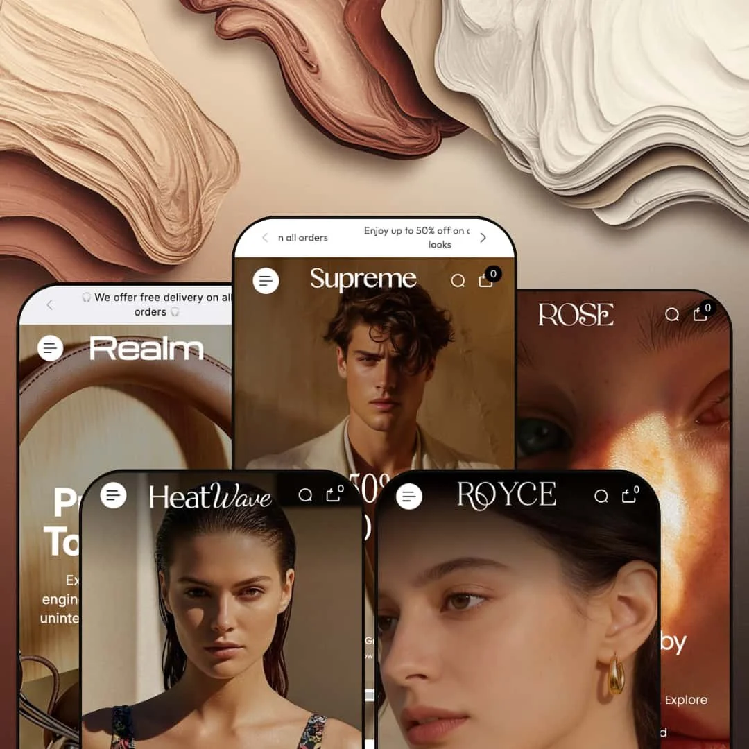
Most $250 Shopify themes pick a lane. Supreme doesn't. Built by Grixio and loaded with over 35 dynamic sections, it's one of the few themes that genuinely convinces across five completely different retail niches. Fashion, beauty, swimwear, electronics, jewelry: each preset feels purpose-built rather than hastily re-skinned with new stock photos.
Pros.
〰️
Pros. 〰️
✚ Mega menu as a merchandising surface
Across every preset, the mega menu goes well beyond basic navigation. It functions as a full-blown merchandising surface with in-menu promotional banners, product images, sale percentages, collection shortcuts, and direct product links organized into multiple columns. Shoppers can browse by category, collection, and even individual product without leaving the navigation flyout, which shortens the discovery path significantly for stores with large or segmented catalogs. It's easily one of the best mega menu implementations at this price point.
✚ Enhanced search that actively sells
Here's what most Shopify themes get wrong about search: they treat it as a utility. Supreme treats it as a selling opportunity. The search overlay presents a trending collection image, a row of popular search terms as clickable tags, and a grid of popular products with prices, making it function almost like a mini storefront. And each preset adapts the search terms to its niche, from "Face Serums" in Rose to "Bikini Sets" in Heatwave, so the feature genuinely helps shoppers find products rather than just returning keyword results.
✚ Deep section library for visual storytelling
The 35-plus section library is where Supreme really separates itself from lighter themes. Shop the Look with product tagging and video support, tabbed collection browsers, multi-image editorial galleries, image-with-text brand story sections, scrolling marquee tickers, brand logo sliders, collection carousels, lookbook page templates, FAQ page templates: it's all there. Merchants can build homepage layouts that range from editorial-magazine storytelling to product-grid-forward catalogs, all without third-party apps or custom code.
✚ Product card interactivity beyond the baseline
Product cards across the theme support image rollover to secondary images, color and variant swatches directly on the grid, sale badges with crossed-out pricing, quick view modals, and multi-axis variant selectors. The practical result is that shoppers can evaluate color options, compare variants, and add to cart without ever visiting the product page. On the product page itself, complex variant combinations are handled through visual swatch selectors and pill-button selectors working across independent axes. For themes in this price bracket, that's a lot of built-in interactivity.
✚ Polished account and transition flows
A detail that's easy to overlook but hard to get right: login and registration open as styled modal drawers rather than redirecting to separate Shopify account pages. That keeps shoppers inside the browsing experience. The sidebar drawer navigation also surfaces contact details alongside page links, so support channels are always one tap away. These are small touches, but they contribute to a polished store feel that helps newer or lesser-known brands build trust with first-time visitors.
Cons.
〰️
Cons. 〰️
🚫 Tabbed collection sections pre-load all tab content at once
The tabbed collection browsers visible in Rose and Royce don't lazy-load their content when a shopper clicks a tab. Instead, every product card from every tab is rendered into the page HTML on initial load. In Rose's "Favorite Beauty" section, for example, three tabs each pull their own product grid, meaning all three grids hit the browser simultaneously even though only one is visible. For a merchant with three tabs of eight products each, that's 24 product cards with full-resolution images loading behind the scenes before the shopper interacts with anything. Most well-optimized themes load tab content on activation to keep the initial page weight down. Supreme doesn't, and for merchants who rely heavily on tabbed homepage sections, that upfront load cost adds up fast.
🚫 No auto-hide fallback for expired countdown timers
When a countdown timer reaches zero, Supreme doesn't collapse the section or swap in a fallback message. It just sits there displaying "00:00:00:00" at the top of the page. This is visible in both the Supreme and Realm demos, and it's a design-level gap rather than a configuration oversight. Themes that handle this well either auto-hide the section when the timer expires or let the merchant set a post-expiry message. Supreme does neither, which means an expired timer actively occupies prime real estate with a dead element. Merchants running time-sensitive promotions would need to manually disable the section the moment a campaign ends, or risk leaving a credibility-damaging zero state visible to every visitor until they notice and fix it.
-
A high-contrast fashion storefront built around dark editorial tones, full-width hero imagery, and layered navigation. This preset speaks directly to premium apparel and accessories brands that want their store to feel like a luxury magazine spread.
What works in this preset
What caught my eye first was the dual-bar header. Below the main menu sits a secondary navigation strip with links to New In, Trendy Bags, and Couture. It's a small structural choice, but it gives merchants two tiers of curated pathways without cluttering the primary menu. Think of it like a visual merchandising rail in a department store: the main menu handles the full catalog, while the strip surfaces whatever's trending right now. For fashion brands with seasonal edits or rotating collections, that secondary strip is a quiet workhorse.
Scroll into the sidebar drawer and you'll find the lookbook page and FAQ page both linked directly from there. The lookbook is staged as a dedicated editorial experience, giving fashion brands a built-in canvas for seasonal campaigns and lifestyle imagery that lives outside the standard collection grid. And the FAQ sits behind clean accordion-style collapsibles, the kind of thing that can quietly reduce support tickets by putting common answers where shoppers are already browsing. Tucking both inside the drawer menu keeps the main header clean while making these pages genuinely discoverable.
The hero composition itself leans into dark, full-bleed imagery with high-contrast overlaid type that funnels attention toward a single CTA. Deep neutrals run throughout the palette, which lets the product photography carry all the visual weight. It's the kind of staging that works best when a brand's imagery is already strong and just needs a clean, confident stage to stand on.
Where it stumbles
Right at the top of the page, the announcement bar's countdown timer reads "00:00:00:00." The timer has expired. Now, the countdown capability itself works fine across the theme, but an expired timer sitting in the most prominent position on the store creates an awkward dead zone. It's a demo staging issue, not a theme flaw, but it does illustrate an operational reality: urgency-driven merchants need to actively manage their countdown end dates, because a zeroed-out timer undercuts credibility faster than no timer at all.
Here, the homepage collection grid takes a more minimal approach than what you'll see in other presets. Product cards don't surface color swatches or quick-add triggers in this configuration, so browsing-to-cart involves an extra click through to the product page. The capability is there (other presets demonstrate richer card interactions), but this demo opts for simplicity. For a fashion audience that expects to browse and be seduced before buying, that's arguably the right call. But merchants who want faster conversion paths will need to enable those card-level features themselves.
There's also some overlap between the dual menu layers. The top drawer and the secondary navigation strip share several links, and without careful curation, shoppers could end up confused about which route takes them where. The fix is straightforward: dedicate the strip to time-sensitive or editorial collections and keep the drawer for the full catalog structure.
-
The same Supreme framework, completely reimagined for skincare and beauty. Rose swaps the dark editorial energy for warm pastels, botanical imagery, and a soft, wellness-forward feel that signals "clean beauty" before you've read a single word of product copy.
What works in this preset
The standout feature here is a tabbed collection browser on the homepage labeled "Favorite Beauty." Three tabs, New Arrivals, True Texture, and Golden Calm, each pull their own product grid, and shoppers can switch between curated sets without ever leaving the page. What makes it feel considered rather than generic are the tab labels themselves: they're niche-specific and clearly hand-picked, reinforcing the impression that someone has thought carefully about how these products should be grouped. For a beauty store, that editorial curation builds trust.
Open the mega menu and you'll notice it's been adapted for beauty retail. "Our Picks" sits in one column with direct product links, "Shop by Category" fills another with collection links, and "Skin Care" gets its own column, all flanked by promotional banners that match the soft palette. It works the way a department store beauty counter works: a shopper looking specifically for serums doesn't have to wade through the moisturizers to find them. The whole navigation feels intentional rather than autogenerated.
Where Rose really nails the niche, though, is in the search overlay. The popular search terms are tailored to beauty vocabulary: "Face Serums," "Moisturizers," "Sheet Masks." That kind of preset-specific customization shows how the enhanced search adapts to a merchant's catalog language, and it makes the experience feel genuinely helpful for shoppers who browse by product type rather than brand name. The blog is linked as "Journal" from the main navigation too, treating content marketing as a first-class citizen rather than an afterthought. For beauty brands that rely on ingredient education and skincare routines to build loyalty, that's a smart default.
Visually, everything coheres. Soft pastels, botanical imagery, clean white space, lighter-weight typography compared to Supreme's bold editorial stance. The warm cream background ties every section together, and the result is a page that communicates "clean beauty" at a glance. That kind of visual coherence matters in a category where trust and ingredient transparency drive the purchase decision.
Where it stumbles
Rose stages its soft, aspirational aesthetic so consistently that urgency-driven elements are entirely absent from the visible homepage. No countdown timers, no stock counters, nothing designed to pressure a quick decision. Beauty brands running flash sales or limited-edition launches might find the default presentation too relaxed. The capability is absolutely available in the theme, but the demo doesn't model it, so merchants who want urgency mechanics will need to enable those sections themselves and test how they sit alongside the softer palette.
-
Bright, sun-drenched, and unapologetically lifestyle-driven. Heatwave takes the Supreme framework and turns it into a summer fashion destination where the visual storytelling does most of the selling before a shopper ever reaches a product grid.
What works in this preset
The homepage's editorial gallery is the centerpiece. Five lifestyle photographs, each paired with a descriptive paragraph like "Poolside Paradise Vibe" and "Sunlit Desert Mood," create an inline lookbook that sells a lifestyle, not just a product. Each image-and-text pairing tells a micro-story, and as you scroll through them, the homepage starts to feel less like a product catalog and more like flipping through a travel magazine. For brands where emotional resonance drives the purchase as much as product features, this gallery section is genuinely powerful.
What Heatwave does differently with the mega menu is worth noting. Instead of the navigation-focused approach other presets take, the dropdown here uses a five-column promotional image layout where each column shows a product image, a bold category label, and a sale percentage. The menu itself becomes a promotional landing surface, essentially treating navigation as another merchandising opportunity. For seasonal swimwear with fast turnover, that's clever: the mega menu doubles as a flash-sale billboard.
Scroll past the gallery and you'll hit an image-with-text section that places a large lifestyle photo beside brand-story copy, complete with a scrolling brand logo slider beneath it. Together, they create an "About Us" moment right on the homepage without needing a separate page. The logo slider loops seamlessly and adds a professional credibility layer, the kind of touch that helps newer swimwear brands signal legitimacy. It makes the whole homepage feel less like a storefront and more like a brand destination.
The marquee ticker here is staged with playful, emoji-accented promotional text that fits the summer mood. It creates continuous visual motion that draws the eye without interrupting the layout, and it functions like a secondary announcement bar with considerably more personality than a static text strip.
Where it stumbles
There's a trade-off to all that lifestyle content: the homepage leans very heavily on imagery before reaching the first shoppable product grid. The editorial gallery alone occupies substantial vertical space, and when you stack it with the image-with-text section and the marquee ticker, the actual product cards feel distant from the top of the page. Shoppers who arrive with clear purchase intent rather than a browsing mindset may need to scroll further than they'd expect. Merchants can reorder these sections, but the default staging unmistakably prioritizes mood over merchandise.
The other consideration is load weight. Five large lifestyle images loading simultaneously is a lot, especially for swimwear photography that tends toward high-resolution beach and poolside shots. On slower mobile connections, this image density could slow down the first meaningful paint noticeably. Trimming the gallery to three or four images, or investing in aggressive image compression, would help balance the visual impact with real-world performance.
-
This is Supreme in tech mode. Realm reconfigures the framework for consumer electronics and audio equipment, deploying a darker palette alongside a Shop the Look section designed specifically for cross-selling accessories with hero products. The result feels more like a product launch page than a traditional storefront.
What works in this preset
The Shop the Look section is the star here. Lifestyle images are paired with tagged products and the layout alternates between large hero shots and smaller product callouts, creating a curated bundle experience that encourages multi-product purchases. For an audio brand, one lifestyle image of someone wearing headphones near a speaker can link to both products simultaneously. That shortens the discovery path for complementary items considerably, and it's the kind of cross-sell mechanic that usually requires a third-party app.
What makes it even stronger is the embedded video integration. Product videos appear right inside the Shop the Look grid, with preview thumbnails linking to hosted media files. For electronics, where shoppers genuinely need to see products in motion, understand physical scale, or get a sense of audio quality in context, video adds a persuasive layer that static photography simply can't match. The Realm demo uses this to show headphones and speakers in lifestyle settings, which reinforces the brand narrative while simultaneously delivering functional information.
Pull up the Wireless Headphone product page and you'll see the variant system operating at full capacity. Two independent variant axes, Color (visual swatches) and Material (pill-button selectors), give shoppers multiple pathways through a complex product configuration. A full variant combination dropdown also lists every permutation with pricing, so shoppers who prefer a straightforward list view aren't left out. This level of variant handling is rare at this price point, and it's especially relevant for electronics where products ship in multiple colorways and material finishes.
The marquee ticker picks up the tech aesthetic too, staged with headphone emojis and alternating promotional messages. The announcement bar above it runs a countdown timer with emoji decoration and dual-line rotating promo text, adapting smoothly to the dark background without losing readability.
Where it stumbles
Because the homepage leans so heavily on the Shop the Look section, products are presented at a smaller scale with more emphasis on lifestyle context than on the products themselves. For electronics shoppers who care about specifications, port layouts, and physical dimensions, that lifestyle-first presentation may not communicate enough technical detail to satisfy someone in research mode. Merchants selling highly technical products would likely benefit from supplementing the Shop the Look layout with a featured collection grid that shows products at a larger scale.
The other hiccup is repetition. The dual hero sections use near-identical messaging: "Pure Sound. Total Control." appears twice during a single scroll session. Different imagery, same headline. The second instance loses impact because you've already seen the first. Merchants adopting this layout would need to customize the second hero with distinct copy to avoid that echo effect.
-
Royce is Supreme dressed for a jewelry boutique. Warm gold tones, elegant typography, and gallery-style collection presentations come together to create something that feels less like a Shopify store and more like walking past the display window of a fine jeweler.
What works in this preset
Below the hero, a collection carousel presents eight jewelry collections, Bridal Spark, Medallion Charm, Diamond Halo Ring, Diamond Bracelet, and more, with large square images and item counts visible beneath each tile. It's the kind of layout that answers the first question most jewelry shoppers ask: "What do you sell?" The visual weight of the carousel communicates catalog depth at a glance, and for a jewelry brand with many distinct product categories, it functions like the display cases you'd see walking into a physical boutique.
The product cards in the "Wear Your Natural Glow" section go further than any other preset when it comes to variant exposure. The Diamond Bloom Necklace, for example, surfaces Material (Diamond, Bamboo) and Design (Cord, Chain, Riviera) selectors directly on the card, beneath the product image. Shoppers can compare configuration combinations before committing to a product page visit. For jewelry, where material and design choices are the heart of the purchase decision rather than an afterthought, this kind of on-card detail is genuinely exceptional.
A "Most-Loved Looks" section reframes the catalog around how shoppers actually think. Large, atmospheric collection images carry text overlays like "Luxe Minimal," "Occasion Ready," "Modern Radiance," and "Golden Ease," functioning as curated mood boards organized by occasion rather than product type. Someone shopping for a wedding piece navigates differently than someone browsing for everyday gold, and the mood board approach acknowledges that distinction. It adds an emotional guidance layer that a straight product grid simply can't replicate.
Breaking up the product sections is a full-width editorial moment, side-by-side images with the text "Jewelry That Speaks Before You Do" and a prominent CTA. It's the brand-story beat that luxury buyers expect, and the warm gold tones plus the diamond-symbol marquee maintain visual consistency throughout the entire scroll. At the bottom, a tabbed collection viewer lets shoppers toggle between "Diamond Halo Ring" and "Golden Muse" collections, each rendering its own product grid. The tab labels feel niche-specific, and the styling matches the gold-toned aesthetic so well that this global capability genuinely feels purpose-built for jewelry.
Where it stumbles
The mega menu here is staged more compactly than in Supreme or Heatwave, using fewer promotional image columns. For a jewelry store with a wide catalog spanning rings, necklaces, bracelets, earrings, and bridal lines, that single-column collection list may not surface the full breadth of the offering as effectively. The menu is configurable, so merchants with expansive jewelry catalogs would want to expand it with additional image slots for key collections, but the default staging undersells the menu's potential.
Niche Suitability
Not Ideal For
Final Recommendation
-
Mid-to-large catalog merchants across fashion, beauty, electronics, jewelry, and lifestyle verticals who want a single theme investment that scales across product types. If your brand relies on visual storytelling, curated navigation, and editorial homepage layouts, you can build a store with Supreme that feels genuinely custom without writing a line of code.
-
Minimalist single-product stores, content-light dropshipping operations, or merchants who want the lightest possible theme with minimal configuration overhead. Supreme's depth is its strength, but that depth demands thoughtful setup, and the investment may not be justified for lean or rapidly iterating storefronts.
-
Medium. The number of configurable sections and menu options means you'll spend meaningful time on initial setup: building navigation structures, choosing which homepage sections to enable, uploading quality imagery. Once it's configured, day-to-day maintenance is straightforward. But the initial build requires deliberate planning to avoid section overload and keep load times tight.
★ 8.0/10
Rating
-
Over 35 dynamic sections, mega menu with in-menu promos, enhanced search overlay, quick view, Shop the Look, tabbed collections, before/after slider, image hotspots, and lookbook support. The section library is among the deepest in its price range.
9
-
The breadth of options means merchants need to invest time in initial configuration. Navigation setup, in particular the mega menu with its promotional image slots and multi-column layouts, requires planning. Day-to-day content updates are straightforward once the structure is in place.
7
-
Drawer-based navigation, modal login and register flows, and responsive product grids all translate well to smaller screens. The mega menu collapses into a clean mobile drawer with expandable sections. Image-heavy sections like the editorial gallery may benefit from lazy loading on slower mobile connections.
8
-
Interactive elements respond quickly, and page-to-page navigation feels snappy. However, image-heavy homepage configurations with multiple hero slides, editorial galleries, and tabbed product grids can add to initial load weight. Performance scales directly with how aggressively merchants optimize their images.
7
-
Five presets spanning fashion, beauty, swimwear, electronics, and jewelry demonstrate real-world range. The 35-plus section library, configurable mega menu, and adaptable product card styles give merchants significant control over look and feel without touching code.
9
FAQ
〰️
FAQ 〰️
-
👑 Supreme is one of the more genuinely versatile themes at this price point. The Realm preset stages an electronics storefront with video integration and a Shop the Look cross-sell layout, while Royce transforms the same framework into a fine jewelry boutique with multi-axis variant selectors on product cards. If your catalog spans multiple product types, this theme accommodates that range well.
-
📱Navigation collapses into a clean drawer with expandable categories, and the mega menu's promotional images carry over as scrollable elements. During testing on the Heatwave preset, the swimwear product cards with color swatches rendered cleanly on narrower viewports, and the search overlay adapted its popular products grid to a stacked layout.
-
🎨 Full control over color schemes, typography, logo placement, and section arrangement. Each of the five presets demonstrates a radically different visual identity using the same section library, from the dark editorial Supreme preset to the soft botanicals of Rose. The mega menu alone offers multiple layout configurations with promotional image slots, text overlays, and collection linking.
-
⚡ Page transitions feel smooth, and interactive elements like the quick view modal, search overlay, and variant selectors respond without noticeable lag. The Realm preset's embedded product videos load and play reliably. The main performance consideration is homepage weight: merchants who stack many image-rich sections should plan their image optimization accordingly.
-
👕 Variant handling is a genuine strength. The Realm preset's Wireless Headphone product page presents two independent variant axes (Color with visual swatches, Material with pill buttons) plus a full variant combination dropdown. On collection grids, the Royce preset shows multi-axis selectors directly on the card for the Diamond Bloom Necklace, which is rare at this price point.
-
🔎 Supreme includes clean URL structures, editable meta titles and descriptions, proper heading hierarchy, alt text support for images, and blog functionality. The breadcrumb navigation listed in the theme's feature set aids search engine crawling and helps visitors orient themselves within the site structure.
-
💱 Yes. Language and currency selectors are configurable and appeared across every preset tested, typically accessible from the header area. The Supreme preset, for example, showed a dropdown with over 25 country options alongside a language selector, confirming that the theme integrates smoothly with Shopify's localization infrastructure.
-
⚙️ The theme is built on Shopify's standard architecture, so it supports the broader app ecosystem. The feature list includes Sign in with Shop integration, and the built-in pre-order and gift wrapping capabilities mean the theme already covers functions that many merchants would otherwise need separate apps to handle.
-
🛒 Yes. All five presets (Supreme, Rose, Heatwave, Realm, and Royce) are available as live, interactive demos through the Shopify Theme Store. You can browse homepages, product pages, collection pages, and navigation flows before committing. Shopify also lets you install and customize the theme before publishing, so you only pay when you go live.
This review is based on hands-on testing of the publicly available preset demos of the Supreme Shopify theme as of March 2026. Theme features, preset availability, and performance can change with subsequent updates from the theme developer.