
Sweet is the most food-obsessed Shopify theme I've tested, and that's both its superpower and its constraint. At $320, it ships with a single preset and a surprisingly deep set of bakery-specific design modules: dietary badge icons on every product card, "Baked 2 hours ago" freshness timestamps, dedicated ingredient breakdowns with custom icons, and a store locator panel built right in. None of that exists in Dawn or most general-purpose themes.
Pros.
〰️
Pros. 〰️
✚ The cards tell you everything before you click
This is where Sweet earns its niche. Product cards display small dietary badge icons for attributes like "No Preservatives," "Dairy Free," "Nut Free," and "Gluten Free" directly on the card and on the full product page. Next to the badges, a "Baked X hours ago" freshness indicator with a clock icon appears on featured cards. No general-purpose Shopify theme ships with these. And they address the two questions bakery shoppers ask most: does this meet my dietary needs, and is it fresh? Getting those answers onto the card, before a shopper even clicks through, is a genuine conversion advantage for food businesses.
✚ Ingredients front and center
Sweet's homepage includes dedicated ingredient highlight sections for products like Chocolate Chip Cookie Dough, Smoothie Nuts Seeds and Kiwi, and Premium Pizza Toppings. Each one lists six key ingredients with custom icons and links directly to the relevant product page. For food brands that market clean or transparent ingredient sourcing, this is a ready-made storytelling tool that goes well beyond a standard product description. The before-and-after image slider adds another layer, letting merchants showcase raw ingredients versus the finished product, or dough versus the baked result.
✚ Navigation that doubles as a storefront
Open the mega menu and you're not looking at a list of links. You're looking at a mini shop. Product thumbnails with live sale pricing, a collection link, labeled category columns, and a promotional banner image all sit inside a single full-width dropdown. The predictive search takes the same generous approach: type a query and you get matching product thumbnails with prices, a "Categories" section linking to collections, a "Pages" section with internal links, and a large promotional image. Both features go noticeably beyond what Dawn offers, and they keep shoppers browsing even when they're technically just navigating.
✚ Store locator and gift-occasion merchandising built in
A dedicated "Store Locations" slide-out panel lists multiple physical locations with operator names, opening hours, addresses, and phone numbers. For bakeries with brick-and-mortar shops, that's one fewer third-party app to install. The occasion-based collection carousel, which displays curated collections like Congratulations, Gift The Unexpected, Happy Birthday, Engagement, and Welcome in a horizontal scroll, pushes gift shoppers toward themed bundles. Together these sections serve bakeries that operate both online and in-store, with a strong gift-commerce angle baked in.
✚ Short path to cart, deep product pages
Inline variant selection on homepage product cards lets shoppers pick Size and Flavor and add to cart without ever visiting the product page. For repeat buyers, that's a real time-saver. On the product page itself, the subtotal updates in real time when quantity changes, and tabbed content sections (Key Features, Storage Life) organize detailed information without overwhelming the layout. A social sharing module covers Instagram, LinkedIn, Facebook, YouTube, Twitter, Snapchat, Pinterest, TikTok, and a copy-link option. That's broader platform coverage than most themes offer out of the box.
Cons.
〰️
Cons. 〰️
🚫 A code-level bug on the product grid
Several product cards in the Sweetbite Signature Items section display a raw "Liquid error (snippets/product-card line 819): invalid url input" message right beneath the variant selectors. It shows up on Dark Chocolate Cake, Floral Birthday Cake, Sugar Cookies, and others. At $320, a theme should not ship with rendering errors visible to shoppers on its primary product grid. This is the kind of issue that undermines confidence in the codebase.
🚫 One preset, one starting point
Most themes at this price offer two to four presets, each demonstrating a different visual direction. Sweet ships with one. If you're a juice bar, a meal prep service, or a specialty coffee roaster, there's no alternative preset to start from. Everything is customizable through the editor, but you'll be reshaping a bakery-focused starting point rather than picking the closest match and adjusting.
🚫 Information density that can overwhelm
The product cards pack a lot into a small space: sale pricing with strikethrough, unit pricing (e.g., "$2.99 per item" or "$10.00 per lb"), variant selectors, dietary badges, a freshness tag, a stock indicator, and an add-to-cart button. On products with multiple variant options, the vertical stack gets dense and the pricing block competes with the badges for attention. On the product page, a legal paragraph about deferred, subscription, or recurring purchases appears below the "Add to basket" button whether or not the product actually uses subscriptions. For a simple single-purchase cake, that text adds friction and may confuse shoppers who aren't subscribing to anything.
-
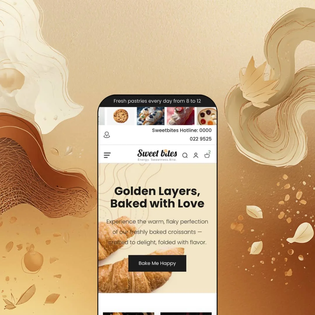
Sweet's only preset is staged as a full-service artisan bakery. Warm cream tones, soft browns, a playful rounded typeface, and oversized product photography set the mood before you've read a word. The hero section keeps things simple: one lifestyle headline ("Golden Layers, Baked with Love"), one full-width croissant image, one call-to-action button. No carousel, no competing offers. Just appetite appeal and a clear next step.
What works in this preset
The palette does a lot of heavy lifting here. That creamy off-white background paired with soft brown accents and warm gold highlights feels immediately at home for a bakery brand. It's the kind of color staging that makes you think of butter and flour before you've even scrolled. The rounded typeface reinforces the artisan comfort-food mood without veering into childish territory, and generous white space between sections lets the product photography do its job. A patisserie or dessert-box brand could adopt this preset with minimal recoloring and it would look intentional from day one.
The hero composition is worth noting for what it doesn't do. Instead of splitting attention across multiple banners or rotating slides, this preset funnels the visitor toward a single full-bleed image and one button. For food products, where appetite appeal does most of the selling, that restraint works. It keeps the above-the-fold decision clean and immediate.
Below the fold, the homepage unfolds like a long bakery counter. A scrolling gallery banner of product shots, then an overlapping image grid labeled "Bakery," a collection list with category cards, the Sweetbite Signature Items product grid, ingredient highlight blocks, a before-and-after image slider, an occasion-based collection carousel, and an Instagram feed section. The rhythm alternates between full-width visual moments and structured product grids, which gives the page a browsing tempo that feels like walking through a display case rather than scrolling a catalog. The consistent cream-and-brown palette ties all of this together. Even with the density, the page doesn't feel fragmented.
Product cards in the Signature Items section are staged to show everything at once. Variant selectors (Size and Flavor as pill buttons), dietary badge icons, a "Baked 2 hours ago" freshness tag, sale pricing with strikethrough, unit pricing, a stock indicator, and an "Add to basket" button, all visible without hovering over anything. It's a lot. But for a bakery's repeat customers who already know what they want, this exposure-heavy approach removes clicks. You pick your size, pick your flavor, and you're in the cart.
The footer rounds things out with social media links across eight platforms, a newsletter signup, and multi-column navigation split into clear link groups. A small decorative bakery logo icon sits at the bottom, a nice touch that carries the artisan feel all the way to the last scroll.
Where it stumbles
The homepage is long. Really long. The scrolling gallery banner, two overlapping image grids, a full-width collection list, the Signature Items grid, three ingredient highlight panels, a before-and-after slider, and an occasion carousel all stack in sequence. On a first visit, the sheer vertical length may test a shopper's patience before they ever reach the footer. Merchants who adopt this preset should seriously consider whether every section needs to be active at once, or whether trimming two or three would create a tighter path to the products that actually matter.
Niche Suitability
-
This preset is ready to go for artisan bakeries, patisseries, dessert-box brands, and confectioneries that sell visually appealing perishable products and want to communicate ingredient quality and freshness right on the homepage. The warm palette, rounded type, and food-centric section rhythm mean a baked-goods business could launch with minimal design rework.
Not Ideal For
-
It's a harder sell for brands that prefer a minimal, image-sparse aesthetic, or for anyone outside the food space who'd need to strip and rebuild most of the homepage sections. Stores with very small catalogs, say under ten products, may also find the section-dense homepage feels like overkill for their offering.
-
Bakeries, patisseries, confectioneries, dessert shops, cookie brands, cake businesses, and artisan food producers who sell perishable or ingredient-conscious products. It's also a strong fit for food businesses with physical storefronts and a gift-box or occasion-based product line.
-
Merchants selling non-food products, stores that need multiple visual presets to test different brand directions before launch, or minimalist brands that prefer stripped-back product cards over information-dense ones.
-
Medium. Sweet ships with strong food-specific modules that don't require apps, so you won't be hunting for third-party solutions. But the single preset means you'll spend more time customizing colors, typography, and section content from one starting point rather than picking the closest preset and tweaking from there.
Final Recommendation
★ 7.0/10
Rating
-
A deep food-niche toolkit with ingredient sections, dietary badges, freshness indicators, a before/after slider, and an extensive mega menu. Shopify's standard filter and sort presentation is clean and functional. The Liquid error on product cards prevents a higher score.
8
-
One preset means more setup work upfront. Once configured, the section-based structure is logical, but the mega menu and information-dense product cards require careful content planning.
7
-
The header collapses into a hamburger menu, product cards stack cleanly, and search stays accessible. The dense card content (badges, variants, pricing, freshness tag) does create a long vertical block on narrow screens.
7
-
The homepage loads a heavy amount of imagery across the gallery banner, overlapping grids, product cards, highlight blocks, and occasion carousel. Perceived speed was acceptable but not snappy during testing, partly because of the volume of visual sections.
7
-
One preset, one visual direction. The theme editor offers standard Shopify section controls and the food-specific sections are configurable, but there's no alternative preset to pivot from if the bakery aesthetic doesn't match your brand.
6
FAQ
〰️
FAQ 〰️
-
👑 It's purpose-built for them. The ingredient highlight sections, dietary badge icons (No Preservatives, Dairy Free, Nut Free, Gluten Free), and "Baked 2 hours ago" freshness indicators on the product cards are features you won't find in general-purpose themes. The occasion-based collection carousel also makes it a natural fit for gift-box bakeries.
-
📱The header collapses into a hamburger menu, the mega menu transitions to a vertically scrollable list, and product cards stack into a single column. Search and cart stay accessible in the mobile header. The badge icons and variant selectors do create a tall vertical stack on product cards at smaller screen widths.
-
🎨 Yes. Colors, typography, and section content are all editable through the Shopify theme editor. The logo area accepts SVG or image uploads, and the mega menu categories, product badge icons, and section headings are all configurable. A chocolate brand could restyle the preset without touching code.
-
⚡ Interactive elements like the mega menu, predictive search, and add-to-cart respond without noticeable delay. The homepage is image-heavy though, with a scrolling gallery banner, multiple overlapping image grids, and large product photography. Initial load time will depend on how many sections a merchant keeps active and how well they optimize image file sizes.
-
👕 Variants display as selectable pill buttons on both product cards and product pages. On the homepage grid, shoppers can pick Size and Flavor and add to cart without visiting the product page. The product page shows a real-time subtotal that updates with quantity changes, plus unit pricing per item or per pound.
-
🔎 Sweet follows Shopify's standard SEO structure with editable page titles, meta descriptions, and URL handles. Heading hierarchy is clean across the homepage and product pages, and breadcrumb navigation on product pages supports structured data for search engines.
-
💱 Multi-language and multi-currency support is handled by Shopify Markets at the platform level, not by the theme. Merchants configure countries, currencies, and languages in their Shopify admin under Settings, then Markets. Sweet provides the visual country/region and language selector dropdowns in the header and footer, which is standard for any Online Store 2.0 theme. The demo shows selectors for Germany, Italy, and the United States with flag icons.
-
⚙️ Sweet runs on Shopify's Online Store 2.0 architecture, so it supports app blocks and app embeds through the theme editor. The product page already integrates with Shopify's native reviews section, and the subscription/recurring purchase notice suggests compatibility with subscription apps.
-
🛒 Shopify's Theme Store lets you install and customize Sweet on your development store before committing. You can test every section and setting in the editor.
This review is based on hands-on testing of the publicly available preset demo of the Sweet Shopify theme as of March 2026. Theme features, preset availability, and performance can change with subsequent updates from the theme developer.