
Most $150 Shopify themes give you a mega menu that links to collection pages. Unity does something different: hover over "Bestsellers" and you're browsing a tabbed product carousel with cards, variant selectors, and add-to-cart buttons, all without leaving the navigation dropdown. That single interaction tells you what this theme is about. It wants to collapse the gap between discovery and cart.
Pros.
〰️
Pros. 〰️
A mega menu that actually sells
Most mega menus link to pages. Unity's links to products. The tabbed product carousel inside the navigation dropdown lets shoppers browse across categories, compare pricing, select variants, and add to cart without ever loading a collection page. It compresses the entire discovery-to-cart flow into a single hover interaction, and it's the clearest functional upgrade over Dawn in the theme's arsenal.
Quick-add that reads the room
The theme handles quick-add differently depending on product complexity, and it gets the logic right. Simple products with no selectable variants show a direct "Add to cart" button on hover. Multi-variant products expand inline selectors directly on the card: the Vitamin D3 K2 product, for example, surfaces both Dosage and Size options before requesting a cart action. This behavior held steady across both presets and across cards in the mega menu, homepage grids, and collection pages. It's reliable theme-level logic, not a one-off.
A section library that replaces apps
With 31+ custom sections, Unity covers ground that would typically require two or three paid Shopify apps. Before/after image sliders, lookbooks, countdown timers, trust badge rows, FAQ sections, image hotspots, testimonial blocks, age verification, back-in-stock alerts, promo popups, and a quick order list are all built in. The blog supports both a standard list view and a collage layout. Contact pages offer templates with and without maps. For a $150 theme, the built-in density is hard to beat, and every app you don't install is one fewer script slowing down your storefront.
Promotion tools that layer without cluttering
The announcement bar rotates multiple messages with custom SVG icons, auto-play, and pause-on-hover. Sale badges render automatically on discounted products. Promo popups and promo tiles provide additional conversion surfaces. These tools work together quietly; they nudge without shouting, which is the right tone for wellness and beauty brands where trust matters more than urgency.
Flexible presets, consistent core
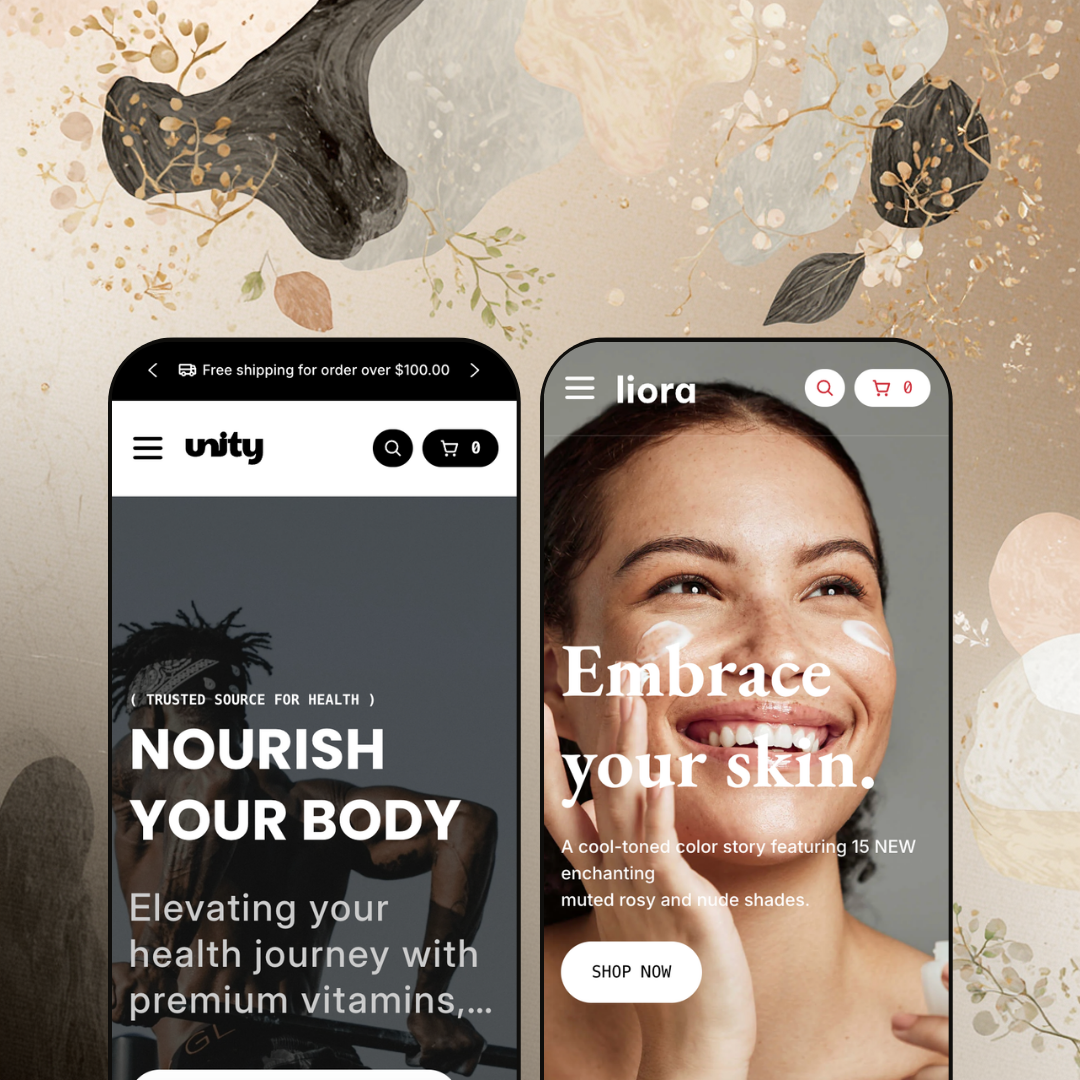
Unity and Liora share every functional capability but deliver genuinely different shopper-facing experiences. One channels clinical wellness with green tones and transparent product photography. The other shifts to editorial skincare with warm cream palettes, lifestyle imagery, and serif type. Dual-logo support, a configurable section library, and an adaptable navigation architecture mean merchants aren't locked into one visual lane. A supplement store and a luxury skincare brand can run the same theme and produce results that look nothing alike.
Cons.
〰️
Cons. 〰️
Lazy-loading stutter below the fold
Sections further down the homepage take a visible beat to render images and animations during the initial scroll. There's a flash of whitespace before content fills in. It's not catastrophic, but it interrupts an otherwise smooth experience. Merchants building long, section-heavy homepages should test carefully and consider whether every section below the fold justifies its spot.
No active state in the mega menu
When a shopper is already browsing a specific collection and reopens the Shop dropdown, nothing marks where they came from. The menu resets to a neutral state every time. In a theme that makes the mega menu this central to navigation, the absence of a selected-state indicator is a missed detail that creates small but unnecessary friction.
-
Clinical greens, transparent PNG product shots, and a no-nonsense layout: Unity's default preset looks like a supplement brand that already knows what it's doing. The tone lands between pharmacy and farmer's market, trustworthy enough for a health product without feeling sterile.
What works in this preset
Deep greens, clean whites, and soft natural accents run from the announcement bar through the footer. It's a cohesive wellness identity that communicates purity at a glance. A supplement brand could launch with this palette tomorrow and look credible, no color tweaking needed.
The mega menu staging is where things get interesting. Open "Bestsellers" and you'll find three category tabs: Herbal Supplement, Advanced Vitamins, Digestive Support. Each tab loads a scrollable product carousel, complete with pricing, vendor names, and variant selectors. Shoppers can browse across categories, pick a dosage, and add to cart without loading a single new page. For a store with 30-50 supplement SKUs, this turns the navigation bar into a storefront.
Product cards use transparent PNGs on clean backgrounds, so every bottle floats in its own space. Hover over a card and a secondary lifestyle image slides in. The result is a grid that feels scannable and organized, which matters when a shopper is comparing five different probiotic brands at a glance.
A dedicated "Pages" dropdown surfaces the blog (in both standard and collage layouts), an About Us page, a contact form, and a contact-with-map variant. Wellness brands live and die on trust. Giving first-time visitors an obvious path to ingredient stories, brand backstory, and direct contact isn't just nice staging; it's smart information architecture.
The "Collections" dropdown renders each category as a rich card with an image, a name, and an exact item count (e.g., "9 Items" for Digestive Support). Before clicking anything, shoppers already know how deep the catalog goes. Small detail, big confidence signal.
Up top, a rotating announcement bar cycles three shipping-related messages with custom SVG truck icons. It auto-plays, pauses on hover, and stacks value propositions without crowding the hero. All three messages in this demo push a free-shipping threshold, reinforcing the conversion nudge quietly.
Where it stumbles
Scroll past the fold on the homepage and you'll catch it: sections below the hero take a visible beat to render images and animations on first load. There's a brief flash of whitespace before content fills in. It happened consistently across multiple scroll-throughs, and merchants building long, section-heavy homepages should keep an eye on their section count.
Open the Shop mega menu while you're already browsing a collection, and nothing highlights. No selected state, no visual breadcrumb showing which category you came from. In a theme that makes the mega menu this central to the shopping experience, the lack of active-category feedback is a missed detail. It's a small friction, but it adds up when subcategory names sound similar (Herbal Supplements vs. Essential Supplements, for instance).
-
Same engine, different universe. Liora trades Unity's clinical greens for warm cream, muted blush, and charcoal. Typography picks up a serif accent. Product photography goes lifestyle-first. The whole preset reads like a skincare editorial spread, and that's exactly the point.
What works in this preset
The palette does most of the work. Cream backgrounds, blush accents, charcoal type. It reads premium without trying too hard, which is the exact frequency high-end skincare brands need to hit. Merchants selling products in the $30-$80 range can lean on this preset's color story to support perceived value without customizing a single swatch.
Where Unity's mega menu stages supplement categories, Liora stages skin concerns. The Shop dropdown includes a "Skin Concerns" column with entries like Dehydration, Brightening, First Signs of Aging, Oil Control, Enlarged Pores, and Fine Lines & Wrinkles. That's not just a different set of links; it's a fundamentally different information architecture. Instead of asking "what category do you want?" it asks "what problem are you solving?" Real skincare shoppers think this way, and Liora's staging proves the mega menu system is flexible enough to support concern-based navigation out of the box.
Product cards lean into lifestyle photography. Textured backgrounds, soft shadows, ambient lighting. Where Unity's transparent PNGs feel like a catalog, Liora's cards feel like a magazine page. The layout gives generous room to the images, which matters when visual storytelling and packaging design sell the product before specs do.
The header loads two distinct SVG logo files, one for light contexts and one for dark. When the logo sits on a transparent hero overlay it uses one version; on a solid navigation bar, the other. Skincare brands tend to invest heavily in their wordmarks, and this dual-logo approach prevents the common problem of a beautiful logo getting washed out against the wrong background.
Where it stumbles
Open the Shop mega menu and count the items in the "All Skincare" column. Moisturizers shows up twice, once at the top and again as the sixth entry. It's a demo content duplication, not a theme bug, but it looks sloppy. Merchants evaluating a $150 theme notice details like this, and it doesn't inspire confidence during the trial window.
Niche Suitability
Not Ideal For
-
Wellness, supplement, skincare, and beauty brands with moderate catalogs that benefit from categorized navigation and conversion-focused product discovery. Merchants who'd rather not stack third-party apps for features like countdowns, age gates, back-in-stock alerts, and promo popups will find strong value at $150.
-
Stores with very large catalogs (500+ SKUs) that need enterprise-level filtering, or brands in non-beauty verticals like electronics or industrial supplies where both available presets require a ground-up visual overhaul.
-
Low to Medium. Both presets cover wellness and skincare out of the box, and the section library runs deep enough that most merchants won't touch code. Brands outside the beauty and wellness space should budget extra time for visual restyling, but the core functionality translates across verticals without technical work.
Final Recommendation
★ 7.6/10
Rating
-
Deep built-in toolkit: in-menu product carousels, quick view, quick buy, age verifier, back-in-stock alerts, before/after sliders. The demo showcased a clean, standard filter presentation.
8
-
Two well-staged presets cover distinct niches. The 31+ section library is powerful but means more decisions for new merchants to navigate.
8
-
Navigation collapses into a clean drawer with back-button hierarchy. Grids adapt sensibly. No unique mobile-only interactions verified beyond standard responsive behavior.
7
-
Hero and above-fold content loads fast. Below-fold sections show a visible lazy-loading delay on first scroll. Interactive elements respond without lag once loaded.
7
-
Two presets covering very different aesthetics, dual logo support, 31+ sections, and full typography control. The jump from clinical green to editorial blush confirms real adaptability.
8
FAQ
〰️
FAQ 〰️
-
👑 It's practically purpose-built for them. The Unity preset stages a supplement catalog with category-specific mega menu tabs, while Liora reconfigures the same engine for skincare with concern-based navigation. Both verticals feel native.
-
📱Navigation collapses into a slide-out drawer that preserves the full multi-level hierarchy. Product grids reflow to single-column. Tested on both presets; no mobile-specific features beyond solid responsive behavior were identified.
-
🎨 Easily. The two presets demonstrate dramatically different palettes, logo treatments (Liora runs dual light/dark logos), and typographic moods. With 31+ sections, you can mix layouts freely.
-
⚡ The mega menu opens instantly, quick-add drawers fire without lag, and hover image swaps are smooth. Below-fold sections on Unity's homepage showed a brief lazy-loading delay on first scroll, but subsequent interactions were fluid.
-
👕 Products with multiple options, like the Vitamin D3 K2 with its Dosage and Size selectors, surface inline variant pickers directly on the product card during quick-add. Single-variant items skip straight to "Add to cart." Consistent across both presets.
-
🔎 The theme renders clean heading hierarchies with H1 tags for product and collection titles, supports breadcrumbs, and uses descriptive alt attributes on product images. Blog support, including a collage layout variant in the Unity preset, gives you a content marketing foundation.
-
💱 Language selection and currency switching are handled entirely by Shopify Markets at the platform level, not by the theme. What Unity controls is the design and placement of those selectors, and it positions them cleanly in the header on both presets. The theme also ships with EU translations in English, French, Italian, German, and Spanish, which helps merchants localize their storefront copy without third-party translation apps.
-
⚙️ Built on Online Store 2.0, so app blocks and app embeds work natively. That said, the built-in toolkit (age verification, back-in-stock alerts, countdown timers, promo popups) may mean you need fewer apps than you'd expect.
-
🛒 Shopify's "Try theme" option lets you install it on a development store and customize freely before publishing. Both preset demos are also publicly accessible for hands-on evaluation.
This review is based on hands-on testing of the publicly available preset demos of the Unity Shopify theme as of March 18, 2026. Theme features, preset availability, and performance can change with subsequent updates from the theme developer.