
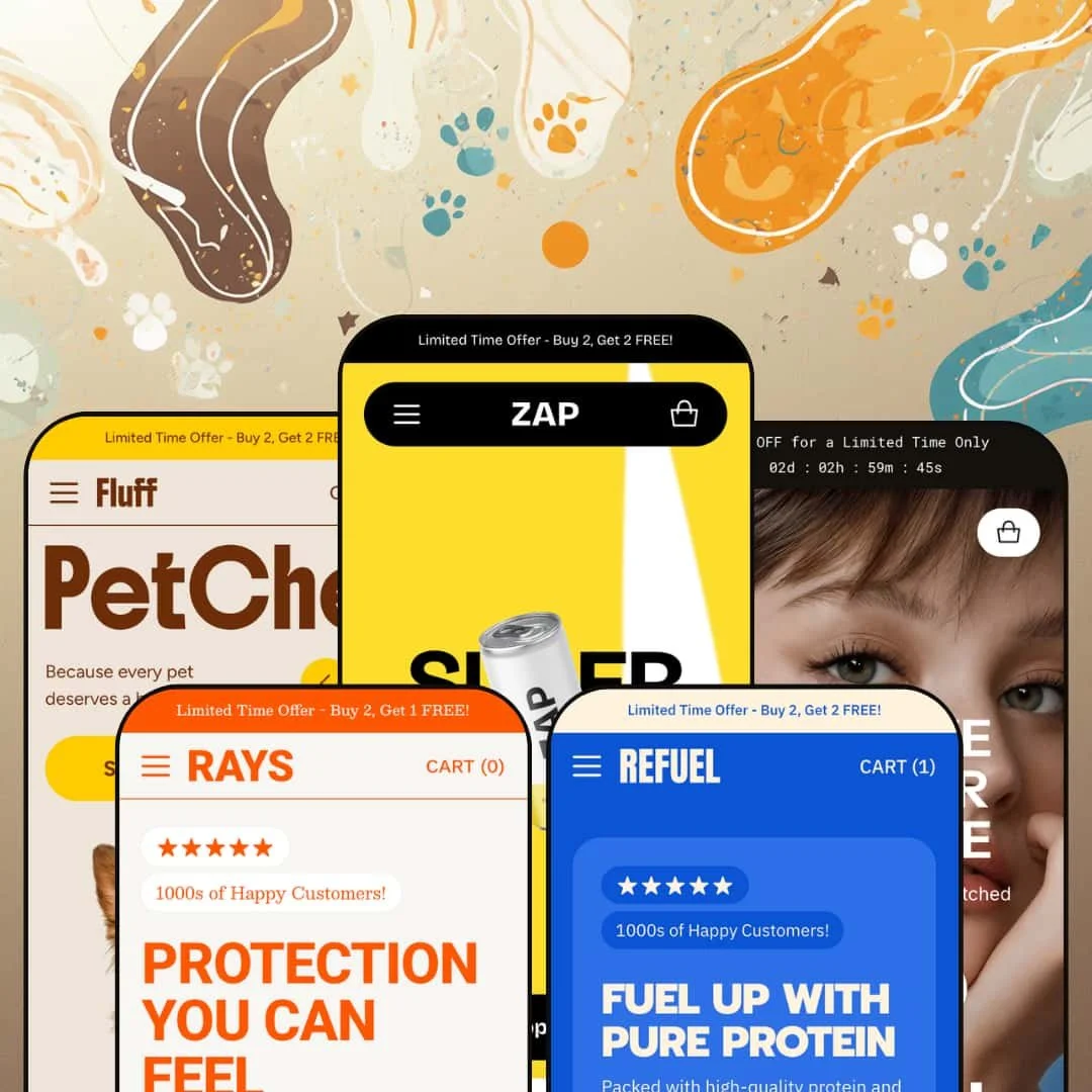
Zap costs $320 and launched three days ago. Zero reviews. Zero track record. So why is it worth your attention? Because this Shopify theme from Almost Perfect Studio ships with 30+ configurable sections, five product page layouts, and a native conversion toolkit that could replace $50/month in apps. That's either a smart bet or an expensive gamble. I tested all five presets to find out which.
Pros.
〰️
Pros. 〰️
An exceptionally deep section library
Thirty-plus section types. Before/After image sliders, product hotspot markers, features comparison tables, image parallax overlays, media slider banners, testimonials carousels, ticker marquees, social feed blocks, and more. Most themes at this price point give you fifteen to twenty sections. Zap covers every common homepage pattern and pushes into territory (hotspots, Before/After comparisons, features tables) that typically requires third-party apps. Want to build a spec-heavy tech landing page? Done. A lifestyle beverage homepage with editorial layering? Also done. No code required.
Five product page layout options
Extended, Vertical Thumbnails, Horizontal Thumbnails, Pill Options, Radio Options. That's not just variety for variety's sake. A headphone brand with colour swatches needs a different layout than a supplement brand with size tiers, and Zap handles both natively. The Portable preset stages all five with live links, so you can click through each one with real product data before committing. That kind of transparency in a demo is genuinely rare.
Native conversion tools that replace third-party apps
Here's the math that matters: countdown timers, promo popups with newsletter capture, age verification modals, stock counters, cross-selling modules, trust badges, promo tiles, and promotional banners are all built in. A store paying $20-50 per month for three or four separate apps covering these features recoups Zap's $320 in under a year. The popup I tested in the Zap preset included a product lifestyle image, a single email field, and a clean "No, Thanks" dismissal. Polished. Not pushy.
Enhanced predictive search with product previews
Every preset surfaces popular search terms and product preview cards with hover images inside the search overlay. Compared to Dawn's default search, this is a meaningful upgrade. The search suggestions are staged with niche-specific terms: beverage flavours in Zap, pet food categories in Fluff, collection names in Refuel. That customization lets merchants tailor the search experience to their vertical rather than settling for generic auto-suggestions.
Polished product card interactions across all presets
Cards swap to a secondary image on hover. Quick View triggers appear on the overlay for variant selection without a page redirect. Sale badges and compare-at pricing display clearly. "Sold Out" states are handled gracefully. These interactions are consistent across all five presets, which means you're getting a refined shopping-grid experience regardless of aesthetic. The hover image swap is especially useful for products where a second angle adds real value, like skincare packaging or headphone colours.
Cons.
〰️
Cons. 〰️
Brand new with zero community reviews
Version 1.0.0 launched March 23, 2026. No update history. No community feedback. No proof that bug fixes ship quickly. Almost Perfect Studio advertises 24/7 support with 15-minute response times, which sounds great until you remember that every new developer says that. Early adopters are betting on potential. For merchants who value a proven ecosystem with years of reviews, that's the single biggest risk factor.
Section volume risks homepage bloat without careful curation
The Zap preset is the cautionary tale here. Ten or more distinct content blocks on one homepage. Promo tiles, ticker, product grid, benefits, image-with-text, logo list, testimonials, image carousel, social feed. It's impressive as a feature showcase, but as a live storefront, it's too much. Merchants who don't trim aggressively will end up with homepages that test visitor patience, especially on mobile where thumb-scrolling through all that content gets old fast.
The logo list section doesn't support outbound links
The scrolling logo marquee looks polished, but clicking individual logos does nothing. If you're planning an "as seen in" or "press coverage" section that links out to media mentions, you'll need to build that using the image-with-text or multicolumn sections instead. For a theme that nails so many other details, this feels like an oversight.
Countdown timer fallback text needs manual setup
When the countdown hits zero, the announcement bar shows whatever post-expiry text you've entered. The demo default? A raw placeholder string. Forget to update it and your live store displays "Text after countdown has ended" to real customers. Small thing. Easy to miss during a busy promo cycle.
-
The flagship preset. Staged as a high-energy cold-brew beverage brand, Zap cranks the section library up to near-maximum and lets you see what this theme can really do. Bold colour accents, oversized display type, and a homepage that just keeps going.
What works in this preset
Three words hit you first: "SUPERCOLD," "COOLKICK," "FLAVORBLAST." They're splashed across three stacked promo tiles, each pairing a full-bleed product image with a bold wordmark and a "Shop now" link. There's an animated graphic element above them adding motion before the visitor scrolls a single pixel. Bright accent colours pop against a clean white base, and the whole thing screams youthful DTC beverage brand. It's loud on purpose, and it lands.
Scroll down and you'll find the testimonials section doing something clever. Each customer review sits beside a shoppable product card, complete with pricing and a "Shop Now" button. Social proof and purchase path, side by side. That's not just pretty layout work. It's a conversion play that lets a shopper read a five-star quote and add the product to cart without leaving the carousel.
The section rhythm here is dense. After those promo tiles comes a scrolling ticker marquee ("Sustainably Sourced / No Artificial Flavours"), then a featured products grid, a benefits callout with three iconographic columns (High Protein, 0-2g Sugar, Sweet & Delicious), a rich-text block with a CTA, a logo list, the testimonials carousel, a lifestyle image carousel, and a social feed. That's a lot. It's basically the theme showing off everything in one homepage, and for merchants evaluating the purchase, it's a comprehensive preview of what's available.
Down at the bottom, the footer packs in a newsletter email capture with a privacy-consent checkbox, an About Us paragraph, three link columns (Products, Customer Service, Information), social icons, and a payment badge row. For a cold-brew brand staging, this level of footer density is unusual. But it shows how merchants can turn the footer into a secondary conversion and trust-building zone rather than just a copyright line.
Where it stumbles
That section density cuts both ways. Ten distinct sections before the footer means a lot of scrolling. If your shoppers arrive with high purchase intent, they'll wade through brand storytelling, testimonials, tickers, and social content before they hit the footer CTA. The Zap preset works brilliantly as a showcase of what's possible, but a live storefront would need aggressive trimming. Leave everything on and you're running a magazine, not a funnel.
The logo list section scrolls continuously, which looks great. Click on a logo, though, and nothing happens. There's no link-through. For brands planning to use this as a "press coverage" or "as seen in" section with outbound links to media mentions, that's a miss. You can see the logos. You just can't go anywhere from them.
-
If Zap is the loud one at the party, Rays is the one with the quiet confidence. This skincare-and-suncare preset swaps bold pop-art energy for warm, sandy tones and soft product photography. Fewer sections, more breathing room, and a navigation structure pared back to match a focused product line.
What works in this preset
Warm, beach-adjacent tones define this preset's colour palette, and they immediately signal a skincare or sun-care vertical. The product photography sits against a light, airy background with a typographic treatment that's calmer and more refined than Zap's shouty display type. Think editorial beauty magazine, not energy drink billboard. That tone builds trust, which is exactly what you need when you're asking someone to put your product on their skin.
Navigation here is staged as a compact, single-tier dropdown: Sunscreen, Repair, Shop All. No mega menu imagery, no three-level depth. For a brand with two or three collections, this is smart. You don't want a sprawling dropdown that's mostly empty whitespace. The reduced complexity shortens the path from landing page to product page, and for a focused skincare line, fewer choices actually means less friction.
An Account link sits directly in the header next to the search and cart icons. Subtle but important. Skincare brands often run subscription models or loyalty programs where logged-in customers reorder regularly. Making that entry point visible without burying it in a menu acknowledges the repeat-purchase cycle that drives this vertical. Small detail, real impact.
The search overlay shows five popular suggestions ("After-Sun," "Sunscreen," "Repair," "SPF," "Body") alongside three product preview cards with hover images and pricing. These aren't generic terms. They're curated for the niche, pre-segmenting the catalogue along the lines that skincare shoppers actually think. Someone landing with vague intent ("I need something for after the beach") gets guided to specific products fast.
Where it stumbles
Rays' calmer homepage density means fewer storytelling sections surface above the fold compared to Zap or Portable. That restraint is an aesthetic choice, not a capability limitation, but brands wanting editorial content, testimonials, and lifestyle imagery on their landing page will need to add those sections manually. The demo won't show you what's possible here; you'll have to build it yourself.
The demo catalogue is thin: three to four products per collection. That's staging data, sure. But the collection grid doesn't inject mid-grid editorial blocks or cross-sell banners to fill visual gaps. If your real store has a similarly compact product line, plan to pad those grids with featured content sections or curated recommendation rows, or they'll feel sparse.
-
Now we're talking tech. Portable is the consumer-electronics preset, built around a dark-accented aesthetic tailored for headphones and earbuds. It stages more of the theme's advanced sections than any other demo, including the countdown timer, features table, and product hotspot markers. If you want to see what Zap can really do under the hood, start here.
What works in this preset
First thing you see: a live countdown timer in the announcement bar. Days, hours, minutes, seconds, all ticking down next to "50% OFF for a Limited Time Only." It runs in real time and it grabs attention immediately. For product launches, flash sales, or limited drops, that kind of urgency trigger sitting at the very top of the page is exactly where it needs to be. No third-party timer app required.
The mega menu here links directly to specific product models with thumbnail images. Open the Headphones submenu and you'll see Studio Wireless Headphones and Wireless Over-Ear Headphones as individual links, each with a product photo. Shoppers bypass the collection grid entirely and jump straight to a product page from the header. For tech brands with a curated lineup of hero products, that shortcut shaves off an entire page load from the purchase journey.
Dark-mode colour scheme, angular typography, crisp product photography against dark backgrounds. Portable looks like a tech product theme. It feels premium and modern in a way that aligns with consumer electronics conventions, and combined with the features table and product markers (hotspot) sections, the staging sells this as a credible alternative to dedicated tech themes that cost just as much.
Here's something you don't see in most demos: every product page layout option is linked and live. Extended, Vertical Slider Thumbnails, Horizontal Slider Thumbnails, Pills Options, Radio Options. Click through each one with real product data and see exactly how colour swatches, size selectors, and thumbnail galleries render. That level of layout transparency is unusual and genuinely helpful for merchants making a purchase decision.
Sale badges and compare-at pricing show up clearly on the product cards. The Active Noise Canceling Headphones display $199.00 next to a struck-through $250.00. No math required. For electronics merchants running promotions, that immediate legibility matters because shoppers in this vertical are price-comparing across tabs.
Where it stumbles
When the countdown timer hits zero, it shows whatever fallback text the merchant configured. In the demo, that's a raw placeholder: "Text after countdown has ended." Forget to write custom post-expiry copy and your live store will display that string to real customers. Easy to fix, easier to overlook, especially during a busy promotional cycle when you're already juggling discount codes and inventory.
The homepage doesn't stage a testimonials or social proof section. That's a notable gap for electronics, where peer reviews and hands-on impressions drive purchase decisions more than almost any other vertical. The testimonials carousel is available in the theme. Portable's demo just doesn't surface it. Merchants here will want to switch it on immediately, because selling headphones without customer quotes is leaving credibility on the table.
-
Fluff is the gentle one. A pet-food preset that combines warm colour tones, rounded visual elements, and a simplified layout built for repeat-purchase, subscription-friendly product lines. Where Zap and Portable compete for attention, Fluff earns trust quietly.
What works in this preset
Warm, earthy tones with rounded shapes create an immediately approachable aesthetic. Product photography centres on raw pet food with natural textures, and the page density sits lighter than any other preset. That's deliberate. Pet owners making health-conscious decisions about what they feed their animals want to feel reassured, not overwhelmed. The visual language here says "we care about this too," which is the right message for the vertical.
Four navigation links in the header: Shop, Blog, About, Features. That's it. The Shop dropdown lists Raw, Snacks, Health, and Shop All. For a pet food brand, this compact structure mirrors the actual product architecture without adding complexity that a shopper doesn't need. When your catalogue has three collections, you don't need a mega menu. You need clarity.
The announcement bar repeats "Buy 2, Get 2 FREE!" twice in succession. It looks intentional, not broken, creating a double-line emphasis that reinforces the offer without adding a separate banner section. For brands running a persistent, site-wide promo, this simple treatment keeps the deal visible without eating up homepage real estate.
Popular search terms in the predictive search panel read like a pet owner's shopping list: "Raw," "Snacks," "Health," "Beef," "Fish." These suggestions segment the catalogue along the exact lines that pet owners shop by, and the three product preview cards that appear alongside them turn the search overlay into a lightweight navigation alternative. Returning customers, in particular, will find what they need in two clicks.
Where it stumbles
Navigation in this demo sticks to a text-only dropdown. No collection imagery, no product thumbnails, none of the mega menu richness that Zap and Portable showcase. The capability's there in the theme. Fluff's staging just doesn't demonstrate it. If you want lifestyle imagery or hero products in your navigation, you'll need to configure the mega menu yourself in the editor.
The blog link exists in the header, but the demo doesn't do anything interesting with it. No distinctive article templates, no featured post highlights, no content marketing sections on the homepage. For pet brands that build authority through educational content about nutrition, ingredients, and feeding schedules, that's a missed opportunity in the staging. The blogging tools exist. They're just not shown off here.
-
Refuel is the grab-and-go preset. Snack bars, protein packs, combo deals. High contrast, bold pricing, and a layout that prioritises getting products in front of price-sensitive shoppers with minimal fuss. It's the most transactional of the five demos.
What works in this preset
The navigation organises products into four collection-based categories: Bold, Combos, Sale, and Crunchy. Putting a "Sale" collection at the top nav level is a smart staging choice for low-ticket impulse buys. Snack brands live and die by promotional visibility, and surfacing deals at the same hierarchy as flavour categories removes friction from the deal-hunting flow. Shoppers looking for a bargain don't have to dig. It's right there.
Compare-at pricing is staged aggressively, especially on bundles. The Mega Mix Pack shows $18.00 against a struck-through $25.00, and the discount registers instantly. No mental math. For snack and nutrition brands where average order value depends on multi-pack upsells, that kind of visual hierarchy does the selling before the shopper even clicks through to the product page.
High-contrast colours and bold type give Refuel an active, fitness-adjacent identity. Product photography features protein bars and combo packs against clean, punchy backgrounds. The aesthetic avoids Fluff's warmth in favour of something more competitive, almost gym-culture-coded. It matches the purchase context perfectly: fast decisions, low price points, volume-based value.
Predictive search here surfaces collection names ("Bold," "Combos," "Crunchy") alongside product preview cards. That mirrors how snack shoppers actually browse: by flavour profile or format, not by individual product name. Two clicks from search bar to product page.
Where it stumbles
No hero banner. No featured product spotlight. The homepage drops you straight into the product grid, which is efficient for returning customers but a missed opportunity for first-time visitors. A new flavour launch, a seasonal special, a brand-defining image? There's nowhere for it above the fold. Merchants will need to configure a hero section or slideshow to create that first impression themselves.
Social proof is absent from the homepage staging. No testimonials, no customer reviews, no user-generated content. For snack and fitness nutrition brands, where athlete endorsements and customer photos drive credibility, that's a real gap in how this demo sells itself. The testimonials carousel section exists in the theme. Refuel just doesn't bother surfacing it, and merchants in this space will want to fix that on day one.
Niche Suitability
Not Ideal For
-
Zap is built for DTC brands in food, beverage, beauty, pet care, supplements, and consumer electronics that want a bold storefront packed with conversion tools. If you're spending money on promo popup apps, countdown timer apps, or comparison table apps, Zap rolls those into a single $320 purchase. The five presets prove the design system's range across very different verticals, and the 30+ sections give merchants room to grow without outgrowing the theme.
-
Merchants with very large catalogues (100+ SKUs across many categories) or those who need advanced filtering well beyond Shopify's native options should consider themes with deeper collection-page architecture. Zap is optimized for small-to-medium product lines that sell through storytelling and conversion triggers, not search-and-filter discovery. And if you want a minimal, stripped-back storefront, the sheer feature density here might be more than you'll ever use.
-
Medium. Thirty-plus sections and five product page layouts mean real customization depth, but also real decision-making. Plan a few focused hours in the editor to curate your sections, configure your conversion tools (popups, countdown timers, stock counters, age verifiers), remove the demo "Features" navigation link, and trim what you don't need. The theme gives you a lot. You'll need to decide how much of it to actually use.
Final Recommendation
★ 8.2/10
Rating
-
One of the deepest section libraries at this price point. Native countdown timers, promo popups, Before/After sliders, product hotspots, and five product page layouts cover most merchant needs without apps. The enhanced predictive search is a strong addition over baseline Shopify search.
9
-
The volume of options is both a strength and a learning curve. Thirty-plus sections mean merchants need time to understand what's available and make intentional choices. The five PDP layout options are well-staged in the demos, which helps.
7
-
Navigation collapses into a clean drawer, product cards stack neatly, and the search overlay adapts well. The slide-out cart works smoothly. The long Zap homepage requires serious thumb-scrolling on mobile, which could test patience.
8
-
Pages loaded quickly during testing. Image-heavy sections rendered progressively. Interactive elements (search, cart drawer, mega menu) responded without noticeable lag. Ticker and carousel animations ran smoothly across all five presets.
8
-
Five presets spanning beverages, skincare, tech, pet food, and snack bars prove the theme's range. The section library covers virtually every common homepage pattern, and the multiple PDP layouts offer real product-type adaptability.
9
-
👑 DTC brands in food, beverage, beauty, pet care, electronics, and supplements. The Portable preset's features table and product hotspots are tailor-made for tech products, while Fluff's warm simplicity suits pet brands. Any small-to-medium catalogue brand that relies on storytelling over search-and-filter will get the most from this theme.
-
📱Navigation collapses into a slide-out drawer with full menu access, and the predictive search overlay adapts to smaller screens. Product grids stack into single-column layouts, and the slide-out cart opens without a page redirect. During testing on the Zap preset, the mega menu's three-level depth stayed navigable in the mobile drawer without cutting off content.
-
🎨 A lot. The five presets range from high-energy neon (Zap) to warm earth tones (Fluff) to dark-mode tech (Portable), and the theme editor exposes colour, typography, spacing, and layout controls across 30+ sections. Product page layouts alone offer five distinct configurations. Font selection uses Shopify's standard typography picker, which includes Google Fonts and custom uploads.
-
⚡It is. During hands-on testing across all five presets, pages loaded quickly, image carousels scrolled without stutter, and the mega menu opened without delay. The enhanced search returned predictive results instantly. Nothing felt sluggish, even on the section-heavy Zap homepage.
-
👕 Yes. The theme offers pill-style and radio-button variant selectors alongside traditional dropdowns, and Quick View on product cards allows variant selection without leaving the grid. On the Portable preset, colour swatches for headphones rendered accurately with distinct thumbnail images per colour option.
-
🔎 Zap follows Shopify's standard SEO structure with clean URLs, meta fields, and heading hierarchy. Breadcrumbs are available for product and collection pages, helping both users and crawlers understand site structure. Blog and article templates support content marketing, and the Zap preset's blog section includes a clean article layout with readable typography.
-
💱 The theme ships with pre-loaded EU translations covering English, French, German, Italian, and Spanish, plus RTL CSS layout support for Arabic and Hebrew markets. Multi-currency and region switching is handled through Shopify Markets configuration, and the Rays preset confirmed both the language toggle (EN/FR/ES) and the region selector function correctly when enabled.
-
⚙️ Zap supports standard app integration through the theme editor's app blocks. Because it already bundles countdown timers, popups, age verification, and stock counters natively, you'll likely need fewer third-party apps than usual. App blocks slot into sections and templates the same way they do on any Shopify 2.0 theme.
-
🛒 You can. Shopify's "Try theme" option lets you install and customize Zap in your store editor without paying the $320 until you publish. All five preset demos are also publicly accessible for hands-on evaluation before installing.
This review is based on hands-on testing of the publicly available preset demos of the Zap Shopify theme as of March 26, 2026. Theme features, preset availability, and performance can change with subsequent updates from the theme developer.