
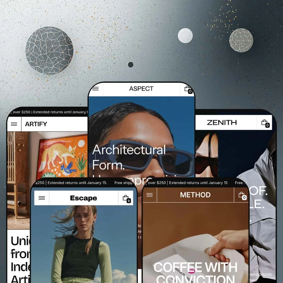
Most $380 Shopify themes give you a polished layout and call it a day. Zenith, built by Apparent Collective, gives you a modular design system with 30+ drag-and-drop sections, a mega menu that doubles as a merchandising surface, a built-in dark mode toggle, and five presets that span fashion, eyewear, coffee, outdoor gear, and art prints. It's not trying to be everything to everyone. It's trying to be the last theme a visual brand needs to buy. I tested all five presets hands-on to find out whether the depth holds up or just looks good in the feature list.
Pros.
〰️
Pros. 〰️
✚ Deep section library with 30+ content blocks
Zenith ships over 30 drag-and-drop sections across every preset. Before/After sliders, image hotspots, spotlight cards, content tabs, specifications, sorted product grids, lookbooks, testimonials, media banners, tickers, social media collages, newsletter blocks, store location maps, and more. This isn't five skins over a shallow template. It's a modular design system that merchants can assemble into completely different homepage configurations depending on brand, catalog size, and content strategy. Method's "Roastbook" and Artify's room-setting lookbook prove these sections adapt to non-fashion contexts without touching code.
✚ Mega menu with promotional imagery at every tier
The mega menu embeds promotional collection images in every dropdown tier. Aspect takes it three levels deep with individual product links. Zenith uses it to surface gendered collections with lifestyle photography. Method organizes by brewing method and origin. Every preset stages the mega menu differently, but the capability underneath is the same: a navigation system that doubles as a merchandising surface. Most themes at this price point give you links. Zenith gives you links with context.
✚ Quick View with variant-sensitive product cards
Quick View works consistently across every preset's product grids. Cards show color swatches, size selectors, and an Add to Cart button right on the grid. Multi-variant products flag sold-out combinations correctly. Single-variant items skip straight to Add to Cart. Image rollover gives shoppers a second product image on hover. Stack all of that together, Quick View, inline variant selection, image rollover, and the clicks between browsing and buying drop to almost zero.
✚ Built-in dark mode toggle
A dark mode switch in the navigation flips the entire color system: product cards, mega menu overlays, footer blocks, everything. Two complete visual identities from one installation. It's not a gimmick. The whole theme adapts cleanly. Brands that want a day/night toggle or simply prefer a dark aesthetic save the cost and hassle of maintaining a second theme variant.
✚ Four product page gallery layouts
Product pages support Slider, Stacked, Slider with Previews, and Stacked with Previews. All four are demonstrated across multiple presets. This matters because different products need different visual treatment. Clothing wants multiple angle shots in a slider. Art prints benefit from a large stacked view. Technical gear works best with preview thumbnails beneath a primary image. One theme, four gallery modes.
✚ Enhanced search and promo popup
Open the search overlay and it's already selling. Trending search links, specific product names, collection titles, and a featured collection image card, all before a single keystroke. The search bar functions as a discovery tool, not just a text field. Add in the promo popup (customizable imagery, headline, copy, CTA, fires on page load), and you've got two conversion touchpoints working before the shopper does anything intentional.
Cons.
〰️
Cons. 〰️
🚫 Feature density demands editorial curation
Zenith's biggest strength is also its steepest learning curve. The flagship preset stages 15+ homepage sections by default, and merchants with smaller catalogs or limited photography will need to make real decisions about what to keep and what to cut. There's no progressive disclosure, no recommended starting configuration for different store sizes. The initial setup demands editorial judgment. You're not just installing a theme; you're curating a magazine layout.
🚫 Lookbook sections are visual, not shoppable
Across every preset, lookbook sections deliver beautiful lifestyle imagery and editorial copy. But they don't include clickable product pins. Image Hotspot is a confirmed theme capability and available as a separate section, but the lookbook panels aren't wired for inline product tagging. Shoppers who get inspired by a lookbook image need an extra click to find the actual product. That's friction in the browse-to-buy flow, and it's a missed opportunity to connect storytelling with commerce inside the same section.
-
Zenith is the flagship: urban streetwear, premium outerwear, dark earth tones, and editorial-grade photography stacked into the densest homepage of all five demos. It's built for fashion brands that want visitors browsing visually before they ever click a product.
What works in this preset
You land, and a promo popup is already in your face. "New Collection Drop," lifestyle imagery, editorial copy, Shop Now button. It's bold. Compared to the quieter openings of Aspect or Method, this preset sets a tone of urgency from the first second. The popup closes cleanly, revealing a hero carousel behind it: three full-bleed lifestyle shots anchored by "Stormproof. Breathable. Layered." as a headline. The entire browsing session gets framed around a seasonal narrative before you've scrolled once.
Below the fold, a tabbed product grid lets shoppers toggle between All, Women, and Men without a page reload. It's a smart default for a fashion store because it surfaces gendered collection filtering right on the homepage, immediately signaling catalog breadth. Every card in the grid shows color swatches, size selectors, a Quick View trigger, and an Add to Cart button. Browsing-to-buying friction? Almost none.
The "Selected Items" accessories section is a nice touch. Three product cards sit alongside large detail images, treating bags, hats, and bottles differently from apparel. Form factor over fit. It's a merchandising layout that wouldn't make sense for jackets, but it's perfect for accessories that sell on craftsmanship and shape.
Testimonials here are shoppable. Each customer quote pairs directly with the reviewed product's image, name, and price. They're positioned after a media banner and collections grid, catching shoppers who've browsed but haven't committed. Click the product card and you're on the PDP. Social proof that actually routes to a sale.
Three lookbook panels round out the lower homepage: City Rhythm, Prefall Looks, Downtown Edge. Each pairs a lifestyle image with a short creative brief. They don't have shoppable product pins, but they build brand atmosphere and invite deeper exploration. Between the lookbooks, testimonials, collections grid, media banner, social media collage, trust badges, and newsletter signup, this homepage stacks 15+ sections from hero to footer. It's the most editorially dense demo in the lineup, and it earns that density.
Where it stumbles
That density is a double-edged sword. Fifteen-plus sections is a lot to fill. Merchants with fewer than 20 products will find themselves disabling blocks to keep the page from feeling padded. The theme doesn't impose this volume, but the default sets an expectation that smaller catalogs may struggle to meet with quality imagery and copy.
The lookbook panels are visually beautiful but not shoppable. Image Hotspot exists as a separate theme capability, yet these lookbook images don't include clickable product pins. A shopper who falls in love with a lookbook look still needs an extra click to find the actual product. It's a gap in how this preset stages the feature, not a missing capability.
-
Aspect strips things back. It reframes Zenith's architecture for an eyewear brand, swapping lifestyle action shots for tight product close-ups and replacing the default Contact button with "Book eye test." The aesthetic is lighter, more restrained, and immediately feels like a different store despite running on the same engine.
What works in this preset
The navigation goes three levels deep, and it uses that depth well. Shop opens to Glasses, which breaks into Optical and Sunglasses, with individual product names (Aviator Style Glasses, Classic Round Glasses) linked at the third level. One click from the homepage to a specific product. For a store with fewer than 20 SKUs, this turns the mega menu into a curated catalog rather than a standard grid entry point. Every product gets individual visibility.
That "Book eye test" header CTA is worth highlighting. It's a small staging choice that demonstrates something bigger: this theme adapts to service-oriented businesses. The button links to the contact page, but its primary-action styling signals that the store blends product commerce with in-person appointments. Opticians, salons, beauty studios. The pattern works.
Product cards hold up well with a smaller catalog. Roughly 10 products across optical, sunglasses, and accessories, and nothing looks sparse. The grid maintains clean spacing, collection pages feel intentional, and the restrained visual approach lets the eyewear carry each page on its own. No lifestyle editorial density needed.
Inside the Shop dropdown, the Sale collection gets a full promotional image card with a labeled overlay, sitting next to a New In image. Promotional events stay visible from any page without cluttering the primary navigation. It's a quiet but effective use of the mega menu as a merchandising surface.
Where it stumbles
With only about 10 demo products, features like swatch filtering and variant-heavy Quick Add don't get a real workout. Merchants with larger optical catalogs, say 50+ frames with multiple colors and lens options, should test with their own data before committing. The demo just doesn't showcase that kind of density.
The lookbook section exists (you can find it through the Explore nav link), but it's not surfaced on the homepage scroll. Visitors who don't dig into the Explore menu won't know it's there. Compared to Zenith or Escape, where lookbooks earn homepage real estate, Aspect buries its brand-storytelling tool one click too deep.
-
Method is the most niche-specific preset in the lineup. It reimagines Zenith for a specialty coffee roaster, splitting the catalog by brewing method (espresso vs. filter coffee), then by origin region. Warm tones, sourcing narratives, and a dedicated equipment collection prove the theme works just as well for food and beverage as it does for fashion.
What works in this preset
The mega menu organizes coffee by brewing method first (Espresso, Filter Coffee), then by origin (South America, Central America, Africa) within each method. That's how specialty coffee buyers actually shop: taste profile and terroir, not alphabetical order. Two promotional collection images, one for Espresso, one for Filter Coffee, reinforce the catalog's dual identity right inside the dropdown. No other preset uses navigation logic this purpose-built for its vertical.
Method renames the lookbook section "Roastbook." A small relabeling, but it matters. The section now showcases coffee sourcing stories and brewing rituals instead of fashion editorials, and it feels native to the brand rather than borrowed from a clothing template. Zero code changes needed.
A dedicated Equipment collection sits alongside the coffee offerings: espresso machines, grinders, reusable bottles. Hardware products get their own collection with single-SKU cards, which demonstrates something useful about the theme. It handles mixed catalogs cleanly. Variant-heavy beans next to simple single-item equipment, no awkward formatting gaps.
Bestsellers gets a top-level navigation spot instead of being buried in a subcategory. Returning customers hit it from any page, one click to the popular stuff. For a coffee brand where repeat purchasing is the business model, that's a smart default.
The Specifications section page shows how coffee brands can present detailed origin notes, roast profiles, and brewing parameters in a structured, scannable layout. It keeps technical product data out of the main product description, which stays clean for the casual browser.
Where it stumbles
Neither the countdown timer nor the stock counter shows up on the homepage or product pages here. Both are confirmed theme capabilities, so they're available. But the Method demo doesn't preview what urgency-driven mechanics look like in a coffee context. Merchants who want those tools will need to set them up without a visual reference.
-
Escape is the utilitarian one. It stages Zenith for outdoor adventure and technical gear, splitting the catalog across footwear, apparel, and accessories. The tone is function-first. Rugged product imagery, a leaner homepage, and a dual-entry navigation structure that gives outdoor shoppers two ways to browse.
What works in this preset
Navigation offers two entry points. Shop organizes by product type: Clothing (Jackets, Pants, Shoes), Accessories (Bags, Caps, Socks). Collections organizes by lifestyle category: Footwear, Accessories, Ready to Wear. That dual-entry pattern gives outdoor shoppers two mental models for finding gear, and it's especially effective when footwear, apparel, and accessories each have different browsing behaviors. You know what you want? Shop by type. Just exploring? Browse by collection.
The mega menu dropdown images here aren't generic branding. Footwear gets a footwear hero shot. Accessories gets an accessories shot. Every menu interaction becomes a visual merchandising moment, reinforcing the shopping context before the shopper even clicks through.
A top-level Collections page serves as a visual table of contents for the entire catalog. Hero imagery for each collection, clean layout, intuitive for first-time visitors who aren't sure if they want jackets, boots, or bags. Simple, but it solves a real problem for mixed-catalog stores.
The lookbook detail pages feel like gear guides rather than fashion editorials. Seasonal outdoor campaigns, equipment stories, adventure narratives. It's the same underlying section as every other preset's lookbook, but the imagery and copy transform its personality completely. That flexibility is the point.
Where it stumbles
Escape's homepage is noticeably leaner than Zenith or Method. Fewer sections activated by default means faster loading and a more focused scroll, but merchants expecting the editorial density of the flagship might feel shortchanged at first glance. The full section library is still there. It's just not on display.
Sale and New Arrivals are tucked inside the Shop dropdown's Discover subcategory rather than sitting in the top-level navigation. For a gear brand that runs seasonal clearance, that buries the deals one click deeper than it should. Shoppers looking for discounts need to know where to dig.
-
Artify is the wildcard. It remaps Zenith for a digital art and poster store, organizing by artistic medium instead of product type. The feel is gallery-like: large product images, minimal chrome, and a lookbook section repurposed for room-setting inspiration. It's the preset that proves Zenith's architecture has range.
What works in this preset
Navigation splits by medium: Paintings, Photography, Mixed Media, Graphic Design. That's how art buyers browse, by style and technique rather than price or size. It turns the shopping experience into a gallery visit. Specific artwork names (Back-to-Back Silhouette, Colorful Characters, Portrait in Pastels) are linked directly from the mega menu, so returning customers can skip the grid entirely and go straight to a featured piece.
Product cards give each artwork real breathing room. Images aren't squeezed into tiny squares, which matters when the visual is the product. The grid treats each card like a mini gallery wall, with enough spacing between pieces that individual works don't compete for attention. For art and print sales, that's everything.
The lookbook section shows art prints hanging in actual living spaces. Scale, color harmony, room context. Instead of fashion editorials, it's interior inspiration. Buyers who can't visualize a 24x36 print on their wall get the help they need. A smart adaptation that demonstrates how much the lookbook section can flex.
The header swaps Contact for a "new collection" CTA pointing to the New In collection. Rotating this link gives art stores a promotional lever at the navigation level, useful for seasonal drops, artist collaborations, or themed series launches.
Where it stumbles
Most products here are single-SKU or size-only. Merchants selling prints with frame options, paper types, and multiple sizes won't see how the theme handles complex variant matrices. The variant system works fine (other presets prove that), but if you're building a custom framing store with 20 options per product, you'll need to test with your own data. The demo doesn't preview that level of complexity.
Niche Suitability
Not Ideal For
-
Mid-to-large catalog brands in fashion, food and drink, outdoor gear, eyewear, or art/print verticals who want a premium editorial presence with deep conversion tools. It's strongest for merchants investing in content marketing, blogs, lookbooks, brand storytelling, alongside their product catalog, and who have the photography to fill Zenith's image-hungry sections with real quality.
-
Single-product stores, merchants without professional photography, or anyone who wants a stripped-back setup that works in an afternoon. Zenith rewards content investment. Without it, the sections are just empty frames.
-
Medium. The section library is powerful, but it needs curation. You'll decide which of 30+ sections to activate, populate them with quality imagery, and configure mega menu images. The payoff is real, but this isn't a five-minute plug-and-play.
Final Recommendation
★ 8.2/10
Rating
-
Exceptional section library with 30+ blocks, built-in Quick View with variant-sensitive cards, four product gallery layouts, promo popups, Before/After slider, image hotspots, dark mode toggle, and a full conversion toolkit.
9
-
The sheer number of sections and options is powerful but demands thoughtful curation. New Shopify merchants may feel overwhelmed by choices. The Features menu in each demo helps with discoverability.
7
-
Navigation collapses cleanly into a drawer with full mega menu support. Product cards, grids, and the slide-out cart adapt to smaller screens. Dark mode stays accessible on mobile.
8
-
Pages load responsively during testing. Image-heavy sections use WebP and lazy loading. The Zenith preset's long homepage is the heaviest case, but perceived speed holds across all five presets.
8
-
Five presets spanning fashion, eyewear, coffee, outdoor gear, and art prints prove genuine cross-vertical adaptability. Dark mode, four gallery layouts, three blog templates, and a deep section library give merchants real creative control.
9
FAQ
〰️
FAQ 〰️
-
👑 Absolutely. Method stages a specialty coffee brand with origin-based navigation and a Roastbook section. Artify handles art prints with gallery-style medium-based browsing. Escape covers outdoor gear with dual-entry categories. The section library is identical across all five presets, so you don't lose functionality by picking a non-fashion starting point.
-
📱The navigation collapses into a clean drawer that preserves full mega menu depth, promotional images and all. Product grids reflow to single-column, and the slide-out cart works smoothly on touch. Quick View and Add to Cart actions on the Zenith preset are accessible without hover interactions on mobile.
-
🎨 Very. The dark mode toggle alone doubles your visual identity without code. Typography is fully self-serve through Shopify's font system. Colors adapt per section. The mega menu supports custom promotional images at every tier. And Aspect's "Book eye test" header CTA proves that even navigation-level elements can be repurposed to fit completely different brand needs.
-
⚡ Pages loaded quickly across all five presets during testing. WebP images and lazy loading keep media-heavy sections snappy. The Zenith flagship's 15+ section homepage is the heaviest case, but scroll performance stayed fluid with no visible layout shifts or interaction delays.
-
👕 Yes. Product cards on the Zenith preset show color swatches and size selectors directly on the grid. Quick View opens a full variant picker. Multi-variant products like the Hooded Down Parka (three colors, five sizes) correctly flag sold-out combinations, and single-variant items route straight to Add to Cart.
-
🔎 Zenith supports Shopify's built-in SEO fields and generates clean breadcrumb navigation on product and collection pages. Three blog post layouts (Overlay, Row, Column) use proper heading hierarchy, making content marketing SEO-friendly without extra effort.
-
💱 The theme ships with pre-translated theme strings (button labels, form text, UI elements) in English, French, Italian, German, and Spanish, plus RTL CSS support for right-to-left languages. The language and currency selectors visible in each demo are powered by Shopify Markets, not the theme. Merchants configure which languages, currencies, and regions appear through the Shopify admin; the theme surfaces the selector UI that Shopify provides.
-
⚙️ Zenith runs on Shopify's Online Store 2.0 architecture, so app blocks and embed-level integrations work as expected. Standard Shopify schema throughout. The presence of "Sign in with Shop" in the feature list confirms compatibility with Shopify's own ecosystem tools.
-
🛒 Yes. Shopify lets you preview and customize Zenith before buying. You only pay the $380 when you publish to your live store. All five preset demos (Zenith, Aspect, Method, Escape, Artify) are publicly accessible for full hands-on testing.
This review is based on hands-on testing of the publicly available preset demos of the Zenith Shopify theme as of March 21, 2026. Theme features, preset availability, and performance can change with subsequent updates from the theme developer.