
Two presets. One looks like a Zara editorial spread, the other like an Apple product launch page. Same theme, same $220 price tag. Zyra by Shine Dezign Infonet packs more homepage sections into a single theme than most competitors offer across their entire catalog: video hero, shoppable lookbooks, tabbed product grids, a scrolling promo marquee, and a full-screen search overlay that feels more like a mini-storefront than a search bar. The mega menu alone, with its multi-column product listings and built-in promotional images, outclasses what you'd find in themes twice the price. Whether that density is a strength or a headache depends entirely on how deep your catalog runs.
Pros
Video hero and rich visual merchandising sections
The theme ships with a video-capable hero slideshow supporting both looping video and static image slides, complete with text overlays and CTA buttons. But the real depth is below the fold. Merchants get a shoppable lookbook section, a large-format product carousel with USP icon overlays, a scrolling text marquee, and a collection spotlight grid. Together, these sections give stores a visual merchandising toolkit that goes well beyond what Dawn or most mid-range themes offer out of the box.
Full-screen search overlay as a discovery tool
Open the search and it takes over the screen. Popular searches, popular categories, recent searches, and a "You May Also Like" product carousel with variant swatches and sale badges all appear before you type a single character. It transforms a utility feature into an active discovery engine, and it increases the odds that a search interaction ends in a sale rather than a "no results" dead end.
Mega menu with editorial navigation
The mega menu supports multi-column product listings, sub-collection groupings, and a promotional image built right into the dropdown. It's not just a list of links. It's a window into the catalog structure, and the in-menu promo image provides a merchandising touchpoint that most simpler menus lack entirely. For stores with deep category trees, this is the kind of navigation that reduces bounce.
Product card interactions and conversion signals
Product cards across the theme support image rollover, colour swatches, sale badges, variant-sensitive quick-buy selection, star ratings, stock counters, and vendor labels. That's a lot of information on a single card, and all of it serves a conversion purpose. The quick-buy behaviour routes cleanly to variant selection without a full page load, and the combination of social proof, urgency, and convenience creates a dense but effective conversion stack.
Tabbed product grids with collection switching
Homepage product sections support tabbed navigation that lets shoppers toggle between different collections, like "Best Sellers" and "New Arrivals" or "Women" and "Men," without a page reload. It's a small interaction that keeps the browsing flow uninterrupted and exposes shoppers to different product groups within a single viewport.
Cons
Limited track record and demo polish
Version 1.0.2 with three reviews. All positive, but there's no track record for long-term update cadence or how the developer handles edge-case bugs. The "POPUPAR SEARCHES" typo in the search overlay, visible across both presets, is cosmetic and easily fixed in theme settings. But it signals that the default text strings haven't had a thorough QA pass, and it's the kind of detail that erodes first impressions during a trial.
Homepage density requires a deep catalog
The homepage architecture is built for variety, and filling all the available sections demands a substantial product catalog and a library of lifestyle photography. Merchants with lean inventories will spend more time disabling and rearranging sections than populating them. That's not a flaw in the theme's design philosophy, but it does mean the out-of-box experience is calibrated for stores with depth, not stores just getting started.
-
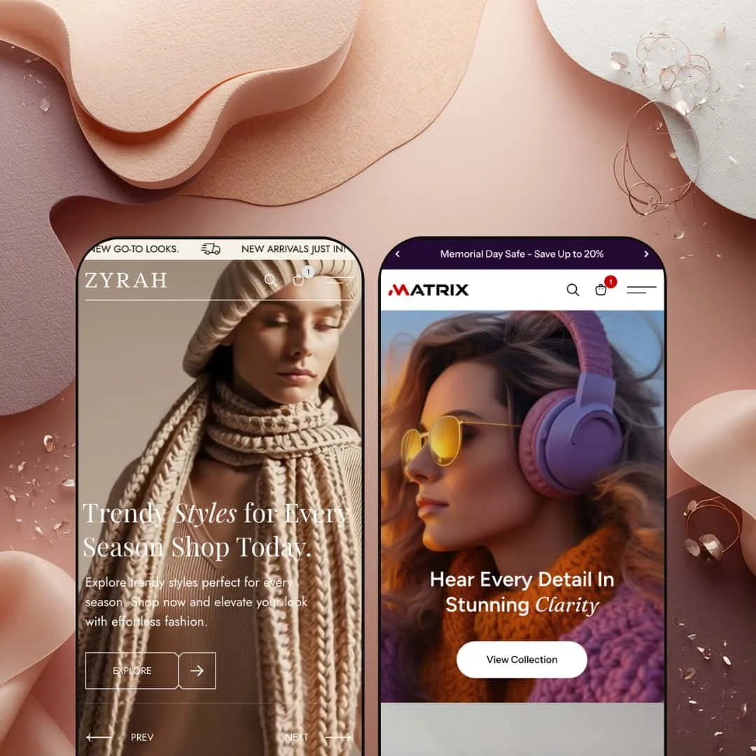
You land on a full-width video slideshow. Fashion footage loops behind a text overlay while a second slide swaps in a static lifestyle banner. The colour story is warm neutrals and off-whites, the kind of palette that says "we curate, we don't just sell." Below the hero, the homepage keeps going: tabbed product grids, a lookbook carousel, promo tiles, a scrolling text marquee, collection spotlights. It's dense. But the spacing holds, and the rhythm between sections keeps it from tipping into chaos.
What works in this preset
The video hero sets the tone immediately. It loops brand-level footage behind a serif headline and a single CTA button, then auto-advances to a second slide with a static lifestyle image and different copy. Two slides, two moods. It gives merchants a broadcast-quality opening without needing a third-party section app, and it signals right away that this isn't a template store.
Scroll down and you hit a tabbed product grid that lets shoppers toggle between "Best Sellers" and "New Arrivals" without reloading the page. Hover over a product card and things get interesting: the image swaps to a second angle, colour swatches appear as small dots beneath the title, a sale badge sits in the corner, and individual size buttons (XS through XL) surface for quick-buy selection. The card treatment is clean and editorial. Compare-at pricing shows in a struck-through format that reinforces the sale narrative without screaming about it.
Further down, a "Recreate the Look" section earns its keep. You see a styled editorial image, and alongside it, clickable product callouts showing the item name, price, and available colours. It's the kind of section that turns browsing into buying, because the shopper sees the complete outfit rather than a single isolated product. If you've ever bought something because you saw it styled on a model rather than floating on a white background, you understand why this works.
A separate carousel presents products in a large-format horizontal layout, each card paired with fabric and fit icons labelled "Soft Fabric" and "Modern Fit." It's a smart touch. Material quality and tailoring philosophy show up right in the browsing flow, before the shopper clicks through to the product page. The carousel tabs into "New Arrivals," "Women," and "Men," reinforcing the editorial structure throughout.
Below that, a collection spotlight grid titled "Uncover Your Vibe" lays out linked collection images with category labels: Trendy Styles, Summer Wear, Street Vogue, Shorts. The images are large-format and visually cohesive. Between sections, a horizontally scrolling text marquee cycles through promo messages like "Drop Deals Live Now" and "Your Favorite Fits on Sale." It adds urgency without the visual weight of another full-width banner.
The mega menu in this preset feels like an editorial navigation panel. Hover over "New Arrivals" and a multi-column dropdown fans out, listing individual products by sub-category (Women, Men, Bags, Dresses) with a featured collection image anchored on the right. It matches the curated tone of everything else.
Where it stumbles
The language and currency switcher doesn't appear in this preset's header, even though Matrix surfaces it prominently. It's almost certainly a theme-settings toggle rather than a missing feature, but international fashion brands will want to check that box before launch. The staging choice here could mislead merchants into thinking the capability isn't there.
Then there's the homepage density. Ten-plus content sections work beautifully when you have 60 products and a folder full of lifestyle photography. Merchants with fewer than 30 items will find themselves repeating products across sections or staring at half-empty grids. The preset is staged for depth, and smaller stores will need to prune sections to avoid looking hollow.
Product cards in this preset demo are staged clean and skip social proof signals like star ratings and stock counts, even though the Matrix preset surfaces both. Fashion merchants who depend on review-driven conversions will want to flip those on in theme settings, because the Zyra demo's stripped-back styling doesn't showcase them by default.
-
Matrix takes everything Zyra builds and dips it in ink. The background goes near-black, the text goes white with occasional neon accents, and the whole vibe shifts from fashion editorial to Apple product launch page. The header immediately surfaces a language/currency switcher, policy links sit inside the announcement bar, and product cards display star ratings alongside stock indicators. Same engine, completely different mood.
What works in this preset
The dark colour scheme is the whole personality. Product images pop against the near-black background with gallery-wall clarity, and white text with occasional neon accents creates sharp contrast. For electronics and audio gear, where the product itself is supposed to be the hero, this staging does exactly what it should: it gets out of the way and lets the hardware shine. The result feels polished and premium rather than gimmicky.
Product cards here are noticeably denser with information than in Zyra. Each card shows a five-star rating, an "In stock, X units" label, and the vendor name ("GadgetZone") directly beneath the product title. That's three conversion signals, scarcity, social proof, and brand identity, all visible before the shopper clicks anything. For a multi-brand electronics retailer, this card treatment does real work.
You don't need to hover to find the quick-add button, either. Matrix stages a persistent "Choose option" button beneath each product card by default. It's just there. This matters more than it sounds, because electronics shoppers tend to compare before committing, and a visible button reduces the cognitive load of figuring out how to add something to the cart.
The announcement bar pulls double duty. Promotional text ("Memorial Day Safe - Save Up to 20%") shares the strip with direct links to the Refund Policy and Privacy Policy pages. It's a practical trust-building detail for electronics purchases, where return policies and data handling weigh more heavily on the buying decision than they might for a $40 dress. A one-line promo strip becomes a functional trust element.
A dedicated "Theme Features" page lives in the main navigation, showcasing every available section type the theme offers. It's clearly aimed at merchants evaluating the theme rather than end shoppers, but it doubles as a built-in setup reference that saves time hunting through the theme editor for capabilities.
The language and currency selector sits prominently in the header, displaying the country flag, currency code, and active language. For international electronics stores, the visible UI placement signals to shoppers that the store is set up for their region before they even browse a product. The actual switching relies on Shopify Markets configuration, but the front-end signal matters.
Where it stumbles
The promotional image inside the mega menu dropdown takes a hit against the dark header background. The same image treatment that looks punchy in Zyra's light chrome gets swallowed here, with noticeably lower contrast. Merchants using the Matrix colour scheme will want to bump up image brightness or add a light border to keep their in-menu banners from blending into the surrounding dark frame.
The dark theme also creates a photography problem. Products shot on standard white backgrounds, which is the default for most electronics product photography, create a visible hard rectangle against the dark layout. It looks like someone pasted a product cutout onto a dark canvas. For a polished result, merchants need consistent image editing, transparent background exports, or lifestyle shots that sit more naturally against the dark surface. That's extra production work.
Niche Suitability
Not Ideal For
Final Recommendation
★ 7.4/10
Rating
-
A wide section library covering lookbooks, shoppable images, tabbed grids, video hero, and a powerful search overlay. Quick buy and variant swatches work reliably across both presets. Product cards support ratings, stock counts, and vendor labels as configurable options.
8
-
The number of homepage sections means setup takes longer than a simpler theme, but the section-based editor keeps individual blocks manageable. The Matrix preset's "Theme Features" page is a helpful onboarding reference for new merchants.
7
-
Navigation collapses into a functional drawer menu with sub-collection accordions. Product cards stack cleanly. The full-screen search overlay adapts well. Some homepage sections like the lookbook carousel and scrolling marquee could feel heavy on slower connections.
7
-
The video hero and dense image sections add payload. Perceived speed on desktop felt smooth during testing, but the sheer number of images and carousels means merchants should optimise media aggressively. Transitions and hover states are fluid throughout.
7
-
Two presets that feel genuinely different, fashion vs. electronics, light vs. dark, prove the theme's adaptability. The section library covers editorial, product-forward, and promotional layouts. Typography and colour are fully configurable.
8
-
👑 It's built for exactly those verticals. The Zyra preset stages a full editorial fashion experience with lookbooks, outfit-of-the-day carousels, and a "Recreate the Look" section that lets you cross-sell accessories alongside styled outfits. The Matrix preset proves it adapts equally well to consumer electronics, with dark-mode card treatments and stock counter displays that suit tech-savvy buyers.
-
📱The mega menu collapses into a drawer with accordion-style sub-categories, product cards stack in a single column, and the full-screen search overlay fills the viewport cleanly. Navigation and search flows worked smoothly across both presets during testing, with core layout elements adapting to narrower viewports without visible breakage.
-
🎨 Very. The two presets share an identical section library but look like completely different themes thanks to colour, typography, and layout choices. The gap between Zyra's warm fashion palette and Matrix's dark tech aesthetic illustrates the range available through the Shopify theme editor, where fonts, colours, section order, and content blocks are all editable.
-
⚡Perceived performance was solid during hands-on testing. Hover transitions, tab switches, and cart interactions felt snappy. The video hero and dense image grids add payload, so merchants should compress media and consider which homepage sections they actually need active. The search overlay and mega menu responded without noticeable lag.
-
👕 Yes. Product cards in both presets display colour swatches and a quick-buy variant selector. On the Zyra preset, hovering over a card reveals individual size buttons from XS through XL. The Matrix preset shows a persistent "Choose option" button by default. Both approaches route to variant selection without forcing a visit to the full product page.
-
🔎 Zyra supports Shopify's built-in SEO fields including title tags, meta descriptions, URL handles, and image alt text. The theme's section headings follow a logical H1/H2/H3 hierarchy, and breadcrumbs are available for internal linking. No additional SEO apps are required for baseline optimisation.
-
💱 The theme includes EU translation files for English, French, Italian, German, and Spanish, and provides a header-level language and currency switcher UI that merchants can enable through theme settings. The Matrix preset surfaces this switcher prominently, displaying the country flag, currency code, and active language. Actual language and currency switching relies on Shopify Markets configuration at the store level.
-
⚙️ No compatibility issues surfaced during testing. The theme uses Shopify's standard section architecture and supports app blocks. Cart notes and gift wrapping are available as built-in checkout enhancements, and the theme's structure follows current Shopify development patterns for third-party app integration.
-
🛒 Yes. Shopify's "Try theme" option lets you install Zyra on your development store and customise it fully before purchasing. Both the Zyra and Matrix preset demos are publicly accessible for hands-on evaluation, so you can explore every page type without committing to the $220 price tag.
This review is based on hands-on testing of the publicly available preset demos of the Zyra Shopify theme as of April 2026. Theme features, preset availability, and performance can change with subsequent updates from the theme developer.